This is a topic for questions, answers, and discussions about session 3 of the Biostatistics for Biomedical Research web course airing on 2019-10-18. Session topics are listed here.
Sorry I didn’t get to the brief section on tables. I’ve added a new short video about tables here.
Sorry about the audio problem. It was corrected at the 2:30 point in the long video.
I have tried twice (with no success) to convince co-authors that extended box plots increase the level of information about the distribution (and that having such information is useful!). In the end, we have settled for violin plots with overlayed box plots instead. Their defense is that it leads to decreased interpretability.
I was wondering if anyone else has had difficulty when attempting to incorporate new visuals (half-violin plots, extended box plots, spiked histograms, etc.) into a field that has mainly used tables, scatter-plots and box plots to describe their populations?
It’s a great question. I haven’t faced much resistance.
I would stick with spike histograms supplemented by quantile intervals and mean, because such histograms are immediately interpretable, expose bimodality and digit preference, and work for all sample sizes.
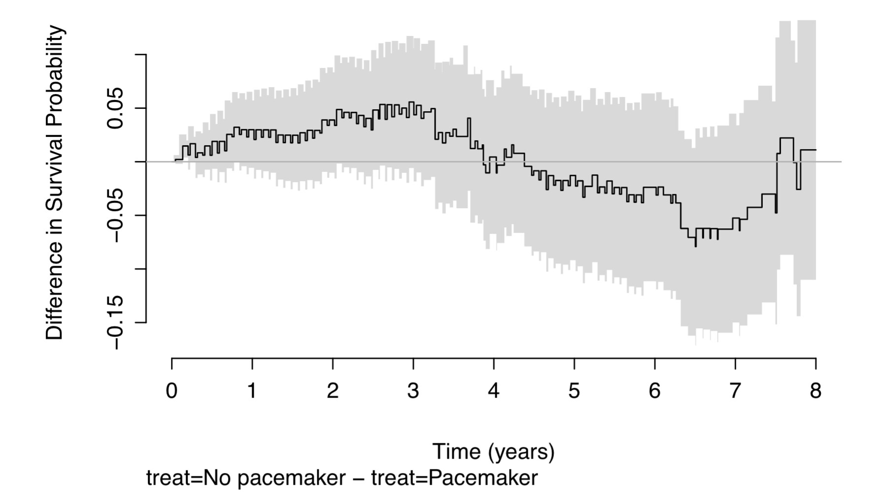
Thank you for providing this course (particularly offline). In the 3rd session, the cumulative event curve difference “1/2CL” was referred to. As I understood it this was centered at the middle difference and the confidence interval superimposed and CL crossing the curves represented ‘significant difference’. I just wanted to clarify how it was calculated and displayed (and interpreted). It certainly seems a better way than the individual CI.
Gather the set of all distinct failure times in either treatment group. These are the only points at which either of the two KM estimates changes
Compute the two Kaplan-Meier cumulative incidence estimates (1 - KM estimates) at all of these points
Take their midpoints
Compute the two standard errors at all the same time points and compute the standard error of the difference (square root of sum of squared standard errors)
Half the width of the confidence intervals for differences is approximately 1.96 * standard error of the difference
Compute two step functions equal to the midpoints +/- 0.5 * 1.96 * SE of difference
Plot the shaded polygon with these two step function boundaries
@f2harrell, is there any chance you can cover visualizations of association involving qualitative variables?
There is one book of which I’m aware by Friendly and Meyer (Discrete Data Analysis with R: Visualization and Modeling Techniques for Categorical and Count Data) that covers some of these ideas, but I think this might be a helpful topic for BBR given the descriptive power graphics provide.
It’s a worthwhile area but I don’t have any plans to cover that at present. I’m sure the reference you gave does a much better job than I could for qualitative variables.
Hi,
This may be too general a question, I can post elsewhere if so, but I’ve been working through the graphics chapter and am trying to apply what I’m learning to my current data, a matrix of counts where samples are rows and species are columns.
I had never really thought about “ties” before this class. A hexagonal binning plot on my data revealed alot of ties. Given many ties, what should we do when analyzing our data?
I imagine trying to figure out if there is a systematic source that can account for the ties is at the top of the list (i.e., if there are many 0s). What else should be a part of a workflow when a dataset is full of ties?
Good question. There may be different issues for formal analysis but to address the question just with respect to best graphical representation, you want to start with the most “raw” unbinned data you can obtain. Are there lots of ties in the primary raw data? And note that hex binning will create ties—too many ties if the bins are large.
The main answer may be to think carefully about the binning algorithm, if binning of the raw data is required. This thinking may dictate that zeros be kept in their own bin.
I’ve just finished watching the video from chapter 3 on charts, together with my colleagues at the hospital. We really liked it. It was also fun to see Frank at his beach house. Very nice teacher.
I would like to ask if anyone can explain the code for Figure 4.10 (Dot chart showing proportion of subjects having adverse events by treatment and differences). It is very useful to replace the ugly toxicity tables.
Many thanks to Frank and everyone.
Thank you for the mechanistic explanation professor Harrell. However, I’m having trouble understanding what you said in the lecture about what it means if either cumulative incidence curve crosses the 1/2 confidence-interval width shaded area centered on the mean? Is there a linearity property of confidence intervals (CI) that is being applied, such that the 95% CI width for half a difference is exactly half the 95% CI width for the full difference? If I understand correctly, when the default shaded area in this plot falls within the individually plotted curves, there is 95% certainty that there is no difference in the curves’ incidence rates. However, when the grey area crosses either curve, I don’t see what at all you can say with 95% confidence.
Thanks Frank and all involved for a stellar course. I am able to replicate the quantiles, mean and dispersion grapic with the support2 dataset. Wondering if you would mind sharing the code for the spike histograms with hovertext for statistical summary?
Dear @f2harrell, perhaps this is a silly question but I cannot find the answer anywhere else.
Is there a way to remove the label automatically generated by rms::survdiffplot() on the bottom of the plot? In this case, it would be the “treat = No pacemaker - treat=Pacemaker”.