Wonderful topic! I have some suggestions particularly with respect to uncertainty visualization. There are many nice possible replacements for uncertainty intervals that fit into a similar space while giving more information (and visually demonstrating that the choice of alpha for a particular interval may be arbitrary, or allowing a reader to apply their own threshold). The tidybayes article on slab+interval geoms (full disclosure: I am the author) outlines a number of those possibilities:
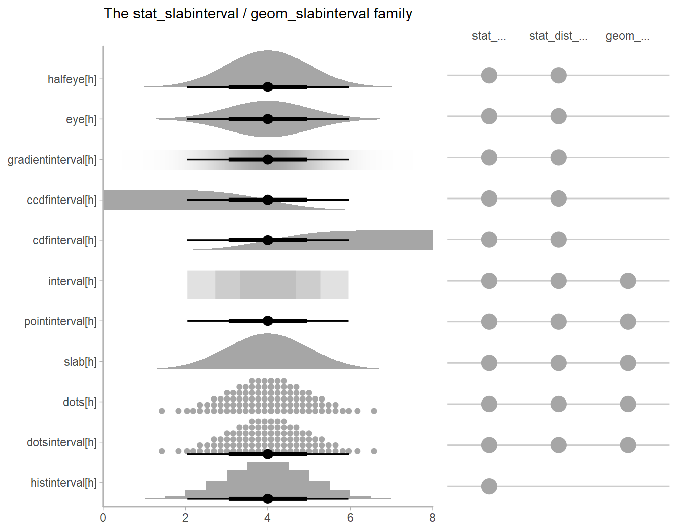
E.g., given a sampling distribution or a posterior, variations on densities or CDFs might be helpful for letting readers apply their own standard of evidence. Quantile dotplots (last two rows) combine this idea with the “frequency framing” approach to risk communication that also motivates things like icon arrays, used in medical risk communication. These are dotplots of quantiles from the distribution, allowing easier estimation of arbitrary intervals (down to the resolution of the dotplot).