A survival paradox I can't explain

Hi all.

I’m running a survival model (a cox regression) - on a large dataset of ~29,000 patients who have had a diagnosis, and we are monitoring their time to survival from this diagnosis.

This is real data, and unpublished, so I’m being slightly vague. There is a biomarker, B, that we have measured (often repeatedly) prior to the diagnosis, D, and therefore there are multiple potential approaches to defining this biomarker:

Most recent test prior to diagnosis, D (minimise B-D)
Maximal test result
Minimal test result
Mean test result

Here’s the distibution of B (all recorded tests - 350,000!)

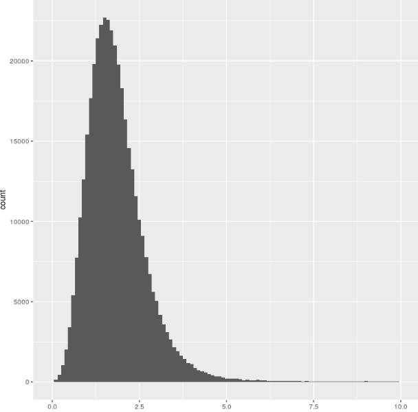
So, fairly normally distributed, and there isn’t a strong relationship to testing strategy:

The Cox regression result is pretty clear: there is a strong relationship between a low level of this biomarker and survival (HR 0.89, p<10^-30). This is born out by both testing strategies (A : minimum appoach, B: maximum approach - adjusted for relevant covariates using ggadjust - the unadjusted look similar but don’t work with cowplot/gridarrange!)

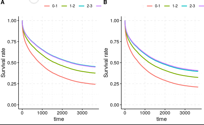
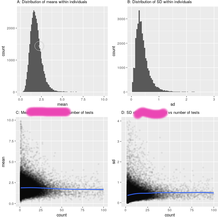
Now the relationship seems pretty robust to how we measure this Biomarker, and which strategy we take (left is minimum, right is maximum approach), despite the actual figures being quite different (mean B across the population 1.53 for the ‘minimum’ approach, 2.53 for the maximum approach).

To plot the curves above, i split the biomarker into 4 groups : <1, 1-2, 2-3, >3 (see the distribution above). This was simply to plot nearly. Unsuprisingly, changing the definition changed the composition of the groups (there were many more people who had a minimum B of less than 1, than those who had a maximum B of less than 1). However, the median survival did not budge

Look at the Kaplan-Meir fits here:

Maximum ever B:

Call: survfit(formula = Surv(censor_time, censor) ~ categorised_B, 
    data = df)

   1 observation deleted due to missingness 
                          n events median 0.95LCL 0.95UCL
categorised_B=0-1  1021    821    613     497     737
categorised_B=1-2 11112   7663   1182    1134    1237
categorised_B=2-3 11095   6547   1903    1806    2024
categorised_B=>3   5425   3202   1835    1714    1997

Minimum B:

> Call: survfit(formula = Surv(censor_time, censor) ~ categorised_B,
>     data = df)
> 
>    1 observation deleted due to missingness 
>                           n events median 0.95LCL 0.95UCL
> categorised_B=0-1  6937   5278    720     681     766
> categorised_B=1-2 15869   9874   1661    1587    1724
> categorised_B=2-3  4896   2568   3010    2733    3321
> categorised_B=>3    951    513   2794    2371    3334

I don’t get this. How come the median survivals are so similar - these are actually remarkably different groups? Am i overthinking this?

I would have thought (given that having a low B is bad), having a Max B less than 1 would be much worse than having a min B less than 1, as there is simply fluctuation around the mean.

Any thoughts (or explanations that this is not really interesting) useful - I am a clinician not a statistician!

Gus

Which medians exactly do you think don’t ‘budge’ very much? Because with the exception of the one for the first categories all other ones are 500 or more (days?) larger, which seems quite substantial to me?

I think your plots of the mean and SD values can give you some clues on what happens when you choose the one or the other strategy modelling strategy. Your plots represent within individual means and SDs (so I assume you calculated them from the different measurements within one individual). The mean of all the means is approximately around 2, while the mean SD is around 0.3-0.5. The measurements of most individuals will therefore range from around 1 to around 3. As a results, you expect a lot of people will have a minimum value in category 1 or 2 (<1) and a maximum value in category 3 (2-3) or more uncommonly even in 4 (>3).

This perfectly agrees with the data in your table. All individuals with a max in category 1 or 2, will by definition also be in these categories in the minimum value approach. A lot of people with a max in category 3 will end up in category 2 or even 1, while similarly individuals from max category 4 (especially those close to the cut-off of >3) will also end up in a lower category in the minimum approach. The people that have a minimum value in category 3 or 4 are either those with structurally higher concentrations with little variation or those with really high concentrations of your biomarker. As you indicate lower concentrations of this biomarker are associated with poorer survival/higher risk of diagnoses, the median survival times seem to align with this? Survival times are substantially higher in the individuals with structurally higher concentrations (i.e. with minimum values in the higher categories).

2 Likes

Thanks so much - really helpful.

I think I was really focussing on the lower group - it just seemed unusual. I agree with your explanation - and thank you for your time. I almost thought it was some variant of Simpsons paradox, but as always, the explanation is not looking properly at the data and being an idiot!

Thanks again.

1 Like

So this is not an answer to your question but another question has come to mind in reading your post.

When you are modelling minimum or maximal values of your biomarker, these are presumably occurring at different times in the follow up of a given individual. So I’m wondering, are these biomarkers measured before the follow-up time in the above graphs ?

Yes, I filtered all results after the diagnosis. That’s not to say those values aren’t interesting, but they weren’t what I was interested in.

1 Like

Aha ok got you. Sounds like you might find joint longitudinal and time to event models useful for this data:

3 Likes

Ah, that looks absolutely fantastic!

Yes, that sounds very appropriate. We are looking at extracting various variables from EHR data and looking at their impact; and most markers are measured on multiple occasions before the event of interest. This looks very, very useful.

Thanks for the link.
Gus

1 Like

The y-axis label (“Survival Rate”) is not correct.

1 Like

A couple of questions & thoughts about which biomarker measurement you should/could use.
Q1: In healthy people do biomarker concentrations change in time? (or over the typical time period you have measured them).
Q2: Is the disease chronic or acute?

I ask Q1 because if the answer is “no” then the differences in an individual may be due to the assay precision (do you know the CV of the assay?). In such cases I would use the mean of the repeat measurements.
I ask Q2 because if it is acute then mean of measurements makes sense. The biological explanation is then “In persons with an acute event D & low B there is increased survival”. However, it is chronic and there is biological plausibility for B to be related to D then I would suggest comparing the results for the most recent measurement of B with the earliest measurement of B. This may help to see if you can determine when B becomes a marker of survival prior to diagnosis.
All the best - biomarkers are fun!

Thanks for your interest.

Q1 - yes, they do change over time (it’s a component of a routine blood test)

The CV of the assay is pretty reasonable, but yes, that could account for some of the variation, although I imagine much of it is physiolgical.
Thanks for the idea, I think mean is reasonable too!

Q2 - disease is acute

Really helpful comments, and much appreciated. You have improved the work significantly, and made me feel more confident in the statistical process.

Gus

1 Like