There are several objectives I hope to address in this new topic. Happy to add more if others are interested.
- Discuss the actual procedure for creating a calibration curve for external validation
- Discuss a potential alternative to the traditional calibration curve
- Discuss a Bayesian application of calibration curves
Objective 1. Discuss the actual procedure for creating a calibration curve for external validation
Although it is likely trivial to most, I have had difficulty in understanding what is the best practice for generating the model that is used for calibration curves. Take this specific example of a risk model predicting a binary outcome that I hope to externally validate. Philosophically, I believe there seems to be several levels of calibration that can occur 1) did they select the right predictors? 2) are the regression parameters correct? (I suspect this is highly dependent on the thresholds selected in this case, but that’s another discussion) and 3) does the model, as presented, predict outcomes in an external population? For this post, let’s focus on 3 as the other two are topics in themselves.
My question then is what parameters should be used in the model?
I see three options: 1) A new model can be generated using the thresholds recommended in the original study, therefore producing new regression parameters. These parameters can be investigated as discussed here to determine if the differences are due to case-mix, different predictor effects, or overfitting. 2) The parameters from the original study can be used to generate linear predictors in a new population. This is referred to as model transportability here but depends on the authors reporting all regression parameters. 3) The final option I see is to calculate the risk score, as recommended in the original study, then enter it alone as a numeric variable in the model. This last option seems to rest on the (large) assumption that the above are correct.
I see different applications for the above 3 options but would value feedback on my thinking. For option 1, this allows for the exploration of “true” predictor effects (if there are in fact true effects) but will look better on calibration as you are fitting the model to your new study population. Option 2 allows for exploration of transportability of the model, but depends on there being a similar case-mix (especially if you use the original studies intercept), similar predictor effects, and no overfitting. Option 3 seems useful to me if you are examining the measurement properties of the score in actual clinical practice (i.e if I calculate the score as reported, how will it work with my patients), and perhaps for looking at predicting new outcomes, but depends on proper internal and validation of the model itself.
Objective 2. Discuss a potential alternative to the traditional calibration curve
Although the traditional calibration curve, with observed probabilities on the y-axis and predicted probabilities on the x-axis and the 45 degree line representing ideal calibration, provides a significant amount of information to researchers about the calibration of their model, I think it provides less information to clinicians hoping to apply the model in practice. For clinicians, I think the style of calibration plot presented here where the risk score is on the x-axis probabilities on the y-axis and two lines representing predicted and observed are presented. Here is an example using the study I link to above.
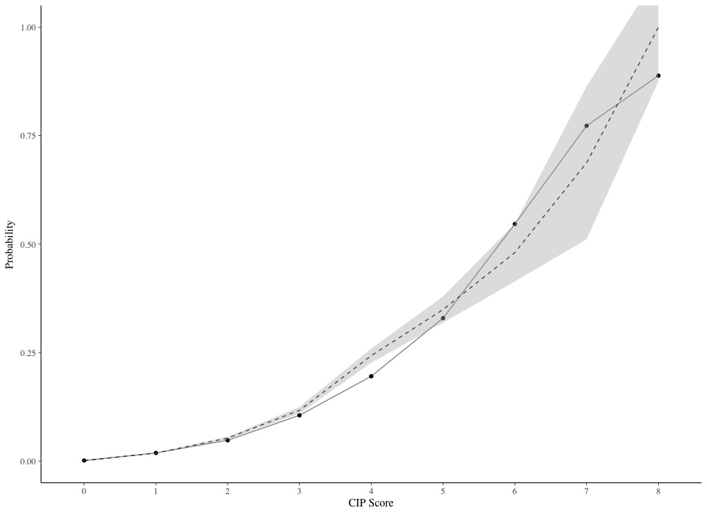
This style of plot allows clinicians to extrapolate to their patient (based on the calculated score).
My approach so far has been to present both styles of plots, but are there limitations of doing so?
Objective 3. Discuss a Bayesian application of calibration curves
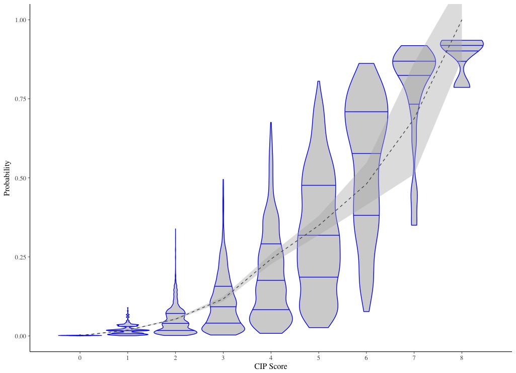
One of the limitations of using a frequentist approach to calibration i’ve noticed is by presenting “mean” calibration, or calibration-in-the-large, the distribution of predicted probabilities is lost. Specifically looking at risk scores, I wonder how much variation in predicted probabilities exists for patients with the same score. One way to explore this is by looking at discrimination measures like the C statistic, as this will give you an idea of how much overlap there are when rank-ordering patients by their predicted probabilities, but these measures have limited power and only represent the ranking. Another way to present this information visually might be using density plots.
Here is an example I created for the study linked to above, where the dotted line indicates observed probabilities and 95% CI, and the density plots indicate the distribution of predicted probabilities with quartiles indicated by the lines. To me this plot shows considerable overlap in predicted probabilities despite good discrimination (C = 0.855), but this could also just represent poor prediction from the parameters.
Taking this thinking a step further, I thought the use of Bayesian modelling may help to explore the calibration better. One could create a binomial model, with the same predictors and same outcome, then use the density plots to show the Bayesian posterior distribution of predictions with credible intervals. Patients could be group by their calculated score. The observed proportion could be shown with a dotted line, similar to how I show it here.
Thoughts on potential limitations on the described Bayesian approach to generating calibration curves?