Hi! I need to ask about calibration again. I created the LR model and did a calibration plot on the test data (n=49). Below are two variants:
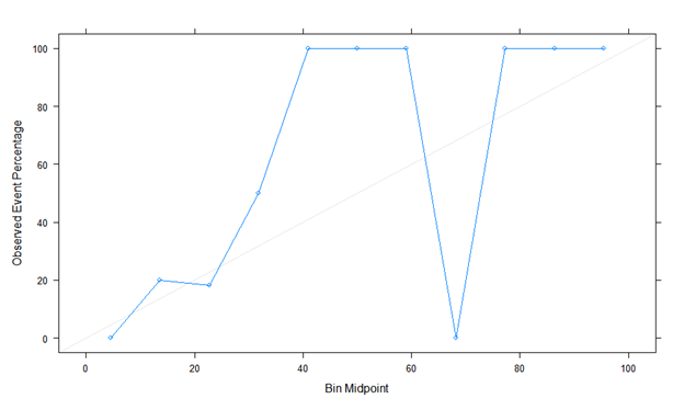
Here is the first calibration plot using Caret. Looks like a true story!

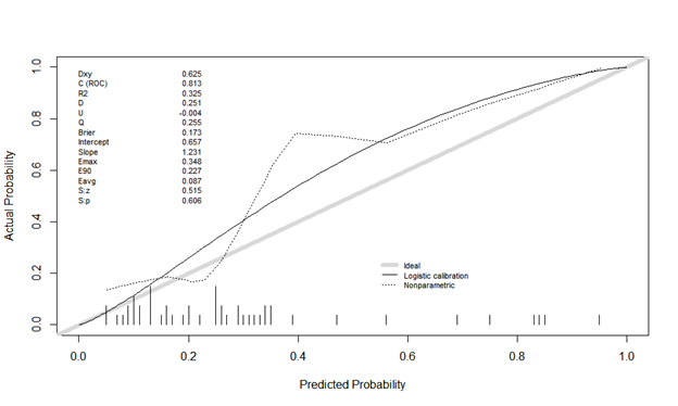
The second is calibration plot using Rms, val.prob (predicted probability, class). The actual probability is odd, and it looks different. Is there something I’m doing wrong?

Please post this as a reply at the end of RMS Describing, Resampling, Validating, and Simplifying the Model and I’ll remove it here. Note that binning is not valid in this context so re-do your own calibration curve without binning before posting. If you are unable to do this, re-post it as-is.
1 Like