While downloading all cause deaths (ACD) data from https://data.cdc.gov/NCHS/Provisional-COVID-19-Death-Counts-by-Week-Ending-D/r8kw-7aab , I noticed that data related to the end of a given week varies substantially from one date (asofDate) to the next. Since early on in the COVID-19 pandemic in the US, I have appended multiple asofDate instance of all cause death data to earlier asofDate instances.The series has now accumulated all cause death counts at asofDates for the same end of week date. Though a very limited set of data, these data show patterns of reporting lags that may bias predictions of all cause deaths based on recent data. Incomplete reports of recent versions of the end week all cause death reports make it appear that counts are decreasing relative to more complete reports of end week counts.
I have uploaded a recent version of State of Florida ACD data to github: https://github.com/SWHermansen/ACDReportingLags/blob/master/ACDReportingLagsFL.csv
My little pro bono project has as its eventual purpose county-level models of reporting lags that will help health departments to identify regional Covid19 hot-spots at earlier and act quicker. A predictive model of State of Florida ACD shows, for instance, ACD numbers in June 2020 surpassing ACD numbers during January 2018 the the height of a flu epidemic.
A SAS® program script orders the end week asofDate ACD counts from Florida by the lag in the number of days from the end week to the report asofDate:
/* ACDlags.sas program 20200726 SWH Capture observed lags in provisional COVID all cause deaths data /
/ https://data.cdc.gov/NCHS/Provisional-COVID-19-Death-Counts-by-Week-Ending-D/r8kw-7aab /
/ Read data from csv source saved as xlsx workbook or read directly from csv file */
libname allCause xlsx “./ACDReportingLagsFL.xlsx”;
proc sql;
/*
create table USA as
select * from allCause.USA
;
/
create table Florida as
select * from allCause.Florida
;
quit;
proc sql;
create table weeks as
select weekend as endWeek,asofdate,COVID_19Deaths,AllcauseDeaths,PercentExpectedDeaths,PneumoniaDeaths,InfluenzaDeaths
from Florida
order by endWeek descending,asofdate descending
;
quit;
/List days into a frame and join endWeek reports and asofDates to frame. /
data daysList;
do i = 1 to 184 ;
day = mdy(3,27,2020) + i;
output;
end;
format day mmddyy10. ;
run;
proc sql;
create table daysObs as
select i as index,day,endWeek,asofDate,asofDate - endWeek as lag,allCauseDeaths,PercentExpectedDeaths
from daysList as r1
left join
weeks as r2
on r1.day = r2.endWeek
order by day,asofDAte
;
quit;
/ Group by lag of reporting data for endWeek as of date. /
proc sql;
create table daysRecalled as
select distinct index,day,endWeek,asofDate,asofDate - endWeek as lag,log(calculated lag) as lnlag,
allCauseDeaths,PercentExpectedDeaths,propMax
from (select 1 - ((max(allCauseDeaths) - allCauseDeaths)/max(allCauseDeaths)) as propMax,
from daysObs where NOT endWeek IS NULL group by endWeek)
where lag > 3 OR propMax between 90 and 99.9
group by endWeek having min(abs(0.975) - propMax) and count() > 2
order by lag,endWeek,asofDate,propMax,allCauseDeaths
;
quit;
/ Adapted from examples of SAS EFFECT statments (in lieu of Frank Harrell’s %RCSPLINE macro) as posted by Rick Wicklin on blogs.sas.com . /
/ Fit data by using restricted cubic splines.
The EFFECT statement is supported by many procedures: GLIMMIX, GLMSELECT, LOGISTIC, PHREG, … /
title “Restricted TPF Splines”;
title2 “Four Internal Knots”;
proc glmselect data=daysRecalled outdesign(addinputvars fullmodel)=Splines; / data set contains spline effects /
effect spl = spline(lag / details / define spline effects /
naturalcubic basis=tpf(noint) / natural cubic splines, omit constant effect /
knotmethod=equal(4)); / 4 evenly spaced interior knots /
model propMax = spl / selection=none; / fit model by using spline effects /
ods select ParameterEstimates SplineKnots;
ods output ParameterEstimates=PE;
run;
quit;
proc sgplot data=Splines;
series x=lag y=Intercept / curvelabel;
series x=lag y=spl_1 / curvelabel;
series x=lag y=spl_2 / curvelabel;
series x=lag y=spl_3 / curvelabel;
yaxis label=“Spline Effect”;
run;
quit;
/ fit data by using restricted cubic splines using SAS/STAT 15.1 (SAS 9.4M6) /
ods select ANOVA ParameterEstimates SplineKnots;
proc glmselect data=daysRecalled;
effect spl = spline(lag/ details naturalcubic basis=tpf(noint)
knotmethod=percentilelist(5 27.5 50 72.5 95)); / new in SAS/STAT 15.1 (SAS 9.4M6) /
model propMax = spl / selection=none; / fit model by using spline effects /
output out=SplineOut predicted=Fit; / output predicted values */
quit;
title “Restricted Cubic Spline Regression”;
title2 “Five Knots Placed at Percentiles”;
proc sgplot data=SplineOut noautolegend;
scatter x=lag y=propMax;
series x=lag y=Fit / lineattrs=(thickness=3 color=red);
xaxis type=log;
refline 5 27.5 50 72.5 95 / axis=x lineattrs=(thickness=2 color=lightblue pattern=dash) label ;
run;
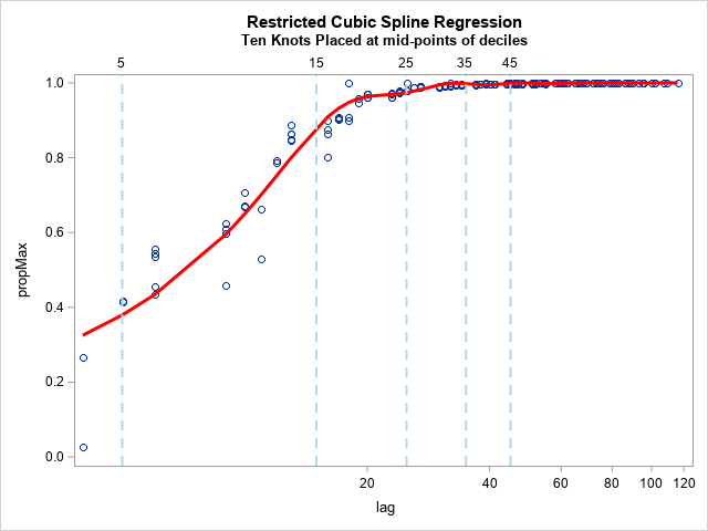
/* fit data by using restricted cubic splines using SAS/STAT 15.1 (SAS 9.4M6) /
ods select ANOVA ParameterEstimates SplineKnots;
proc glmselect data=daysRecalled;
effect spl = spline(lag/ details naturalcubic basis=tpf(noint)
knotmethod=percentilelist(5 15 25 35 45 55 65 75 85 95)); / new in SAS/STAT 15.1 (SAS 9.4M6) /
model propMax = spl / selection=none; / fit model by using spline effects /
output out=SplineOut predicted=Fit; / output predicted values */
quit;
title “Restricted Cubic Spline Regression”;
title2 “Ten Knots Placed at mid-points of deciles”;
proc sgplot data=SplineOut noautolegend;
scatter x=lag y=propMax;
series x=lag y=Fit / lineattrs=(thickness=3 color=red);
xaxis type=log;
refline 5 15 25 35 45 / axis=x lineattrs=(thickness=2 color=lightblue pattern=dash)
label;
run;
libname allCause;
The program generates graphs of the increases in end week ACD counts by lags in days to the time of an asofDate report. As expected the counts increase rapidly during the first two weeks after the end week date.
My questions have to do with the number and timing of the knots in cubic splines used to fit the predictive models, and with an R implementation that may have a wider audience. Fitting to the model to the standard quantiles
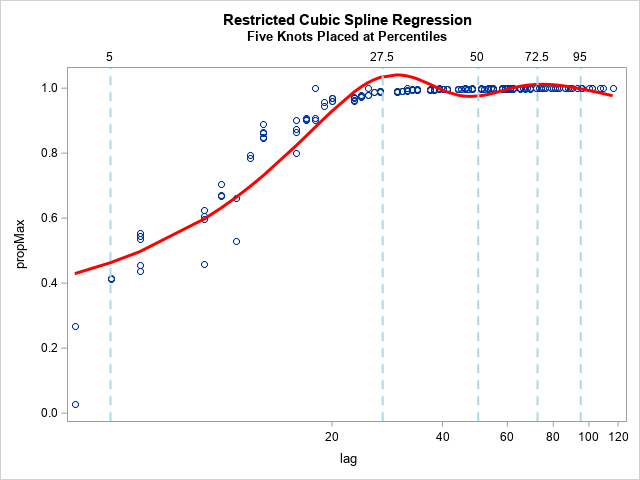
looks wierd.
Fitting to the deprecatded Hosmer-Lemeshow deciles looks better:
Where do I go from here?