Journal graphics

Graphical depictions of raw data and data summaries as well as graphical displays of results of statistical analyses are important components of published articles. The single best reference for scientific graphics is Bill Cleveland’s classic text The Elements of Graphing Data. Handouts covering some of the methods in this book may be found here and an excellent video by Rauser is here. Other resources may be found in Section 4.3 of BBR, here and here.

Many standard static graphics are very suitable for inclusion in journal articles. These include

  • scatterplots
  • line charts
  • Bill Cleveland’s dot charts (see also here)
  • box plots

Though very commonly used, bar charts are no longer recommended, for many reasons including

  • devoting space to bar widths, while conveying no data information, restricts the number of categories that may be displayed
  • Cleveland and colleagues have demonstrated that accuracy of lookup is better for dot charts
  • multi-panel dot charts allow more data dimensions to be depicted
  • categorical labels are easier to read in dot charts
  • multiple dots can appear on one horizontal line whereas stacked bar charts depicting the same thing are confusing and side-by-side bars take up too much space

Enhancing Scatterplots and Line Graphs

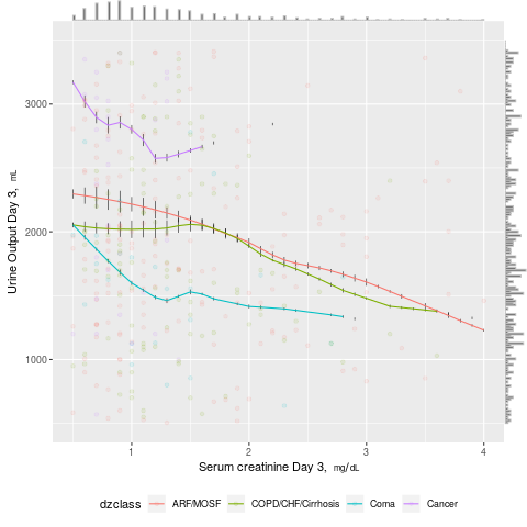
Standard graphics such as scatter and line plots can be enhanced to show more information. Marginal distributions of x- and y-variables can be shown in the margins as rug plots or high-resolution histograms. When more than one curve is shown in the plot, raw distributions of the x-variable specific to each curve may be overlaid onto curves using rug plots or spike histograms. In the following example, a scatterplot of daily urine output vs. serum creatinine for critically ill adults from the SUPPORT study is shown, with four disease classes indicated by colors. Smooth nonparametric curves stratified by disease class are added. Marginal distributions of urine output and creatinine are shown in the margins, and distributions of raw data for creatinine stratified by disease class are shown as spike histograms on each of the four smooth curves.

require(rms)
require(ggExtra)
getHdata(support)
support <- upData(support,
                  units=c(crea='mg/dL', urine='mL'))
# See https://stackoverflow.com/questions/8545035/scatterplot-with-marginal-histograms-in-ggplot2

p <- ggplot(support, aes(x=crea, y=urine, color=dzclass)) +
         histSpikeg(urine ~ crea + dzclass, data=support, lowess=TRUE,
         nint=200, frac=function(f) 0.001 + 0.01 * f/max(f)) +
         geom_point(alpha=.1) +
         xlab(label(support$crea, plot=TRUE)) +
         ylab(label(support$urine, plot=TRUE)) +
         xlim(.5, 4) + ylim(500, 3500) +
         theme(legend.position='bottom')
ggMarginal(p, 
           type='histogram', bins=200, size=20, weight=1.001,
           color=I('gray'))

linehist

:new: For line graphs, including step functions, an effective way to distinguish curves in published articles is to use thin black lines and thick grayscale lines. Curves can even intertwine and still be distinguished. See for example Figure 1 of this.

Empirical Cumulative Distribution Functions

ECDFs are wonderful whole-distribution summaries that do not involve binning. When the number of groups is less than, say, 5, one can show stratified ECDFs on one graph. Examples of ECDFs are in BBR Section 4.3. When there are more categories, box plots, which are “skinny”, are typically used instead.

Box Plots

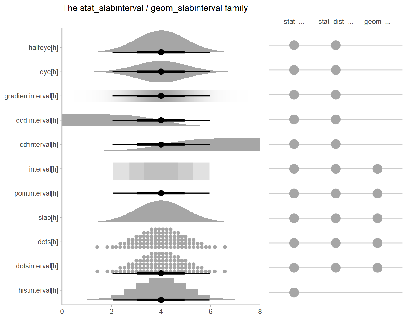
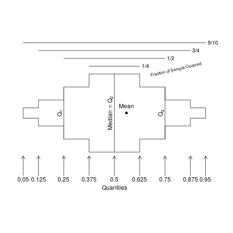
John Tukey’s box plots are widely used for displaying characteristics of truly continuous variables, and for good reason. One can show box plots stratified by a categorical variable having a large number of categories. Box plots show the three quartiles and the mean, plus “outer values” which can be confusing to some, making the reader falsely judge the outer values as “outliers” to be mistrusted. Most readers concentrate on the quartiles. To only show 3-4 statistical quantities means that box plots have a somewhat high ink-to-information ratio. They also fail to reveal data features such as bimodality and digit preference.

Extended box plots show more information, as seen in the schematic below.

require(Hmisc)
bpplt()

eboxproto

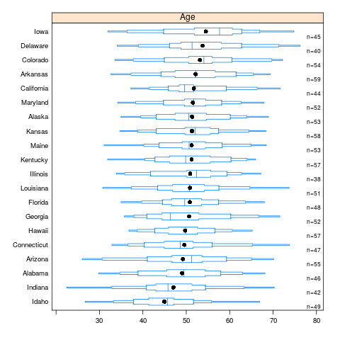
Here is an example of extended box plots stratified by U.S. state. States are sorted by the mean age of simulated subjects from that state.

n <- 1000
set.seed(2)
age <- 50 + 12*rnorm(n)
label(age) <- "Age"
state <- factor(sample(state.name[1:20], n, TRUE))
mage <- tapply(age, state, mean)
state <- factor(state, levels=names(sort(mage)))
bpplotM(age ~ state)    # in Hmisc
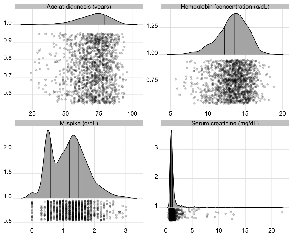
ebox

Spike Histograms

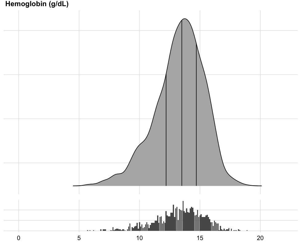
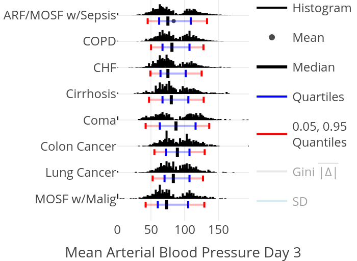
To show the full data distribution (like ECDFs but not smooth), high-resolution (lots of bins) histograms are very useful. Spike histograms use needles instead of boxes after binning the data into 100-200 bins (or fewer if the number of distinct data values is < 100). They make bimodality and digit preference apparent. One can add selected quantiles underneath the spike histogram, shown as tick marks on an axis, and the mean can also be shown. When using interactive graphics (see below) one can hover over a spike with the mouse and see the x-coordinate and frequency of values for that bin. An example taken from here is below. Note the bimodality of blood pressure distributions, due to the protocol for data collection (record the most extreme blood pressure measured during the patient’s day in the ICU, either low or high).

Confidence Intervals for Differences

In a parallel group randomized clinical trial, the patients in one treatment group are not a random sample of the population of patients, so confidence intervals for within-treatment measures are at odds with the experimental design. Such clinical trials are designed to make inference about differences in outcomes between treatments. Yet many papers published in the medical literature only provide the within-treatment-group confidence intervals.

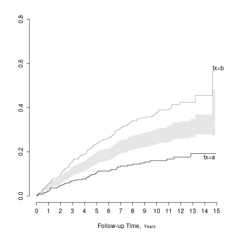
A general solution is to show the two point estimates and to add a separate panel to show the difference in the two point estimates along with the confidence interval for that difference. When two groups are being compared and the confidence intervals are symmetric about the point estimates, there is a simple solution that does not require using extra space. Draw the half-width of the confidence interval for the difference, centered at the midpoint of the two treatment point estimates. The resulting interval has the property that it touches the two point estimates if and only if there is no “significant” difference between the groups at the \alpha level, when the confidence interval has coverage 1 - \alpha. The following example shows a confidence band for the difference in two Kaplan-Meier cumulative incidence estimates.

require(rms)
# Simulate data from a population model in which there is a treatment effect
n <- 1000
set.seed(731)
tx <- factor(sample(c('a','b'), n, TRUE))
cens <- 15*runif(n)
h <- .02*exp(.8*(tx=='b'))
dt <- -log(runif(n)) / h
label(dt) <- 'Follow-up Time'
e <- ifelse(dt <= cens,1,0)
dt <- pmin(dt, cens)
units(dt) <- "Year"
dd <- datadist(tx)
options(datadist='dd')
S <- Surv(dt, e)
f <- npsurv(S ~ tx)
# Show half-width of confidence intervals centered
# at average of two survival estimates
survplot(f, fun=function(y) 1 - y, conf='diffbands')

survdiffci

Interactive Graphics for Online Supplements

Online journal article supplements can be of any length and format. Instead of using pdf format, one can use for example RMarkdown to produce an html report that contains interactive htmlwidgets created, for example, using javascript plotly graphics. Two of the many features that such content makes possible are

  1. the ability to show or hide extra “traces”. For example with stratified spike histograms, one may turn off or turn on the display of quantiles and the mean.
  2. the ability to hover with the mouse and see more information, such as numerical summaries (n, mean, SD, frequency count, number of missing values, etc.). A very effective use of this for survival curves is showing the number of subjects at risk wherever the mouse is currently pointing, as shown here.

:new: See this for several examples of interactive graphics useful in biomedical research. Here is an example of an interactive attribute chart showing all combinations of symptoms that occurred in patients. This could also be used to show reasons for exclusions of patients before randomization in an RCT.


This topic is a wiki meaning those with sufficient datamethods privileges can edit this top article to make it better. Also feel free to add your suggestions, examples, and criticisms as replies below.

12 Likes

Wonderful topic! I have some suggestions particularly with respect to uncertainty visualization. There are many nice possible replacements for uncertainty intervals that fit into a similar space while giving more information (and visually demonstrating that the choice of alpha for a particular interval may be arbitrary, or allowing a reader to apply their own threshold). The tidybayes article on slab+interval geoms (full disclosure: I am the author) outlines a number of those possibilities:

E.g., given a sampling distribution or a posterior, variations on densities or CDFs might be helpful for letting readers apply their own standard of evidence. Quantile dotplots (last two rows) combine this idea with the “frequency framing” approach to risk communication that also motivates things like icon arrays, used in medical risk communication. These are dotplots of quantiles from the distribution, allowing easier estimation of arbitrary intervals (down to the resolution of the dotplot).

8 Likes

Improvements can also be made on uncertainty bands in regression fits, for example this chart (from here):

The top chart shows spaghetti plots of the uncertainty in the conditional mean using draws from a posterior distribution (which also shows correlation in the mean across values of mpg, not visible when summarized using intervals), and the lower chart shows multiple uncertainty bands per line instead of just one (again, to facilitate readers applying their own threshold).

7 Likes

A bit biased here… but I think P-value functions for main effects may be more useful than graphing 95% interval estimates

Relatively simple to graph with the concurve R package

6 Likes

i would just note that sas graphs have improved a lot with annotate and sgplot etc, and there’s a free ebook here which includes medical data (chapter 4): http://support.sas.com/publishing/vds.pdf, the author’s sas code is available here: https://support.sas.com/en/books/authors/sanjay-matange.html

2 Likes

I know that SAS graphics have improved a lot, but my own personal opinion is that graphics in other packages has improved faster. And with R you can easily convert many of the graphics to be interactive.

4 Likes

is “interactive” good with all the reproducibility talk? one good thing about sas is it reproduces the same figure exactly - any adjustments are within the code and not made after the image is created. I want to get back into matlab, i think it feels like R + great graphics, although i don’t know R well…

I like this short <5min read on violin plots from https://twitter.com/kathmwood: https://inattentionalcoffee.wordpress.com/2017/02/14/data-in-the-raw-violin-plots/

1 Like

Definitely, since I’m really referring to partial interactivity, e.g. drill down to see more information. And one of our hotshot R developers showed me how to create an RMarkdown html report that has a click box in it that allows the user to view printable static graphs vs. semi-interactive graphs when the statistician has dual code chunks to handle the two tasks (e.g., one chunk calling ggplot and the other calling plotly).

1 Like

wow great discussion.
where can I find the code for the spike histogram in the eg
thanks

Click on the link just above the plot, and look for spike histograms in that document. Then click on Code there to see the code. That particular graphic used plotly to produce an interactive graphic, which uses javascript and html after calling from R.

1 Like

A problem with violin plots is their resemblance with a certain body part:

(Someone else made a point about it before XKCD, but I couldn’t find it right now.)

Half-eye plots or joy plots don’t have this issue.

1 Like

I dream to replace the infamous “Table 1.” with better visualizations…
Toying with the ggridges functions:

```R
library(survival)
library(tidyverse)
library(ggridges)
mgus2 %>% 
  pivot_longer(names_to="cont_var",values_to="value",-c(id,sex,dxyr,ptime,pstat,futime,death)) %>% 
  mutate(y=1,
         cont_var=(recode(cont_var,
         age="Age at diagnosis",
         creat="Serum creatinine",
         hgb="Hemoglobin concentration",
         mspike="M-spike (g/dL)"))) %>% 
  ggplot(aes(x = value,y=y)) +
  geom_density_ridges(
    jittered_points = TRUE,
    position = position_points_jitter(width = 0.05, height = 0),
    point_shape = '|', point_size = 3, point_alpha = 1, alpha = 0.7,
  )+
  stat_density_ridges(
      geom = "density_ridges_gradient", calc_ecdf = TRUE,
      quantiles = 4, quantile_lines = TRUE
    )+
  theme_ridges()+
  theme(axis.title=element_blank(),axis.title.y=element_blank())+
  facet_wrap(~cont_var,scales="free",ncol=1)


Using dots instead of the jittered lines:

mgus2 %>% 
  pivot_longer(names_to="cont_var",values_to="value",-c(id,sex,dxyr,ptime,pstat,futime,death)) %>% 
  mutate(y=1,
         cont_var=(recode(cont_var,
                          age="Age at diagnosis (years)",
                          creat="Serum creatinine (mg/dL)",
                          hgb="Hemoglobin (concentration (g/dL)",
                          mspike="M-spike (g/dL)"))) %>% 
  ggplot(aes(x = value,y=y)) +
  geom_density_ridges(
    jittered_points = TRUE,
    position = "raincloud",
    point_alpha = 0.2,
    alpha = 0.2,
    scale=0.9
  )+
  stat_density_ridges(
    geom = "density_ridges_gradient", calc_ecdf = TRUE,
    quantiles = 4, quantile_lines = TRUE
  )+
  theme_ridges()+
  theme(axis.title=element_blank(),axis.title.y=element_blank())+
  facet_wrap(~cont_var,scales="free",ncol=2,nrow=2)


Adding histograms:

mgus2 %>% 
  #  summarize_at(vars(var),median,na.rm=TRUE)
  ggplot(aes(x = hgb,y=y)) +
  geom_density_ridges(
#    jittered_points = TRUE,
#    position = "raincloud",
    point_alpha = 0.2,
    alpha = 0.2,
    scale=0.9
  )+
  stat_density_ridges(
    geom = "density_ridges_gradient", calc_ecdf = TRUE,
    quantiles = 4, quantile_lines = TRUE
  )+
  theme_ridges()+
  scale_x_continuous(limits = c(0,22))+
  theme(axis.title=element_blank(),
        axis.title.y=element_blank(),
        axis.text.x = element_blank(),
        axis.text.y = element_blank(),
        axis.line.x = element_blank(),
        axis.ticks.x = element_blank(),
        plot.margin=margin(margin(b=0))) -> p1

mgus2 %>% 
  #  summarize_at(vars(var),median,na.rm=TRUE)
  filter(!is.na(hgb)) %>% 
  ggplot(aes(x = hgb,y=y)) +
  geom_col()+
  theme_ridges()+
  theme(axis.title=element_blank(),
        axis.title.y=element_blank(),
        axis.text.y = element_blank(),
        axis.line.x = element_blank(),
        axis.ticks.x = element_blank())+
  scale_x_continuous(limits = c(0,22)) -> p2
ggarrange(p1,p2,ncol=1,nrow=2,heights = c(4, 1),align="v")


Comments and suggestions are appreciated :slight_smile:

1 Like

That’s really excellent. But we can show more: the relationship between each baseline variable and outcome. See this .

I don’t think jittering is the way to go as points get hidden in the dense region. I’d go with spike histograms as with the Hmisc histSpikeg function that works with ggplot2.

1 Like

Thanks for the comments Frank. I’m having troubles using your histSpikeg function. Ideally I would like to keep the dplyr pipe – almost – intact. See above some edits to my previous post.
Agree that showing association with outcomes very interesting!
I’m just keeping it simpler for the time being…

i guess people saw this paper recently re meta-analysis plots: Charting the landscape of graphical displays for meta-analysis and systematic reviews
although they don’t provide the code for the best plots, only figures 3-7, R code

2 Likes

I am not sure if it’s appropriate to ask this basic question here…
With the spike histogram on the curve in the example above (first graph), using histspikeg, what does the spike on the curve actually represent? I gather it should be representing the distribution of creatinine on the curve within some x range, but I can’t figure out what that means (e.g. what does the width of the vertical spike mean? what does the space between the spike mean… etc?).
Apologise if this is a very basic question, I am just not familiar with spike histograms and can’t seem to find an answer when googling it.
Thank you.

Spikes are used so that you don’t need to talk about the width. The width conveys no information. The height is proportional to the bin frequency just as with histograms in general. Just think about this as a regular histogram with very thin bars and lots of bins, to show the marginal distribution of the predictor.

Oh yes! I can see it on the graph now and how it is related to the rug plot at the top! Thank you!

I like the approach of plotting the confidence interval for the difference in survival curves as suggested by @f2harrell from Boers et al ( Journal of Clinical Epidemiology 57 (2004) 712–715). However, I wonder if this could be seen as performing multiple statistical tests.
There are also proposed tests to compare statistical differences in survival at fixed time points (Klein et al. Statist. Med. 2007; 26:4505–4519). What is your opinion/recommendations about providing the results of any of these tests at some relevant time points in addition to the 1/2 CI of the difference? Those could be useful for example when survival curves cross and avoid multiple comparisons…

1 Like