Hello. I want to ask how to picture a plot where the y axis represents the hazard ratio of death for a categorical varialbe (for example, chemotherapy or not), and the x axis represents the a continuous variable (for example, a risk score) using R.
Here is the plot I want to draw.
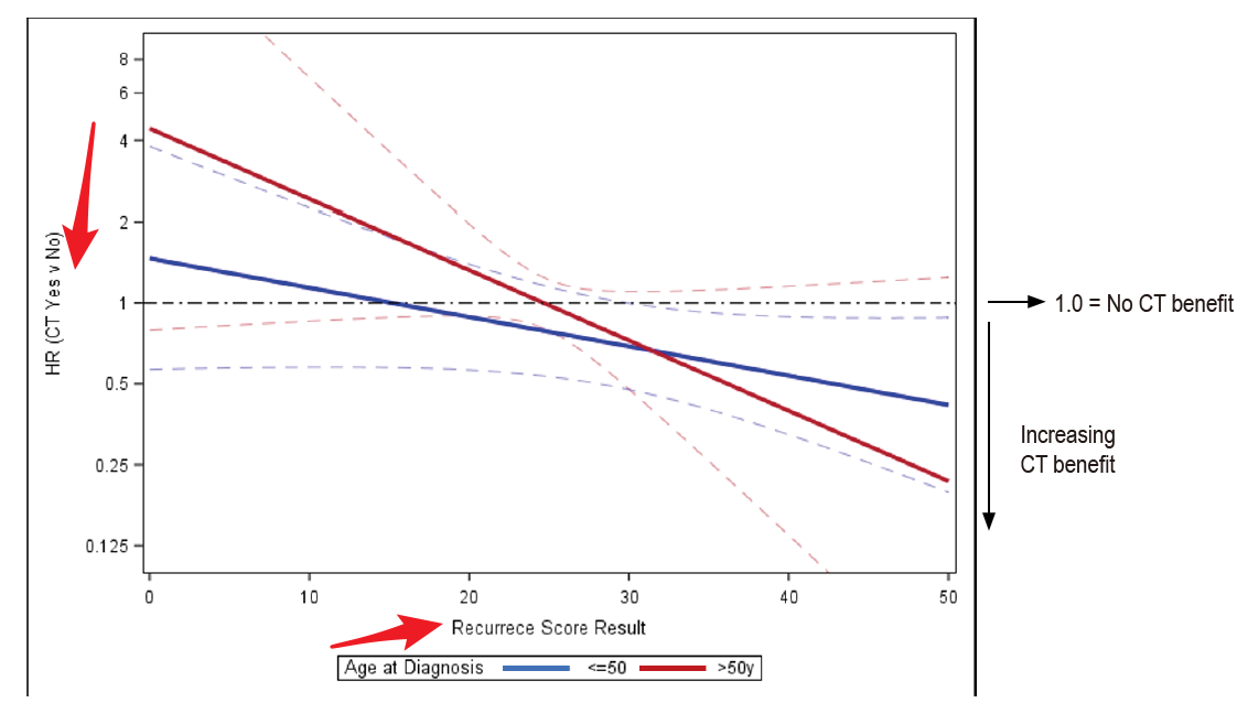
No, I think the question is how to actually create these plots and the plots in the post just serve as an example/illustration of what @Lin_Caijin wants to create. In a simple Cox model each variable is associated with a fixed hazard ratio, so what I think is visualized here is the interaction effects between the continuous (x-axis) variable and the categorical (y-axis) variable.
The authors describe here indeed that they fit a multivariable Cox model that includes treatment (y-axis variable), risk score (x-axis variable) and a interaction term between the both of them. If you want to create a similar plot for the analyses you are performing, you should start with fitting a similar model. You can then calculate the HR for the treatment at each value of the continous variable and plot them similarly to the examples above.
Not 100 % what you are looking for but this may be useful. Using the broom::augment() function on a model like so augment(model) allows you to pull out the predicted values for each observation in a model. This can be plotted against a continuous variable in your data very easily using ggplot2 or some other graphical package. This requires some familiarity with the tidyverse packages.
Also, Lamina et al. have published some methods for visualizing interactions with HRs on the y-axis and continuous variables on the x-axis where you may find some useful code.