Dear all,
I am working on some projects where the overarching goal is to assess whether a selection of machine learning algorithms perform better than “traditional” statistical methods such as logistic regression (with and without regularization) in terms of (binary) predictive performance, similar to this 2021 study by Austin, Harrell, and Steyerberg.
In my case, most relevant datasets range in sample size from ~500 to ~10 000 and the number of predictors from ~10 to ~50. I work with the Tidymodels meta-package and tune the models via Bayesian optimization. I use a nested resampling approach — k-fold cross-validation repeated n times for both the inner and outer loops (although possibly with different k and n for inner and outer) — to obtain estimates of predictive performance. For single value estimates, I can just populate a matrix and calculate an average, like so:
| log_loss | outer_repeat | outer_fold |
|---|---|---|
| 0.43 | 1 | 1 |
| 0.40 | 1 | 2 |
| 0.39 | 1 | 3 |
| … | n | k |
And then:
mean_log <- mean(c(0.43, 0.40, 0.39 ...))
But — and herein lies my main concern — I also want to plot some kind of averaged calibration curve. My current solution is that for each prediction on held-out data in the outer loop, I first get model predictions:
test_pred <- predict(final_mod_fit, data_test, type = "prob") %>%
        bind_cols(data_test) %>%
        rename(prob_yes = .pred_yes) %>%
        select(prob_yes, outcome) %>%
        mutate(outcome_num = ifelse(outcome == "yes", 1, 0))
test_pred looks like this:
| prob_yes | outcome | outcome_num |
|---|---|---|
| 0.03 | no | 0 |
| 0.45 | yes | 1 |
| 0.67 | yes | 1 |
| … | … | … |
Then I use stats::lowess to get the x and y coordinates of the smoothed calibration curve, with the predicted probabilities and observed outcomes in test_pred as input:
cal <- data.frame(with(test_pred, lowess(prob_yes, outcome_num, iter = 0)))
I thus get one cal dataframe for each k in each n. After some processing to merge them all, I get a dataframe structured like this:
| x | y | outer_repeat | outer_fold |
|---|---|---|---|
| 0.01 | 0.03 | 1 | 1 |
| 0.01 | 0.03 | 1 | 2 |
| 0.02 | 0.05 | 1 | 3 |
| … | … | n | k |
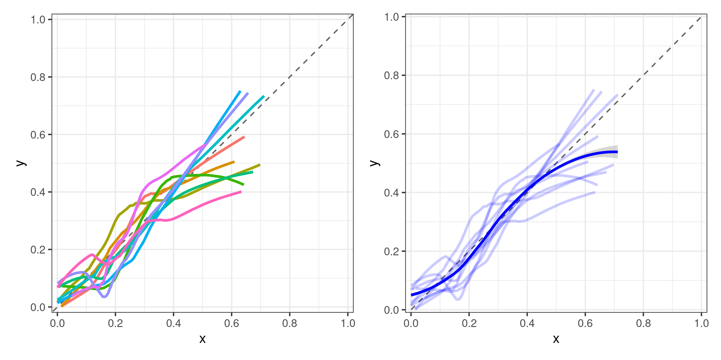
I can plot this with an interaction term of n and k for color, like so:
p1 <- ggplot(results, aes(x, y)) +
    geom_abline(slope = 1, linetype = "dashed", color = "#606060") +
    geom_line(aes(color = interaction(outer_fold:outer_repeat)), size = 1)
Now, finally, for the averaged calibration I just add a loess-smoothed curve:
p2 <- ggplot(results, aes(x, y)) +
    geom_abline(slope = 1, linetype = "dashed", color = "#606060") +
    geom_line(aes(color = interaction(outer_fold:outer_repeat)), size = 1) +
    geom_smooth(method = "loess")
The resulting plots (using a small example dataset) look like this:
My question boils down to whether this is a suitable approach?
My thinking is that with a large enough number of n repeats for the outer loop, just showing the averaged/smoothed curve for each model would suffice. Maybe also include the averaged GLM curve as a reference in order to compare it to ML algorithms. Still, I am very much open to suggestions if there are better approaches!
Finally, a bonus question:
The hyperparameter optimization stage takes a long time (~10+ hours for some models/datasets). What would you deem as an absolute minimum number of repeats of the outer loop? This will help determine if I can run this on a local workstation or if I need HPC resources.
If you’ve read this far, thank you!