Hi Prof Harrell,
What is your rationale for using a non-equally spaced y-axis in the rank hazard plot, and how do you address the concern that this may introduce visual distortion?
Many thanks in advance.
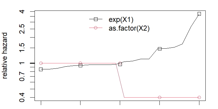
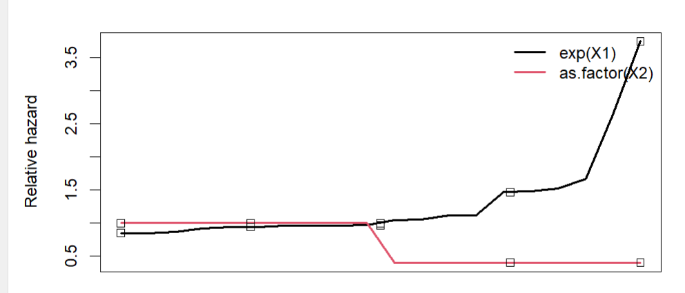
The two figures below are for comparison: one was generated using the rankhazardplot function, and the other was produced using my code with an equally spaced y-axis, based on the same underlying approach.
Relates to smoothed scaled Shoenfeld residuals plots which need to have x=time instead of x=Kaplan-Meier survival estimate to give meaningful hazard ratio plots vs. time. Discussed in the vignettes in the R survival package.
Thanks, but I’m still don’t understand how this relates to the non-equally spaced y-axis in the rank hazard plot(hazard ratio vs rank), and how that scaling give “meaningful hazard ratio plots vs time”.
If there are specific references (e.g., sections of the R survival package vignettes) that explain this connection, I’d be grateful if you could point me to them.
I expect that it is plotted on the log scale which is fairly standard for ratio measures
Thank you. I get it know, spacing is uniform in log-space, but not uniform in HR-space.
1 Like