RMS Case Study in Cox Regression

Regression Modeling Strategies: Case Study in Cox Regression

This is the 21st of several connected topics organized around chapters in Regression Modeling Strategies. The purposes of these topics are to introduce key concepts in the chapter and to provide a place for questions, answers, and discussion around the chapter’s topics.

Overview | Course Notes

Additional links

RMS21

Q&A From May 2021 Course

  1. What can you do if your data does not meet the proportional hazards assumption? Is there a regression model for time to event that does not assume proportional hazards? The RMS book has a section of things to do when PH doesn’t hold. My current favorite approach, which is better in a Bayesian context, is to generalize the model, e.g., add time-varying covariate effects.
  2. We discussed that continuous variable like age should not be categorized to use as a predictor in the model. However, for clinical reasons a physician might be interested in studying the effect of 4 specific age groups (pre-defined clinically) on a specific survival outcome. So, we use a categorization of age with 4 levels as a predictor in a Cox proportional hazards survival model. We plot the –ln(-lnSurvProb) vs ln(time), and the curves pertaining to the 4 age-group are fairly parallel among themselves, and the cox-snell residuals plot doesn’t show evidence of violation of the proportional hazard assumption. Under this setting, would it be ok to categorize age? Is there any other test that we can do to check whether using age as a categorical variable would be ok in this setting? Categorization of age is misleading and leads to invalid estimates with hidden age heterogeneity. Think about removing speeds from a speedometer on your car and labeling speed intervals as “slow, moderate, fast”.

Dear Professor,
my apologies if I am not posting in the right place.
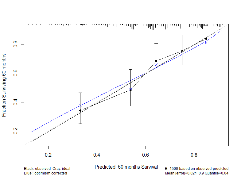
calibration_final
I am evaluating the performance of a model via validation and calibration following the example in the book. Yet, it is not clear to me what the blue x and the black dot refer to. The plot is obtained with the following code:
cal ← processMI(f, which = “calibrate”, nind=3)
plot(cal)
cal ← calibrate(f, B=50, u=12*5, maxdim=5, cmethod = “KM”, m=110, conf.int = FALSE)
plot(cal, add = T).

thank you very much for any suggestions

marco

cmethod=‘KM’ is obsolete. Use only the smooth calibration curve (unless perhaps you have N > 100,000). The preferred blue curve estimates the overfitting-corrected (i.e., likely future performance) of the model for predicting survival probabilities at 60m. So the blue curve is estimating out-of-sample calibration accuracy, smoothly.

Thank you very much for this advice!
Marco