many thanks. I believe this is the study i was searching for:
2 Likes
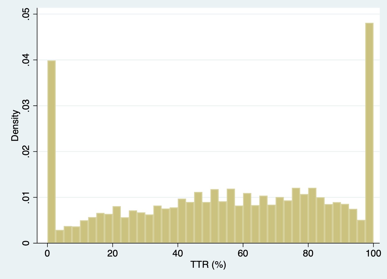
I am curious on folks’ thoughts surrounding use of restricted cubic splines for modeling an outcome such as time within therapeutic range. This is a measure ranging from 0% to 100%. In the project I am working on, there is a fair amount of information at the tails (0% and 100% TTR). See density plot below. If I modeled this variable using a RCS with 4 or 5 knots, do you all think it would behave appropriately? As a non-statistician I value everyone’s input. Thanks in advance.
Before answering that specific question, you mentioned that TTR is an outcome but splines are usually used on predictors. What’s the goal of your study? And note some possible deficiencies with TTR that might make going back to the raw data on which it is computed a better idea.
- observation periods can differ by patient
- summing over all times hides time trends in coagulation
- “therapeutic range” has not been fully validated and ignores important variation in coagulation parameters even when they stay on one side of the therapeutic range cutoff
Hi Frank, sorry for not being clearer about our research question. We are evaluating the association between time in therapeutic blood pressure range and clinical outcomes (cardiovascular & kidney) in a hypertensive population. The lead investigator initially broke TTR down into 6 categories of 0%, 100%, and quantiles. Thanks.
Sorry I thought TTR was used solely in anticoagulation therapy. Still the comments about TTR for hypertension control hiding longitudinal trends and stability holds. Having multiple baseline variables representing summaries in different time periods would be of interest. But to your immediate question, as long as you manually specify knot locations it should be very effective to use a restricted cubic spline for TTR. The large number of ties at TTR=0 and 1 mess up default knot location choices.
1 Like
What is the most efficient way to specify knot locations with the RMS package? I am used to allowing the package to choose for me [e.g. … rcs(TTR, 4)].
You can try the defaults and see if they make sense:
f <- fittingfunction(y ~ rcs(ttr, 5))
specs(f, long=TRUE)
Or specify your own locations: rcs(ttr, c(20, 30, 40, 50, ...)).
1 Like
The default for the y axis of the partial effects plot of an logistic regression model is log-odds. First, why was log odds the default option? Second, how can I change it to odds ratio for easier interpretability?
It is log odds because it is customary with most any regression model to show the linear predictor (X\hat{\beta}) scale. It is easy to convert this to the odds scale by specifying for example Predict(fit, fun=exp) but that is different from what you are requesting: odds ratios. To get an odds ratio you have to select a reference level of the predictor X, something that partial effect plots don’t require you to specify. It is harder to see what’s going on with reference levels when you have multiple predictors, so it’s best to take total control and to form contrasts, then pass these to your favorite plotting function as exemplified in the help file for contrast.rms. The contrast function is very general and handles any amount of nonlinearity or interaction that you happen to have put into the model. Once you get the contrasts you can anti-log them to get odds ratios, or look at the fun argument to contrast.
For example suppose that you wanted to get, for females, the odds ratios for age=x vs. age=30 for many values of x. You would do something like this to get a log scale:
k <- contrast(fit, list(sex='female', age=10:80), list(sex='female', age=30))
print(k, fun=exp)
# Plot odds ratios with pointwise 0.95 confidence bands using log scale
k <- as.data.frame(k[c('Contrast','Lower','Upper')])
ggplot(k, aes(x=10:80, y=exp(Contrast))) + geom_line() +
   geom_ribbon(aes(ymin=exp(Lower), ymax=exp(Upper)),
               alpha=0.15, linetype=0) +
   scale_y_continuous(trans='log10', n.breaks=10,
               minor_breaks=c(seq(0.1, 1, by=.1), seq(1, 10, by=.5))) +
  xlab('Age') + ylab('OR against age 30')
4 Likes
My principal investigator is interested if there is an optimal cutoff for weight in determining failure (yes/no) of surgical implant (ankle replacement).
My thinking is that I want to create a logistic regression for failure, with weight with knots, then look at the anova of the model. I’m getting that the nonlinear p value is not significant for weight-- do I just stop from there? What else can I do to investigate nonlinearity of weight? Nevertheless, when I ggplot the model with knots for weight albeit nonsignificant, I’m seeing a curve for the weight (a slight u shape), which suggests that the odds changes at a particular cutpoint.
1 Like
Don’t use statistical significance for model selection. Specify as many knots as your effective sample size will support, up to 5 or 6. Look at confidence bands for the estimated function. Don’t try to simplify it. No threshold exists.
1 Like
Greetings all. I would appreciate any and all advice you can give this R newbie. While evaluating missing information in my dataset, I want to look at what variables are related to missingness through logistic regression. I have used the following to create a variable for missing:
data_miss$missing_HTN ← is.na(data_miss$REC_HTN). This provides me with a false/true result.
When I then use that as the dependent variable in lrm: HTN_MISS_REG = lrm(missing_HTN ~ ., data=data_miss) I get an error: Error in fitter(X, Y, offset = offs, penalty.matrix = penalty.matrix, :
NA/NaN/Inf in foreign function call (arg 1).
If I convert the missingness variable to a 0/1 factor and re-run lrm I get the following error: Error in names(numy) ← ylevels : ‘names’ attribute [2] must be the same length as the vector [1]
Use lrm(is.na(x) ~ ..., data=). But your main problem is that ~ . can be a bit dangerous because it’s not clear what is in ..
Would it be preferred to individually list each item in the datafile separately in the model statement rather than using the “~.”?
It’s worth a try, and remember to not use $ inside a formula; use data=.
Expanding it to the following gives me the same “Error in fitter(X, Y, offset = offs, penalty.matrix = penalty.matrix, : NA/NaN/Inf in foreign function call (arg 1)”
HTN_MISS_REG = lrm(is.na(missing_HTN) ~ OUT_MALIG + Out_Death_1 + DON_AGE +
DON_HGT_CM + DON_WGT_KG + DON_CREAT + REC_HTN + CAN_GENDER +
REC_BMI + REC_MALIG + REC_ECMO + REC_IABP + REC_INOTROP +
REC_VENTILATOR + REC_CARDIAC_OUTPUT + REC_CREAT + REC_TOT_BILI +
REC_HR_ISCH + REC_AGE_AT_TX + CAN_TOT_ALBUMIN + TX_YEAR +
REC_DRUG_INDUCTION + REC_ABO + REC_ANGINA + HF_ETIOL +
REC_DM + REC_COPD + REC_PVD + CAN_SCD + DON_ABO1 +
DON_ANTI_CMV_POS + REC_CMV_IGG_POS + REC_EBV_STAT_POS +
REC_HBV_ANTIBODY_POS + REC_DR_MM_EQUIV_TX + REC_VAD +
REC_CLCR + REC_HIST_CIGARETTE + REC_HGT_CM + REC_WGT_KG,
data=data_miss, x=TRUE, y=TRUE)
Delete 5 variables at a time until it works. Then back up to find the culprit variable. But start by fixing your dependent variable: is.na(HTN) not is.na(missing_HTN) if the original variable is HTN.
2 Likes
Using is.na(HTN) fixed it. Thank you so much for the quick responses.
Greetings All, I am working with collaborators on developing a clinical prediction model and we are currently at the missing data stage. They prefer to use the MICE package (over the ‘aregimpute’ function) for multiple imputation due to it’s ability to visualize diagnostics such as density plots, convergence plots, etc. I’ve seen that the “diagnostics=TRUE” argument within aregimpute gives diagnostic plots showing imputed values for each variable per imputation. Are there other diagnostic options that align closer to those in MICE?
Thanks for everyone’s time. Cheers.
A general diagnostic that is probably not implemented in either package is described at the end of the missing data chapter of RMS. I would be pretty easy to implement for a particular application.