RMS Discussions

Dear professor,

I would like to hear your thoughts on how the 95% CI is calculated in the summary.rms function.

I noticed that the method used in summary.rms is similar to the formula: effect ± 1.96 * SE, which is the same as confint.default. However, this method differs from confint (profile likelihood method).

The summary.rms does not seem to provide a profile likelihood method or other methods.

I have been using confint and found that the output of rms is different. I want to ask if the effect ± 1.96 * SE method is sufficient most of the time and there is no need to consider other methods (such as the profile likelihood method of confint).

I wrote an R example to confirm the difference between the two methods.

require(rms)
set.seed(1)
options(datadist =  datadist(iris))
iris$x <-  sample(0:1, 150, replace = TRUE)

f <- glm(x ~ Sepal.Length,iris, family = binomial)
ff <- lrm(x ~ Sepal.Length,  iris)

confint(f)[2,1]
Waiting for profiling to be done…
[1] -0.4335911
confint.default(f)[2,1]
[1] -0.4307842
summary(ff, Sepal.Length = c(1,2))[1,4]- qnorm(0.975)*summary(ff, Sepal.Length = c(1,2))[1,5]
[1] -0.4307842

confint(f)[2,2]
Waiting for profiling to be done…
[1] 0.346351
confint.default(f)[2,2]
[1] 0.3451433
summary(ff, Sepal.Length = c(1,2))[1,4]+ qnorm(0.975)*summary(ff, Sepal.Length = c(1,2))[1,5]
[1] 0.3451433

Profile likelihood is much preferred. The problem with confint is that you are limited to simple linear variables or binary covariates. Version 7.0 of rms now supports general likelihood profile CIs using the contrast.rms function (but not with summary.rms). For a simple linear effect, for example where you want an interval for changing x from a to b use

require(rms)
dd <- datadist(d); options(datadist='dd')
f <- lrm(y ~ x + x2, data=d, x=TRUE, y=TRUE)
contrast(f, list(x=b), list(x=a), conf.type='profile')

Sometimes you may want to add plot_profile=TRUE. You’ll find that this syntax gets no more complicated with you add nonlinear terms or interactions.

The more I compare likelihood intervals with Wald intervals the more I think we need to get away from Wald intervals. The same goes for hypothesis tests.

2 Likes

Dear professor, is it possible to include frailty terms in rms::cph() function for Cox model?

I’ve seen that it can be used with coxph() but would like to use your rms function to use all the functionalities that are available in rms and HMisc packages which are extremely useful. If it’s not possible, what are the available options in R?

Thank you!

No sorry; need to use coxph.

Dear professor,

unfortunately, I haven’t been able to find documentation about the formula interface for the regression functions.

In base R, I have a model like this:

lm(dep_var ~ (var_1 : time_1) + I(var_2 / var_1), data = df)

Since I want to use rcs(), I tried to translate that formula to rms. However, the term I(var_2 / var_1) is ignored and (var_1 : time_1) throws an error.

Could you kindly point me to some resources covering this topic?

Thank you so much for your effort!

Sorry this is outside the scope of the rms package. You might try stackoverflow.com with a tag of r.

1 Like

Thank you for the response!

In that case, I will just hardcode the variables, thanks!

Hi

I am trying to touch up the output of the cox model predictors generated using ggplot(predict(f). I was hoping since it was ggplot I could pass it a theme and change the base font like a typical ggplot. I have tried the usual tricks but no luck.

The key things I want to change are the font and remove the gray background. I did notice if I do not do the full model it will take the theme_classic() argument. When I try to plot all variables no such luck.

Any ideas?

Note it’s Predict and not predict. I tried to design ggplot.Predict so that you could add to the plot but I didn’t do that in the best way. There is an argument that allows you to add a few things. If you will respond with the ggplot2 function calls you like to add to the ggplot() output produced by ggplot.Predict, I’d like to play around with it.

Thanks for the reply.

I tried to remove the gray background by using theme_classic(), this worked for an individual predictor but not when passing the full model. I get “NULL” printed to the console. The other thing I was trying to do was change the font to Times New Roman with theme(text = element_text(family = “serif”)). That did not work either.

Slightly different note is there a way to 1) control the font and 2) put a title on survplot outputs?

In upcoming rms 7.1 I’ve added a ggplot method for one of the survplot functions. For existing survplot using base methods you can always run functions like title after the plot and par before it. For your other question look at the addlayer argument to ggplot.Predict while I’m seeing if I can clean up the ggplot2 code within that function to make it more adaptable.

Update: In looking at the code we’ll need to make addlayer work.

2 Likes

Hi,

I’m getting two significantly different Dxy values from the model summary output and the validate() function for a log-logistic AFT model. In the model summary, the reported Dxy is 0.799, whereas the validate() function (with B = 300, or even B = 1000) gives Dxy values of index.orig = 0.3376 and index.corrected = 0.327 . Why is there such a large difference between these reported values (index.orig & the reported Dxy value under model summary)?

Many thanks,
M

Please provide the code.

Would this be sufficient?

Fitting a log normal AFT model: With interaction

aft_loglogistic ← psm(Surv(os, status) ~ var1(categorical) * var2(categorical) + var3(categorical) + var4(categorical) + rcs(age, 3) +
var5(categorical) + var6(categorical) + var7(categorical) + var8(categorical),
dist=‘loglogistic’, x= TRUE, y=TRUE,
data=full_data)

Model summary

aft_loglogistic

Model validation

set.seed(1000)
validate(aft_loglogistic, B=300, dxy=TRUE)

There are 859 events with 13 model dfs. (LR chi2 277.65, d.f. 13)

Thanks,
M

Dear Prof. Harrell,

After updating the rms package to the latest version, I re-ran the model (the current model has 13 degrees of freedom, compared to 11 in the original version). Now I get the below outputs for the model summary and for the validation. This is different to the previous one now.

Model summary

Validation

Shouldn’t the Dxy= 0.269 match with the validation() original sample Dxy value?

Cox model

When I fit a Cox model, the Dxy values from the model summary and the validate() function (Original Sample Dxy value) match. However, as you can see Dxy values from the two models under validate() function have quite similar results.


Thanks,
M

Thanks for the info. I’ll have to do some digging. If you have time to create a minimal example that fails that would help a bit.

Thanks. I’ve used the below sample data set to fit both models (for the sake of fitting the models). Since I can’t upload it as a .xlsx/.csv file, I’ve pasted all the observations at the end of this reply.

sample_data ← readxl::read_xlsx(“/path/sample_data.xlsx”)

dd ← datadist(sample_data)
options(datadist=‘dd’)

Fitting a log normal AFT model

test_ll ← psm(Surv(time, status) ~ treatment + sex + rcs(age,3),
dist=‘loglogistic’, x= TRUE, y=TRUE,
data=sample_data)

test_ll

Model validation and calibration

set.seed(100)
validate(test_ll, B=300, dxy = T)

Fitting a Cox model

test_cox ← cph(Surv(time, status) ~ treatment + sex + rcs(age,3),
x= TRUE, y=TRUE,
data=sample_data)

test_cox

Model validation and calibration

set.seed(1000)
validate(test_cox, B=300, dxy = T)

The discrepancy is eveident in this case as well.

Sample data set

ID Age Sex Treatment Time Status
1 66 Female DrugB 8.706 1
2 53 Male DrugB 14.430 1
3 63 Male DrugA 11.306 1
4 61 Female DrugB 4.719 1
5 57 Female DrugB 11.144 0
6 42 Female DrugA 9.901 0
7 56 Female DrugA 14.277 1
8 54 Female DrugB 10.232 1
9 63 Male DrugA 11.447 0
10 58 Male DrugA 32.025 1
11 59 Female DrugA 10.852 1
12 56 Female DrugB 19.498 1
13 60 Male DrugB 7.338 1
14 60 Male DrugB 8.467 1
15 42 Male DrugA 16.158 1
16 73 Male DrugB 11.364 1
17 67 Male DrugA 15.868 1
18 64 Female DrugA 26.000 1
19 56 Male DrugA 24.848 1
20 68 Male DrugB 0.522 0
21 59 Male DrugA 1.393 0
22 61 Male DrugA 3.715 1
23 51 Female DrugB 11.127 1
24 74 Female DrugB 6.247 1
25 62 Male DrugA 11.157 1
26 77 Male DrugA 17.042 1
27 76 Male DrugB 5.450 1
28 62 Female DrugB 7.823 1
29 67 Female DrugA 1.262 0
30 76 Female DrugA 16.952 1
31 58 Female DrugA 0.555 0
32 63 Female DrugA 19.034 1
33 60 Female DrugB 4.881 0
34 65 Female DrugB 13.248 1
35 63 Male DrugA 4.840 0
36 71 Female DrugB 14.146 1
37 67 Female DrugB 3.407 1
38 55 Male DrugB 14.985 1
39 67 Female DrugB 12.959 1
40 55 Female DrugA 30.425 0
41 53 Male DrugB 13.087 1
42 68 Male DrugB 8.982 1
43 52 Female DrugA 32.923 0
44 64 Female DrugA 21.904 1
45 55 Female DrugB 13.433 1
46 73 Female DrugB 9.294 1
47 68 Male DrugB 9.109 1
48 59 Female DrugB 7.279 1
49 68 Female DrugB 19.260 1
50 65 Female DrugB 8.416 1
51 53 Female DrugB 12.084 1
52 60 Female DrugB 17.186 1
53 55 Female DrugA 14.887 1
54 66 Female DrugB 0.321 0
55 57 Male DrugB 22.755 1
56 60 Male DrugB 1.950 0
57 52 Female DrugB 12.763 1
58 54 Male DrugB 23.820 1
59 63 Male DrugA 10.684 1
60 54 Male DrugA 11.509 1
61 61 Female DrugA 1.452 0
62 63 Male DrugB 12.763 1
63 60 Female DrugA 11.868 1
64 60 Male DrugA 10.199 0
65 48 Female DrugB 10.943 0
66 60 Male DrugB 6.157 1
67 48 Male DrugB 10.483 0
68 71 Male DrugB 18.650 1
69 54 Male DrugB 12.480 0
70 63 Male DrugB 6.521 1
71 66 Female DrugA 17.391 1
72 62 Female DrugA 13.962 1
73 73 Female DrugA 11.684 1
74 55 Female DrugB 20.826 1
75 66 Male DrugA 7.513 0
76 54 Male DrugA 24.134 1
77 79 Female DrugB 10.475 1
78 68 Female DrugB 6.955 1
79 59 Female DrugB 9.693 1
80 68 Female DrugA 7.641 1
81 53 Female DrugB 19.103 1
82 74 Female DrugA 8.747 0
83 53 Female DrugB 6.231 1
84 50 Female DrugA 20.901 1
85 62 Male DrugA 16.715 1
86 69 Female DrugA 12.310 1
87 62 Male DrugB 6.341 1
88 56 Female DrugB 7.950 1
89 71 Male DrugB 15.196 1
90 81 Male DrugB 5.894 1
91 46 Male DrugB 23.866 1
92 74 Female DrugB 6.651 1
93 58 Female DrugA 32.580 1
94 70 Female DrugA 17.628 1
95 47 Female DrugA 21.602 1
96 60 Male DrugB 17.849 1
97 54 Male DrugB 9.358 1
98 58 Female DrugA 8.976 0
99 53 Male DrugA 15.435 1
100 65 Male DrugA 11.586 1

Hi everyone, here is my attempt to summarize the main idea from rms course. I have not seen a coherent philosophical/logical write-up out there yet, would love to have Frank’s correction on this and everyone thoughts and contributions to this write-up.

The course seems to (day 1 and 2) ben centered around relaxing the regression assumptions so that our models would be closer to nature.

These assumptions are:

  1. Linearity of effect and additivity (absence of interaction)
  2. Distributional assumption: like assuming a normal or gamma distribution for the outcome (associated with parametric methods), and relative distributional assumptions (like equal variance or proportional odds)

Linearity of effect and additivity

Additivity
What everyone should be careful here is the “phantom degree of freedom” (really like this term), that is, testing variables in a stepwise fashion.

If you fit a model with multiple terms (parameters) and then remove terms that appear insignificant (e.g., if a coefficient’s p-value is not below a certain threshold), and subsequently calculate standard errors or conduct further tests using only the remaining variables, the resulting standard errors will be too small.
Simulating this process shows that even though you test what appears to be a smaller number of parameters, your effective alpha (false positive rate) is inflated compared to the nominal level (e.g., 0.05)The omitted parameters are “haunting the analysis” - hence a phantom.

For example, if you tested a quadratic term for significance and then removed it, testing the linear term afterward leads to an inflated alpha because you had two “opportunities to be not flat” (one via the quadratic, one via the linear term)
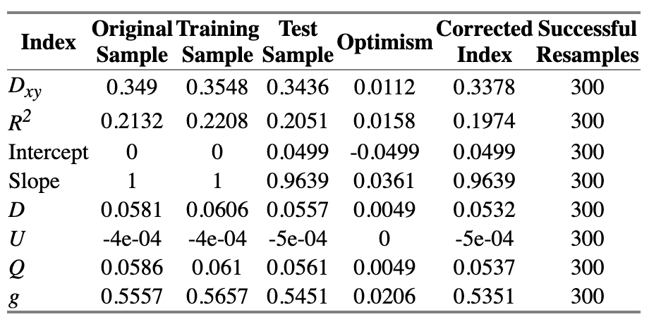
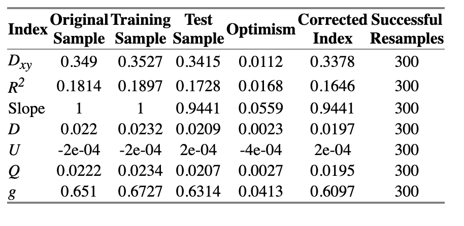
=> Solution: chunk test - A chunk test is a multiple degree of freedom test designed to assess the joint association or importance of a group of parameters or variables simultaneously

Linearity
I will paraphrase what Drew said: very seldom there is a linear relationship in nature
=> Solution: restricted cubic spline (rcs)
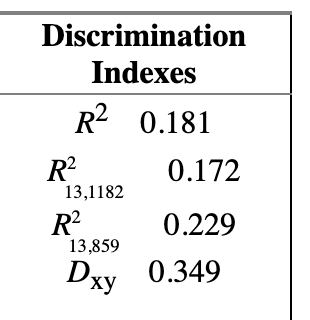
The technical note on why we should use rcs instead of other forms of spline is quite fascinating. Just a note on practice and connect things back to the the phantom degree of freedom/multiplicity, when using splines for continuous predictors, assessing the overall association of that variable with the outcome requires testing all the parameters associated with it (the linear term and all spline terms) simultaneously.

Distributional assumptions
The course seems to favor ordinal model because of the following:

  1. A primary reason for favoring these models is their semiparametric nature, meaning they do not make absolute distributional assumptions about the outcome variable. This is a significant advantage over parametric models like linear regression, which require assumptions about the distribution of residuals (e.g., normality). While ordinal models do make relative distributional assumptions (like proportional odds), these are generally less stringent and can often be chosen for better fit (e.g., using a log-log link instead of logit)
  2. Versatility and Handling Non-Ideal Outcomes: Ordinal models are highlighted as being robust to outliers on the outcome and naturally handle ties and detection limits ( I actually have not grasped the technicality on this). Crucially, they are also advocated for analyzing continuous outcomes, especially when those outcomes have ties, non-normal distributions, or floor/ceiling effects, offering advantages over assuming normality with linear models. (also, I have not grasped this technicality of this). Apparently, this is the feature of the proportional odd assumption where we only need to estimate computationally the intercept for each level of the continuous variables, which is an easier task than estimating the coefficient
  3. From 2, an ordinal model can provide a variety of useful predictions, including the probability of exceeding various thresholds (exceedance probabilities), predicted means, and predicted quantiles (such as the median). This allows for a more complete understanding of the predicted outcome distribution than just estimating a mean or single probability.

There are also a lot of gems in graphical method, to communicate and interpret model, that Frank showed us, here are my attempts to summary them:

  1. Partial Effect Plots: These are a primary graphical tool for interpretation. They allow you to vary one predictor continuously (or across its categories) while holding other predictors constant (often at their median or mode) and plot the predicted outcome (e.g., linear predictor, probability, mean, median)
    Frank advocate for this as an alternative to the interpretation that “changing by one unit while keeping other variable constant”
  2. Nomograms: Presented as a powerful and transparent tool, nomograms integrate the effects of all predictors in the model into a single diagram

◦ For each predictor, they show how its values contribute to a “points” scale or directly to the linear predictor (like log odds or log hazard)

◦ These points/linear predictor can then be mapped to the final predicted outcome, such as the probability of an event, predicted mean, median, or other quantiles.

◦ Nomograms are described as the “antithesis of a black box” because they make the model completely visible and allow for manual calculation of predictions

  1. Contrasts and Plotting Contrast Results: While “contrast” itself is a way to define specific comparisons between predictor settings (e.g., comparing the predicted outcome for a 30-year-old male vs. a 60-year-old female), the results of multiple contrasts can be plotted to visualize the effect of a variable relative to a reference value. My understanding of this is that you can make a plot with your reference as a constant ( a straight line on the x-axis) and plot the change of the exposure/compared group.

4.. Relative Explained Variation (REV) Plots: Derived from concepts like likelihood ratio chi-squares, REV is a measure of variable importance – specifically, the proportion of the model’s explained variation that is attributable to a subset of terms or a specific variable

Plotting REV allows for a graphical comparison of the relative contributions of different variables to the model’s predictive power.

Confidence intervals for REV can also be plotted, which are called “honesty inducing intervals” because they show the uncertainty in estimating variable importance, especially with limited sample sizes.

Thank you Frank and Drew for the first 2-day of the course! I hope this write up would be beneficial for people.

9 Likes

This is a really excellent course summary. Thank you!

3 Likes

Absolutely. I have posted in their respective chapters, feel free to remove all my comments here.