I am trying to create a plot like the one in the picture.
It is using Schoenfeld residuals for the effect of a binary covariate (BITA:SITA) against a continuous covariate (Age). Could you please provide an example with the code in R?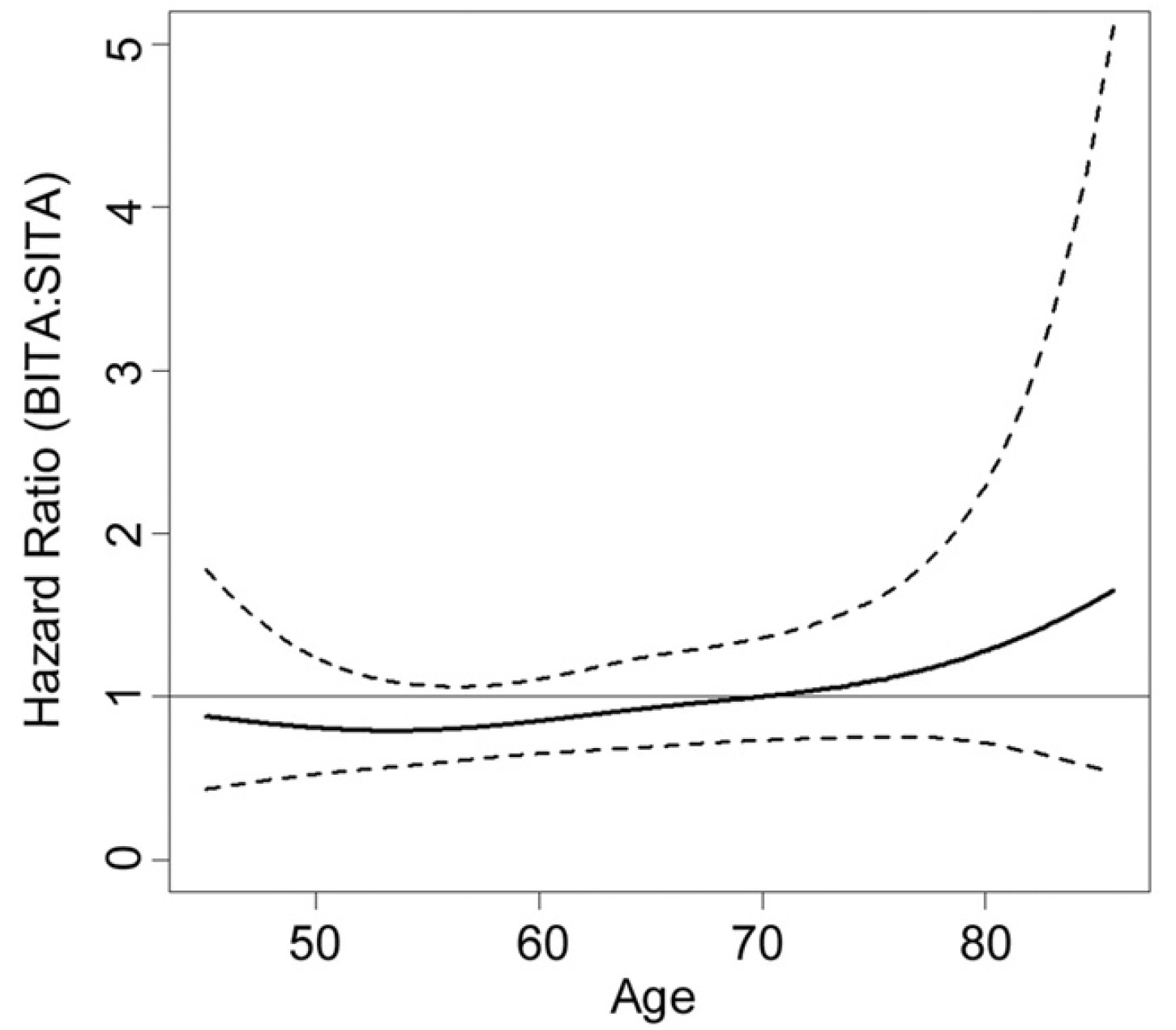
There are several ways to do that in R.
If you only need the PH test use the cox.zph function in the survival package. To plot the dynamic HR smoothly, my preference is the Royston-Parmar model in theRstpm2 package.
This is provided very simply by a plot method for the cox.zph function in the R survival package. You just need to tell it to use the identity transformation of time instead of the Kaplan-Meier transformation.
Dear Albert and Professor Harrell,
Thank you for your prompt responses. I will dive into both methods and I will post the results to see if there is any particular advantage of one method over the other (or any further questions).
Please let me know whether you are aware on any vignette regarding this issue. (Otherwise I will go through one by one until to find it)
There are many examples:
1 Like
My search to find the code for the plot method to produce the result of the figure in this post was not successful so far. So I am providing a simple cox model to describe the problem:
S ← Surv(time, status)
fit ← coxph(S~ age + bita)
zph ← cox.zph(fit, transform= “identity”)
So, I am looking for the code to use plot method in order to produce the result shown in the picture in the initial post (age=continuous covariate to be represented in the x axis, bita=binary covariate: 1=bita, 0=sita, to be represented in the y axis). I already used identity transformation as suggested by professor Harrell, but all codes I have found so far they are using time in the x axis.
Thank you in advance
The are several ways to plot that, my favourite one is the Royston-Parmar model.
You have to select the degrees of freedom. Something like this should work:
library(rstpm2)
fit <- stpm2(Surv(time,event==1)~arm,data=data,df=3, tvc=list(arm=4))
plot(fit, newdata = data.frame(arm = 0), type = “hr”, var = “arm”, ci = TRUE, rug = FALSE, main = “Time dependent hazard ratio”, xlim=c(1,24), ylim=c(0,2.5), ylab = “Hazard ratio”, xlab = “Time”)
Dear Albert,
Thank you very much for your help. Indeed for my covariate with time-varying coefficient the plot illustrates nicely this. So, for the code:
fit ← stpm2(Surv(time,event==1)~bedsidescore,data=bedside,df=3, tvc=list(bedsidescore=4))
plot(fit, newdata = data.frame(bedsidescore = 0), type = “hr”, var = “bedsidescore”, ci = TRUE, rug = FALSE, main = “Time dependent hazard ratio”, xlim=c(1,24), ylim=c(0,2.5), ylab = “Hazard ratio”, xlab = “Time”)
I am getting the attached plot.
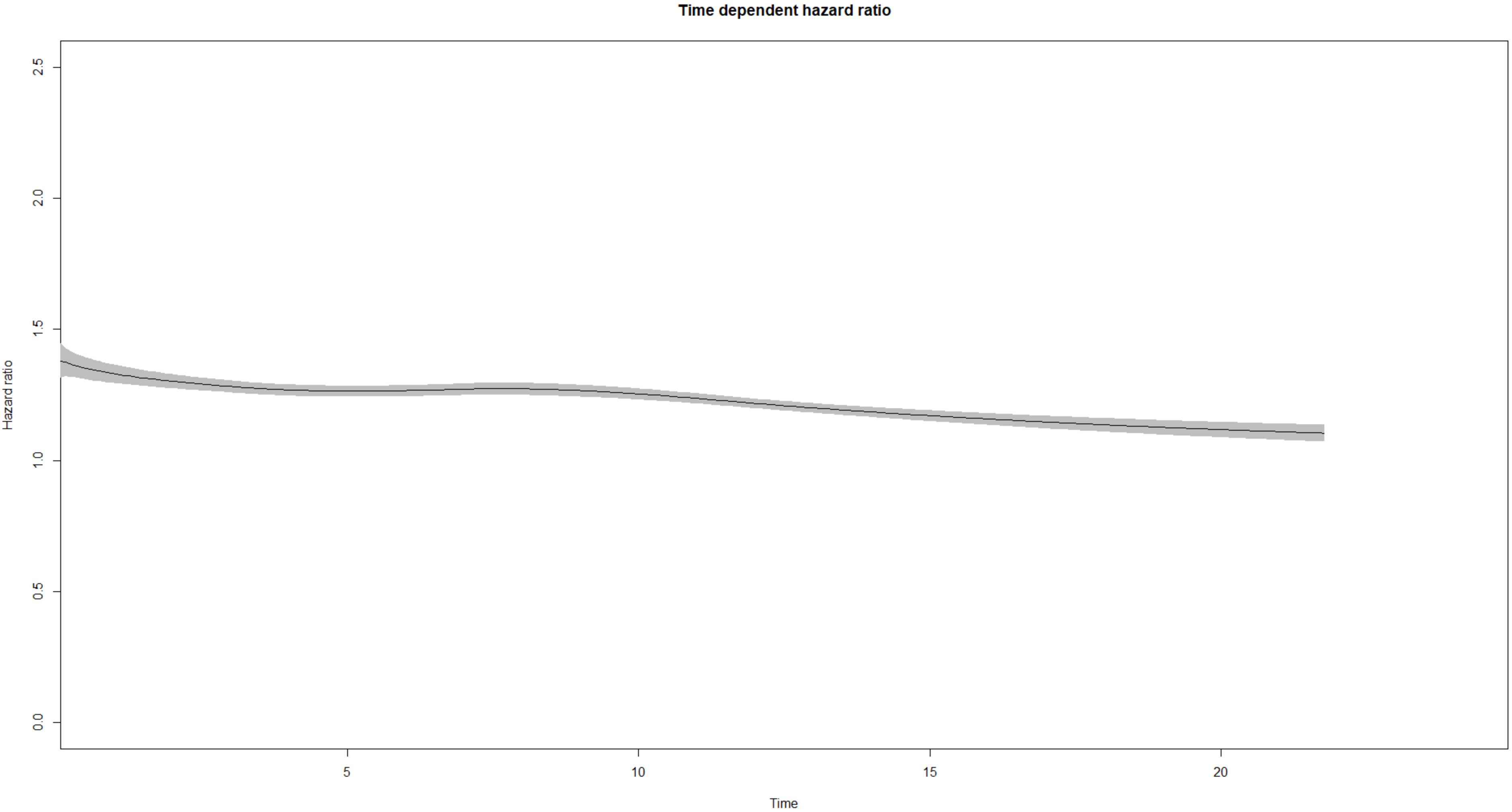
However, my model contains another 2 binary time-constant covariates (bita: 0=sita, 1=bita and cabg: 0=isolated, 1=combined). I assume that the model should be as follows:
fit ← stpm2(Surv(time,event==1)~cabg + bita + bedsidescore, data=bedside,df=3, tvc=list(bedsidescore=4))
Is it possible to create a plot like the one I posted in the 1st post, i.e. x-axis continuous bedsidescore covariate and y-axis relative hazard ratio (bita:sita)? I am not sure if I need to use an interaction term in the model. By the way, I was able to draw separate curves for bita and sita groups in the same plot with bedsidescore in x-axis with visreg package. However, I would like to reproduce the chart shown in the 1st post.
Thank you in advance for your valuable support
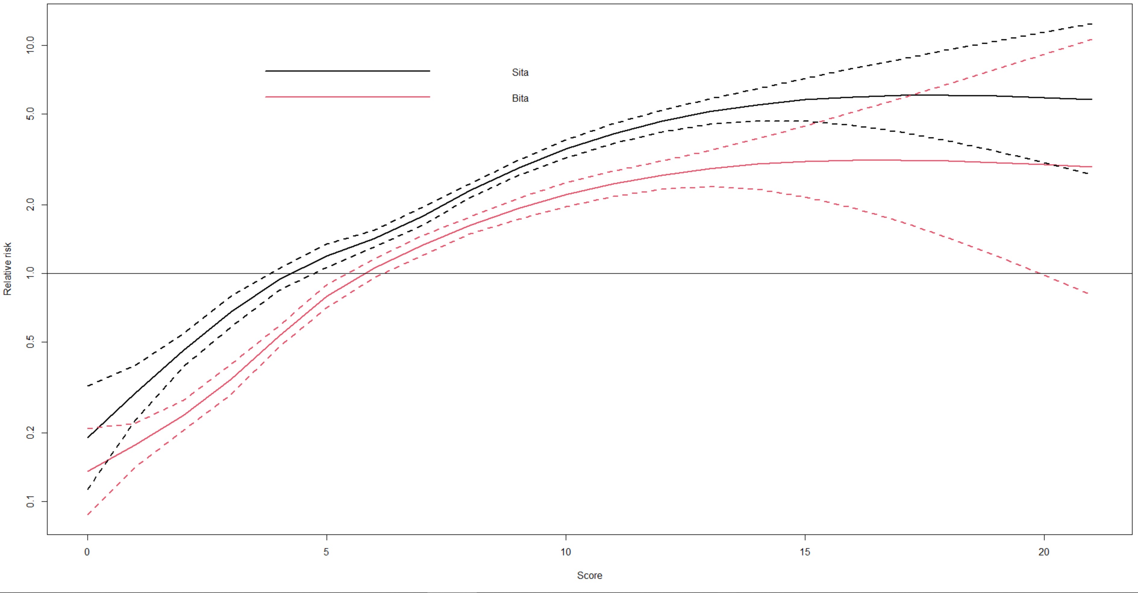
By using “Spline terms in a Cox model” guidance (Terryn Therneau, June 12, 2020), section 3 “Splines in an interaction” I was able to get the following plot:
Code:
nfit <- coxph(Surv(years2018, genealogy) ~ bita*ns(score, df=5), data = bedside)
pdata <- expand.grid(score= 0:21, bita=c(“sita”, “bita”))
ypred <- predict(nfit, newdata=pdata, se=TRUE)
yy <- ypred$fit + outer(ypred$se, c(0, -1.96, 1.96), ‘*’)
matplot(0:21, exp(matrix(yy, ncol=6)), type=‘l’, lty=c(1,1,2,2,2,2), lwd=2, col=1:2, log=‘y’, xlab=“Score”, ylab=“Relative risk”)
legend(2, 10, c(“Sita”, “Bita”), lty=1, lwd=2, col=1:2, bty=‘n’)
abline(h=1)
From this plot is it possible to create a plot like the one in the 1st post? (Which I think that it is the difference of the 2 curves)
In that graph the scale of the y- axis would have to be optimized. The model supports multiple covariates, but the plot function then requires to specify a value for each of them.