The demise of the funnel plot in meta-analysis

We have published this paper that finally states clearly that the Doi plot should replace the funnel plot in meta-analyses. Perhaps this will usher in a new era where we see the classical funnel plot disappear and tests of funnel plot asymmetry also be replaced with measures of Doi plot asymmetry (LFK index)

Left is a funnel plot and right is a Doi plot of the same set of studies on the efficacy of thrombolysis in MI

The article is paywalled. It may help to define the “doi” plot here, and explain how unknown effect sizes could be on the x-axis. Didn’t you mean to say Estimated Effect Size?

1 Like

Yes, the effect sizes are those estimated from each study. Given that funnel plots are scatter plots, their ability to detect asymmetry by eye-balling is very subjective. The Doi plot is an attempt to improve the appearance, so that visual representation becomes less subjective, and to achieve this, the study data need to be presented in a form other than a scatter plot. The Doi plot thus replaces the conventional scatter plot of precision versus effect with a normal quantile versus effect plot. The latter allows the study data to make up the limbs of the plot as opposed to the body of the plot. The idea of using a quantile plot is well established for detecting normality and is known to provide a much better visual representation than a simple dot plot. To create the normal quantile in this context, account is taken of the SE from each of the studies included in the meta-analysis to arrive at an effective sample size for each study. Initially, each element of the effective sample assumes the effect size of their study and all the samples are ordered by effect size. The ordered sample then has percentiles computed at the boundary between consecutive samples (with the boundary being taken to be the middle of the effective sample in each study). The percentiles are then converted to a normal quantile (Z-score) for each study. The final plot is a folded (at the normal quantile value closest to zero) variant of the normal quantile versus effect plot. To get the folded plot, the Z-scores are converted to absolute values and the effect size on the X-axis are plotted against the absolute Z-score on the Y-axis (in reverse order) for each study. The effect size with the smallest absolute Z-score is taken to be the reference point for symmetry of the plot. The studies form the limbs of this funnel unlike the standard funnel plot where the studies are scattered points in the form of an inverted funnel. A symmetrical inverted funnel is created with a Z-score closest to zero at its tip if the trials are not affected by publication or other related forms of bias (such as heterogeneity and chance). An example of a prototypical symmetrical Doi plot is depicted in the previous post. If there is asymmetry, there will be either unequal deviation of both limbs of the plot from the mid-point or more studies making up one limb compared with the other or both. Unlike the funnel plot, it works with any effect size (transformed if not normally distributed) while the funnel plot fails with proportions and SMD. Also, given the studies make up the limbs, the plot works with as few as five studies while the funnel plot requires at least 10 or even more. Our first paper on this plot has been cited more than 900 times.

Software to run the plot:
R: doiplot {metasens}
Stata: doiplot module; lfk module (note doiplot requires the metan module)
Excel: www.epigear.com (MetaXL)

1 Like

I wonder how ignoring the sign of Z works when studies collide with each other.

I assume you mean ES collision - they all fall on the central line but that rarely happens and if it does for the majority it means that we do not have uncertainty in estimation - hence plot not required

I meant when two trials have opposite directions of observed effects.

1 Like

Oh, that is handled nicely - they will appear on either side of the fold. Note that the ES will be far apart but the studies will be at the same |Z score| level. I have given an example below with a red line through these two studies to highlight them.

1 Like

In 2011, the BMJ published a paper like ours titled Recommendations for examining and interpreting funnel plot asymmetry in meta-analyses of randomised controlled trials
Fourteen years later we now have our paper titled Examining and Interpreting Doi Plot Asymmetry in Meta‐Analyses of Randomized Controlled Trials which is linked in the first post above. This is not just a rebuttal but a carefully thought out replacement whose history I now outline below:
2014: We started by creating the Doi plot (11 years ago and implemented in MetaXL at www.epigear.com).
2018: Our first paper on it followed (7 years ago and which has 900+ citations)
2021: The doiplot module was created for and implemented in Stata.
2024: Finally, as citations to our method grew, two authors from the original BMJ paper grew “concerned” and responded in Research Synthesis Methods—not by engaging with the call for progress, but by attacking the LFK index (an index aimed at quantifying Doi plot asymmetry since they could not fault the Doi plot) in an attempt to defend the funnel plot at all costs. This is a textbook example of clinging to the status quo rather than embracing needed change.
2025: Our paper cited in the first post above now is a response to this paper and expands to make a recommendation on the use of the plot just as was done in the BMJ by the same authors 14 years ago. Also, the method is accessible through R and Stata and therefore easy to implement and also compare with the funnel plot.

I have attempted to use the Doi plot for proportional meta-analyses to pool estimates of disease prevalence (ranging between 1% and 20%) - do you have any advice or recommendations for the use of Doi plots in this scenario?

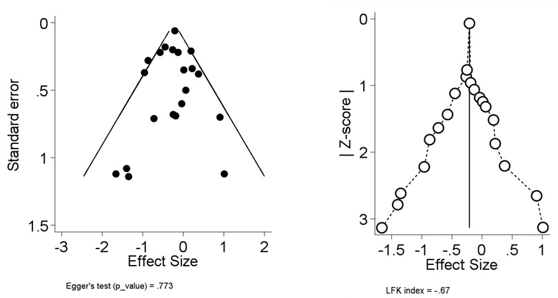
Thanks for the question @GJB. As you are aware funnel plots cannot be used with meta-analysis of prevalence for various reasons and so the Doi plot solves that. The interpretation is as follows:

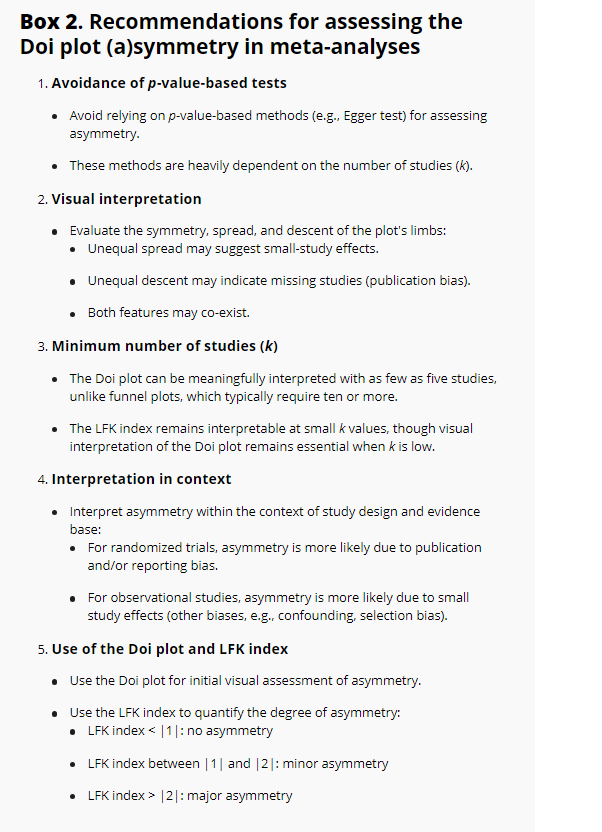
In addition we gave this recommendation:

" The visual assessment of the Doi plot depends on the spread, descent, and number of studies on its two limbs. Three examples illustrate these concepts:

1. Small study effects: Both limbs have a similar number of studies and descend equally from the tip, but one limb is more spread out from the center line as study sizes decrease.
2. Publication bias: One limb has fewer studies and descends less from the tip, though its spread matches the other limb until its descent, indicating missing studies.
3. Combined effects: Both limbs descend equally, but one limb has fewer, more widely spread studies, indicating both small study effects and potential missing studies.

Thus, the visual assessment of Doi plot asymmetry remains critical when assessing asymmetry due to random or systematic error, as explained above (Box 2**, Recommendation 2***).*

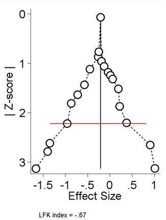
The Doi plot has several other advantages, it can be used even with five studies, as corroborated by the simulation results in this study. Nevertheless, systematic review authors should carefully distinguish between potential causes of Doi plot asymmetry and consider factors such as the intervention, its context, and variations in study design when interpreting findings. Furthermore, unlike funnel plots, the Doi plot imposes no restrictions on outcome scales, making it applicable to a wide range of metrics, including prevalence and standardized mean differences (Box 2**, Recommendations 3 & 4***).*

While the Doi plot and LFK index are also applicable to meta-analyses of observational studies, effect estimates may become asymmetric due to decreases in quality (e.g., confounding and selection biases) of the primary studies. In such cases, asymmetry may reflect not just publication or reporting biases, but also differing degrees of other biases between smaller and larger studies (Box 2**, Recommendation 4). To address this issue, especially in observational studies, some researchers advocate stratification by quality (higher vs. lower based on an arbitrary threshold) or risk of bias judgments, but this should be avoided as this can actually create a scenario that creates spurious within stratum asymmetry. The use of quality or risk of bias assessments to bias-adjust meta-analyses may be a preferred approach."

Link to paper