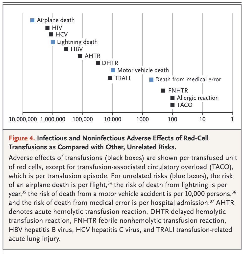
This is tangental to the topic, but still - I wanted to share one of the best communicative visualisations of risk that I have seen in a medical publication.
The article is Indications for and Adverse Effects of Red-Cell Transfusion by Carson et. al in NEJM in 2017 https://www.nejm.org/doi/full/10.1056/NEJMra1612789 . There, the authors discuss rare transfusion reactions and recognise the need to provide context to the risk of these reactions occurring. Some of the reactions may be catastrophic, such as contracting HIV. But as the figure clearly demonstrates, these occurrences are rare, and are more unlikely to occur than dying of a lightening strike. My only gripe is that the figure provides the demonstrably incorrect statistic of deaths from medical errors.