As we know, classify the continuous variable would lose some information and should be avoided. However, this paper focused on absolute risk, which is very common in clinical practice. I am wondering whether we have a more appropriate way to present the results on the continuous variables.
Thank you for your time and wish you have a great day!
This is very easy and more informative to handle continuously, using e.g. regression splines for continuous predictors. The categories the authors’ used are far too broad to handle outcome heterogeneity. You can use typical models (Cox PH, logistic) that model relative effects then take differences in predictions to get absolute risk increase/reduction.
I think I got your point. Actually, we do not need to provide the absolute risk in each category, we could provide the information that the absolute risk increase/reduction per 10 years older or per 10 annual volume increase if the relationship is linear.
Figure 19.5 in Chapter 19.8 of BBR shows an example with R code of visualizing the effect on log odds of a continuous predictor (cholesterol in that case). I think this would be a way to describe the relationship closer to what you wanted Lingxiao_Chen?
The continuous graph doesn’t need to think of intervals such as 10 years but provides the risk estimate at that age on the x-axis.
Figure 19.5 in Chapter 19.8 of BBR shows an example with R code of visualizing the effect on log odds of a continuous predictor (cholesterol in that case). I think this would be a way to describe the relationship closer to what you wanted Lingxiao_Chen?
Thank you so much again, Frank and Martin!
Take age in this JAMA publication as an example. The first step is to test whether we should use restricted cubic spine or some other similar technologies to model it. Assume there is no need to use restricted cubic spline, the second step is plot the age (x-axis) and the risk of removal (y-axis) based on different follow-up time points (in this example, 1 year, 5 years and 9 years). Just as Figure 19.5 in Chapter 19.8 of BBR. The final step is to use a multilevel Fine-Gary model to calculate the subdistribution hazard ratio. Are these the right steps to deal with the age?
By the way, as a previous medical doctor (currently a PhD student), I always told patients that your one-year risk for … is …, your five-year risk for … is … I noticed the follow-up duration is also a continuous variable. Thus, is it ok for us to classify them into several points, such as 1 year, 5 years and 10 years?
Thank you for your time and wish you have a great day!
A minor point. I see the first step as using previous knowledge to see whether we should entertain age having a nonlinear effect. We have such knowledge, and fit age as a spline and do not need to check whether the nonlinear terms in the spline are “significant”; just keep the spline no matter how the fit turns out. This gives you the right degrees of freedom and preserves confidence interval coverage.
We pick a few time horizons as examples. Some patients understand risk. But we need to more often provide patients with what they understand more: time estimates, e.g. life expectency and median life length. Competing risks make all this more difficult.
The tension is between the need to use the full range of variation in the variable versus the need to present easily-understood measures of effect size.
In a paper on in vitro fertilisation, I recall using logistic regression, but then making a simple results table that showed the chances of pregnancy at 5-year ages from 25 to 40. It was clear that at age 25, chances were about a third, which is about the same as for unprotected intercourse, while at forty they had dropped to 15%. This was designed to be useful for clinicians counselling people who were thinking of IVF. The odds ratio for a 5-year increase in age would simply not have been as useful.
There is a further problem that arises with arbitrary scales. While it’s easy enough to think of meaningful ages, birth weights or body mass indices, many scales used in health and social research have no intrinsic measurement unit. So presenting odds ratios isn’t much use. I’ve used quantiles here – for example, by pointing out that the difference in health service use between most health-anxious 10% of the primary care population and the least health-anxious 10% amounts to an extra physician visit a year.
I do think that we need to be aware of the purpose of our research and to make sure that we can communicate what we know in a way that allows the practitioner to appreciate and communicate its significance.
As I said, I reach for quantiles when I’ve got a scale that is arbitrary, where there is no real-life interpretation to a scale difference of a given size.
My preference, of course, is for calibration. We have a paper in submission at the moment that looks at levels of student burnout. Authors have suggested, based on cumulative distributions, that scores could be divided into tee-shirt sizes (low/moderate/high) but this seems to me to be dogged with circular reasoning, assuming that a certain proportion of the population will be experiencing high burnout and then declaring, on the basis of a cutoff score, that the hypothesised proportion exists!
We’ve taken the tack of calibrating the scores against probability of depression on a standard self-completion instrument that pretty closely conforms to clinical diagnostic criteria. So our ‘high’ cutoff is interpretable as ≥50% probability of caseness on the depression scale. This allows us to give prevalences in categories that have a non-arbitrary interpretation.
Of course, we could have calibrated burnout against another variable – I’d be interested in calibrating it against course drop-out, but we have a low-dropout setting.
However, in modelling relationships, I struggle with getting interpretable measures of effect size. If you were looking at the effect of self-stigma in the probability of compliance with treatment in people with tuberculosis (current project, so the question is not at all hypothetical) how would you express the strength of the relationship?
Oh – piece of trivia. I once spoke with Garrow, he of “Treat obesity seriously” – the book that put obesity on the map as a health issue. I took the opportunity to ask him how he got the neat cutpoints for BMI – 19-25 = normal, 25-30 = overweight, 30+ = obese. He said to me “They were easy to remember and they looked about right, based on my own experience”. I was delighted to realise that subsequent intense scrutiny has shown that Garrow was pretty much on the money!
I wrote this up as a little piece for the Stata Journal, way back when. It discusses the issue of effect size and goes through all the things you can do with the in vitro fertilisation data that don’t actually help physician or patient to make a decision. The thing is available here
I confess that I re-read it to make sure I wasn’t embarrassed by what I had written. I think I still agree with every statement except one. I would now claim that Spearman’s rho has, in addition to its other drawbacks, no real-life interpretation.
When flexibly modeling a smooth nonlinear relationship, there is no need for a single effect size. I just show the smooth relationship, with confidence bands. To quantify the strength of the overall effect, I use measures such as those discussed here.
I would be surprised if data actually exist that validate these cutpoints. To validate them you would need to demonstrate that all subjects within an interval of BMI have the same expected outcome, i.e., that the BMI relationship is piecewise flat with the points of discontinuity being the nice nice round numbers.
I guess that BMI sharply underlines the difference between statistical significance, model form and clinical utility. While risk rises with BMI from the low 20s onwards, the interval from 25 to 30 is a range in which you can set realistic targets for weight reduction. It’s the ‘orange light’ on the prevention model.
It’s the same story with many continuous variables. With type II diabetes, for example, the WHO defines it as fasting plasma glucose ≥ 7.0mmol/l (126mg/dl) or 2–h plasma glucose ≥ 11.1mmol/l (200mg/dl). However, these are non-equivalent in two senses. There is far from a perfect overlap between the two criteria, and being diagnosed on the basis of 2—h plasma glucose carries a higher risk of subsequent cardiovascular disease than the fasting glucose definition.
However, the important point is that fasting glucose can be done when routine bloods are being taken. The patient simply has to turn up fasting to phlebotomy, get a draw done and then head off for breakfast. The 2-hour protocol really means taking the morning off work. Consequently, you can screen far more people using the fasting protocol – people who just couldn’t or wouldn’t turn up for a 2-hour screen.
Garrow’s BMI figures are simple and easy to remember. They give people a useful warning if their weight needs looking to, and the range is such that losing one BMI unit isn’t easy but you feel you have achieved something when it happens.
What I’m saying, Frank, is that clinical medicine has to be above all pragmatic. Professionals and patients must be able to understand each other, share goals and track progress. And my own favourite among the projects I’ve done is solar disinfection, where we could reduce the evidence to just two instructions :
Put the water bottle in the sunshine today
Drink it tomorrow
So I guess I’m voting for pragmatism – the simplest we can go without doing violence to the underlying model!
Ronan I can see a need for that, but the rest of the argument is not compelling to me. Patients routinely deal with weight as a continuous variable, and athletes likewise when dealing with running times etc. I think the labeling that has been used in diabetes and other diseases is harmful to decision making and public health. This is discussed very well here.
A good example. But medical decision making is seldom that clear. Borderline diagnoses are discounted when the patient has everything else going in her favor.
Concerning things like obesity, I think a safe and accurate, and only slightly oversimplified message is “the heavier you are the worse, if you did not start out underweight”. Almost everything is dose-response.
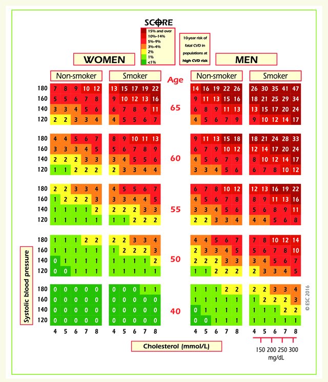
I’d forgotten the SCORE risk chart, which we based on continuous modelling of the predictor variables but is displayed using categories, so that you can see 400 risk-factor combinations on a flat surface. Its success lay in its simplicity. When we were building it, I left an early mock-up for a cardiologist colleague to have a look at. He was out to lunch, but when he arrived back his secretary had already worked out her estimated risk and her projected risk at age 60, despite the fact that the chart had no instructions on it. It was at that point I became convinced that we were working on something that would actually help clinicians and patients.
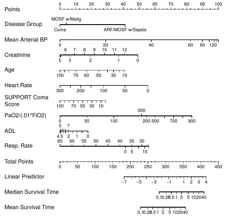
Ronan this type of chart has pretty good resolution. But a nomogram can be produced with a single R command, and provides a little more resolution, and especially provides a way to handle more predictors. An example of a manually drawn nomogram is below - our old nomogram for estimating the risk of significant stenosis in a major coronary artery.
@f2harrell – When we did the SCORE chart, I was familiar with the various risk estimation methods that had been tried and never really made it into clinical practice, and certainly didn’t make it ‘over the counter’ to the general public. I actually have a copy of the original Framingham risk tables, one of the original Pfizer electronic hand-held risk calculators that Dan McGee programmed and once had a library of the various risk estimation algorithms that had been published.
My brief was to produce something that was self evident, that could be used in the absence of any calculation, and that would be suitable for the public. And it had to have no moving parts.
It also needed to show the person’s risk in context – to allow them to get a sense of how they compared with people of their age with different levels of risk factors, and to get a sense of where they might be in, say, ten years time. All of these things are very difficult with nomograms because the nomogram does one calculation at a time. The chart does all the calculations at once, and has a colour code that helps to make sense of the results.
So we made concessions to user-friendliness and versatility, but I still believe that a tool that will increase evidence-based risk management has to be one that professionals are willing to use and that patients can understand.
It’s a balance in which the perfect seems, once again, to be the enemy of the good.