Setting
I have a small cohort of very preterm infants in a single NICU (n = 370 with complete predictions, NDI prevalence about 30%), restricted to infants without intraventricular haemorrhage or periventricular leukomalacia. The outcome is neurodevelopmental impairment (NDI) at follow-up, and the clinical use case is deciding which infants get directed into a closer follow-up pathway. The cohort is what it is and I recognize that building any model is probably a waste of time but I have to work with the team where they are.
Two models are on the table. The primary one is a logistic regression with backward selection from 26 candidate predictors, which is the conventional analytical tool in this clinical area and the one the team understands/requested. The extension is a Bayesian additive regression tree (BART) ensemble. Discrimination is comparable (BART AUC 0.75 vs GLM 0.74), Brier scores are within 0.005, calibration is acceptable for both, and decision curve analysis shows both sitting above treat-all and treat-none across the clinically elicited threshold range. BART technically sits above the GLM over the range of values people might use to treat but differences are very small. On those grounds the team preferred the GLM.
Clinicians indicated that follow-up referral would be considered at a risk threshold somewhere in [0.20, 0.40]. So I wanted a look at how the two models actually disagree in their decisions across that band, rather than in their predicted probabilities globally.
What I tried
My first attempt was a regression tree on the predicted-probability difference (BART minus GLM). The splits were interesting/made sense but I found them uninformative for the decision question: most large differences sat in regions where both models were either well above 0.40 or well below 0.20, so the difference would not flip a recommendation.
To focus on decisions, I defined a policy-signed decision gap that scales each infant’s disagreement to the elicited band:
F is the share of the 0.20 to 0.40 threshold range over which the two models give different binary decisions for infant i. It is positive when BART would flag and the GLM would not, negative for the reverse, and zero whenever both predictions sit outside or in agreement within the band. Each infant is then classified into obvious-low (both predictions below 0.20), obvious-high (both above 0.40), or boundary (at least one prediction inside the band).
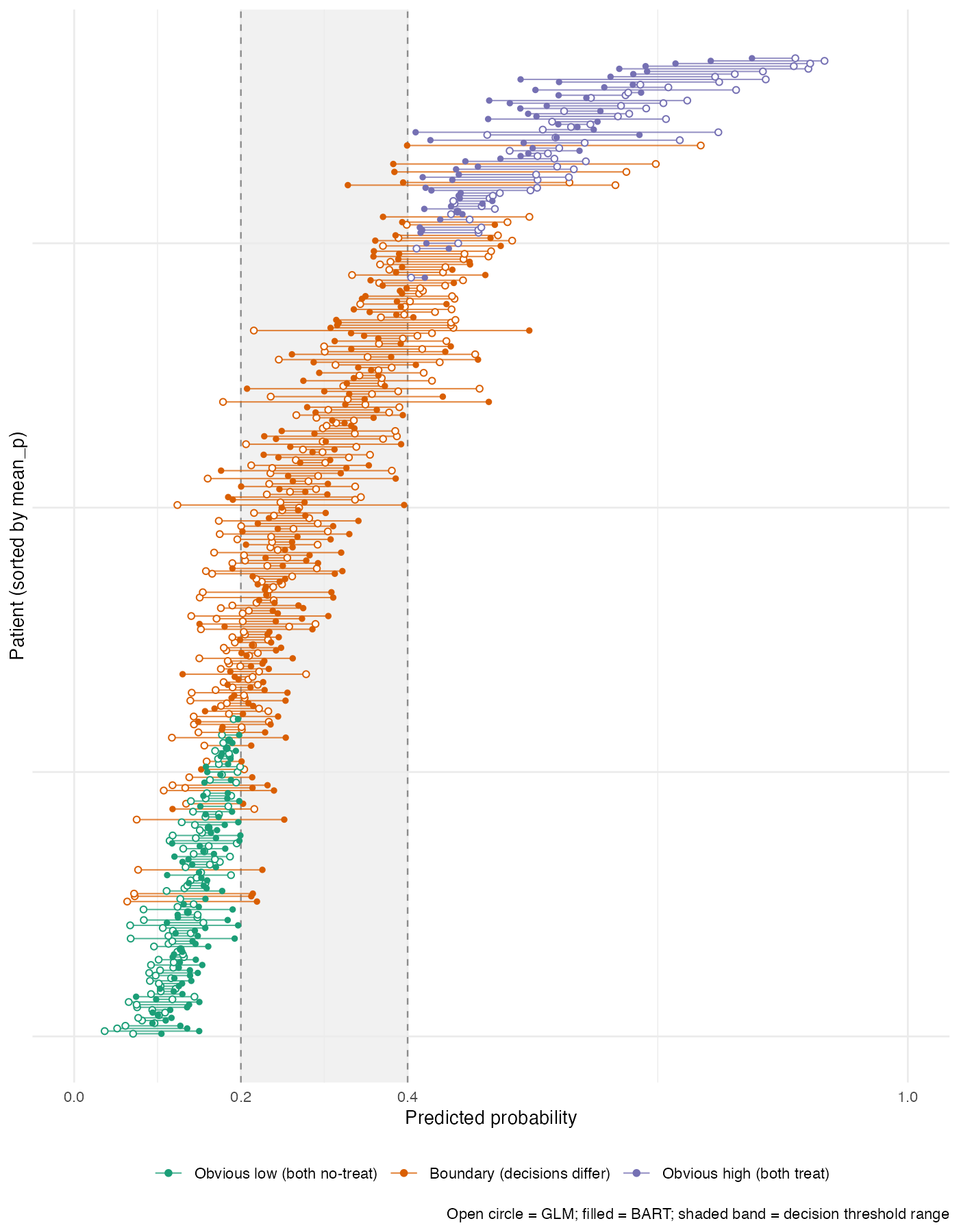
About three in five infants in this cohort sit in the boundary group, and roughly one in four are discordant at t = 0.20. I then k-means clustered the boundary infants (k = 3, fixed seed, on the standardised pair of F and mean predicted probability) and described the resulting clusters post hoc on the original covariates.
What it shows
Three clusters split cleanly. Cluster c1 is GLM-aggressive (the GLM puts these infants above the upper threshold and BART keeps them inside the band). Cluster c3 is BART-aggressive (the reverse). Cluster c2 is the middle group where the two models broadly agree.
| Feature | c1 GLM-aggressive (n ≈ 72) | c2 agree (n ≈ 101) | c3 BART-aggressive (n ≈ 39) |
|---|---|---|---|
| Mean GLM probability | 0.43 | 0.20 | 0.24 |
| Mean BART probability | 0.33 | 0.23 | 0.39 |
| Mean signed F | -0.32 | +0.07 | +0.58 |
| Low SES | 41% | 0% | 16% |
| Maternal substance exposure | 46% | 14% | 33% |
| Maternal diabetes | 19% | 7% | 0% |
| BPD at 36 weeks | 32% | 14% | 39% |
| Weight-for-age below 10th centile | low | low | 25% |
| Mean birth weight (g) | 1097 | 1225 | 1055 |
The cleanest contrast is c1 vs c3. The GLM-aggressive cluster carries the social-disadvantage and maternal-diabetes signal; while BART (which drops diabetes, NEC, temperature, and lowest blood pressure during permutation variable selection) is more conservative. The BART-aggressive cluster carries a heavier neonatal-risk profile (BPD at 36 weeks, weight-for-age below the 10th centile, lowest mean birth weight) with no maternal diabetes.
What I find interesting is that each model picks a coherent reading of risk. The GLM weights family environment and social disadvantage more aggressively and would flag a different patient list, closer to what a policymaker thinking about family-level support might want to see. The BART weights the acute clinical morbidity bundle more aggressively and is closer to what a NICU clinician acts on at the bedside. So the choice of model is not just a statistical one, and I find the “who gets treated” question is substantive even if the analysis is descriptive for this unit.
What I want advice on
I am pretty sure I am making at least one important error that I have not spotted, and I would value pointers on two things:
-
Conditioning on the ambiguous zone. The cluster characterisation conditions on boundary membership, which is itself a function of the two model outputs. That is a post-selection inference problem, and I do not have a clean handle on what it does to interpretation. I am treating the cluster descriptions as descriptive of this unit’s patient mix rather than as inferential statements, but I would like to know whether there is a more established framework that does this job and is less open to that critique.
-
More validated approaches to the same question. The question I want to answer is: given two models with comparable global performance, who would get treated differently, and what do those people look like? I have ruled NRI and IDI out. DCA I have run, but it averages over patients and does not localise disagreement. I haven’t found the right mix of keywords in the methods literature to get what I’m looking for so any help is appreciated.
The analysis is descriptive for a single unit and I do not need a deployment-grade method, but I would like to be on the right side of “this is a sensible thing to do” rather than re-deriving something the field has already shown to be flawed.
Thanks in advance!
P.S.
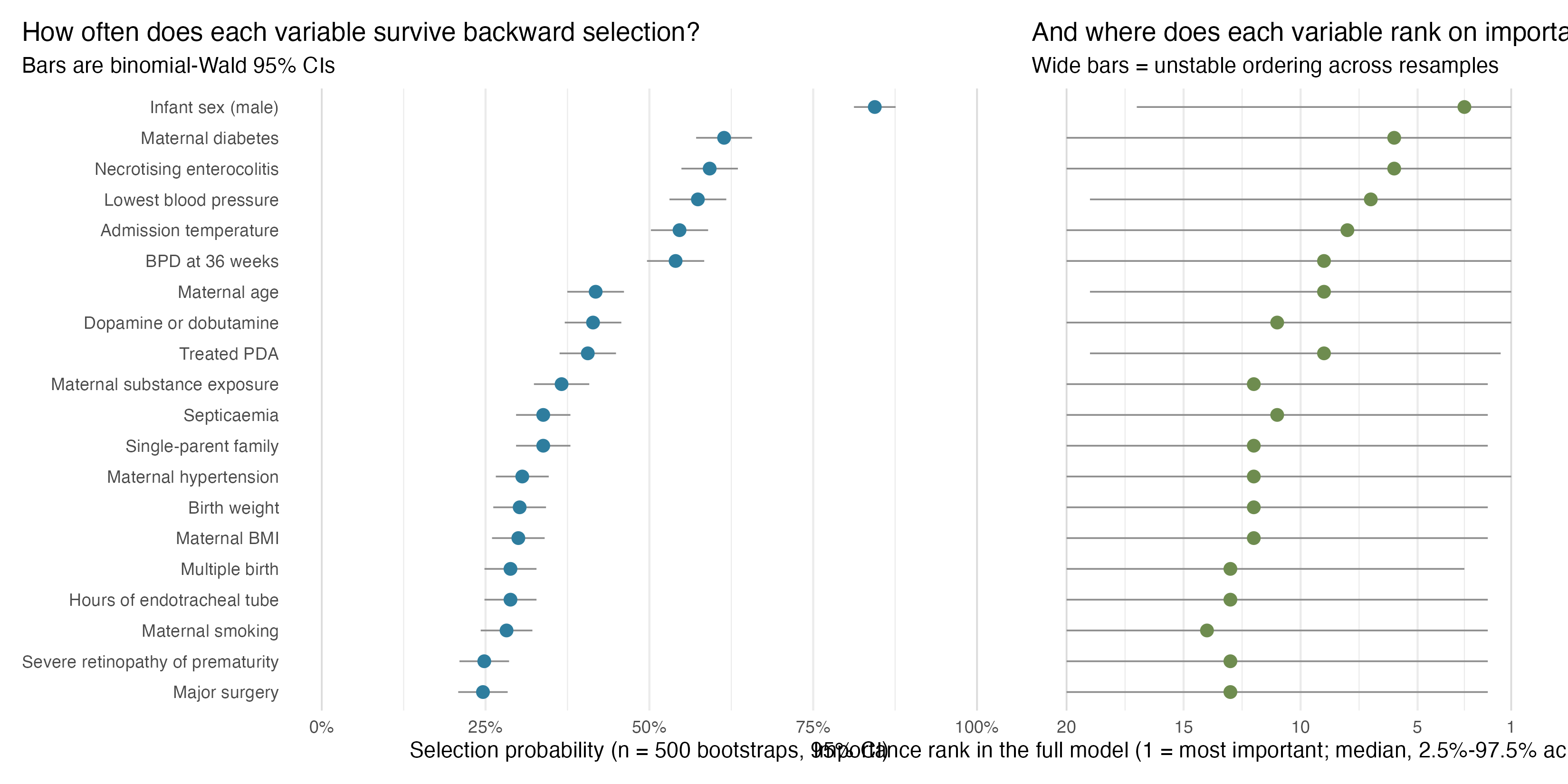
Another line of argument I am making with the team is that really the data don’t leave a lot to be gained here. I did a really simple bootstrap replication of the backwards selection and the performance is pretty abysmal which is telling me we are more or less outsourcing important policy decisions to a random number generator. left panel is probability each variable is selected and right is rank importance based on chi-square