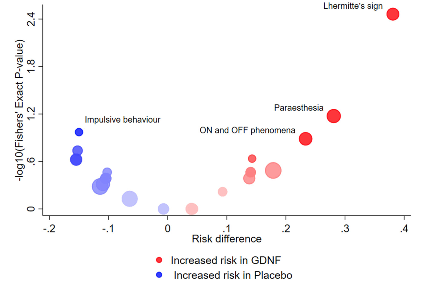
A recent paper by Cornelius, Cro & Phillips [1] featured the volcano plot for exploratory visualization of adverse effects (AEs) in clinical trials. Here is an example of such a plot, from their Fig4(a):
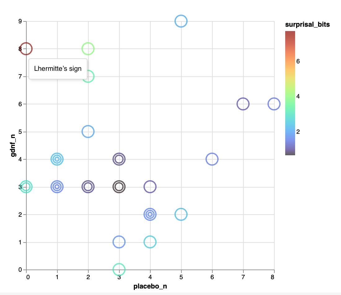
Over at ObservableHQ, I have sketched an alternative plot that addresses the same question (are AEs attributable to treatment?) while I think having some definite advantages. Here is the figure itself, shown with the ‘tooltip’ that pops up with mouseover of the red mark at (0,8):
This feels in retrospect like ‘the obvious way’ to plot these AEs, since it exhibits the raw data so that you can read them off directly from the plot. (Cf. Tufte’s exhortation to “show the data”.) It also immediately invokes the 45° line idiom.
Given its obviousness, my question is: Have people seen this sort of plot used previously?
Cornelius V, Cro S, Phillips R. Advantages of visualisations to evaluate and communicate adverse event information in randomised controlled trials. Trials. 2020;21(1):1028. doi:10.1186/s13063-020-04903-0
And I think that confidence limits should be on the absolute risk difference scale, not relative risk. Ratios for rare AEs are just too hard to nail down.
The Stata command we’ve developed for this can plot risk differences and corresponding confidence intervals instead of the relative risks if preferred.
This is an interesting idea. My initial reaction was to think how well this alternative plot would work when the range of frequencies is much larger than the 0-9 range we have in this example. Is it as clear when incremental increases are not unit increases?
A transformation that straightens out the contours of constant surprisal would also help span a larger range of AE frequencies. Whatever gets lost with abandoning linearity in AE freqs might very well be compensated for by the great simplification of the inferential topography of the plot. This quick-and-dirty R script suggests that a square-root scaling does the job asymptotically:
library(data.table)
library(lattice)

## F is the CDF of the F distribution, which also yields
## the Binomial probability F(k;n,p) = Pr(X <= k).
F <- function(k,n=40) pf(q=(k+1)/(n-k), df1=2*(n-k), df2=2*(k+1))

## Here, x and y are numbers of AEs (of some given type)
## seen in 2 equal-sized arms of a trial.
dat <- CJ(x=1:40, y=1:40)[, F := F(pmin(x,y),x+y)]

tics <- c(1:10, 10 + 2*(1:15))

contourplot(F ~ sqrt(x) + sqrt(y), data = dat
           ,at = 2^-(4:8)
           ,labels = paste("S =", 4:8,"bits")
           ,scales = list(labels=tics, at=sqrt(tics))
           ,xlab = "Arm 1 AEs"
           ,ylab = "Arm 2 AEs"
            )
In all seriousness, though … I agree that drawing contours of any kind does indeed raise the spectre of threshold-style thinking in general, and NHST in particular. This was one benefit I was proposing for my color encoding of the surprisal, which seems (to me) to discourage overly precise interpretation. For the value of surprisal per se, I would lean on the argument@zad and @Sander advance in terms of “calibrat[ing] intuitions against simple physical experiments like coin tossing.”
Apparent between-arm AE imbalances in clinical trials create real dilemmas for drug sponsors and regulators, particularly when the number of AEs in question is very small. A large variety of AEs are reported during the course of a typical clinical trial and between-arm imbalances in some AEs will invariably be present. From what I recall (having worked in drug safety for several years), trying to sort out whether a given AE imbalance heralded a true drug-related safety signal or simply reflected the play of chance was often very difficult. I don’t recall compatibility intervals around between-arm AE differences playing much of a role in whether we decided to further investigate any particular AE imbalance. Instead, I think we looked to other lines of evidence- e.g, whether there was biologic plausibility for the drug to cause the AE; whether a similar imbalance had been seen in earlier-phase or other pivotal trials; whether rate of occurrence of a rare AE was far above what might be expected in the general population over a given period of time; whether there was evidence of a dose effect (e.g., lower reported AE rate at lower drug doses); whether similar AE imbalances were seen with other drugs in the same class…
One of the more rational approaches to that is the Berry & Berry hierarchical Bayesian model where AEs from the same body system are connected to each other so that information is borrowed and the low event counts are partially overcome.
Such connectivity could be achieved as well within a raw data display, by applying a further encoding on the AE marks. Body systems could be discriminated by mark shape (square, star, etc.), for example; alternatively, the encoding of surprisal might be shifted to mark size, and color then repurposed to discriminate body systems. One disadvantage of the ‘rational’ application of a generic, off-the-shelf statistical model, is that it presents what seems to be an ‘answer’, but without offering up the raw material needed for its critical examination. Direct (‘empirical’) display of data, by contrast, invites the experts around the table to bring into the discussion their wealth of specific scientific knowledge such as Erin related above.
A really nice example of how raw AE data can be visually integrated with the patient-level information necessary to assess AE causality is the “eDISH” tool developed by FDA. eDISH was developed several years ago to assess clinical trial databases for signals of idiosyncratic drug-induced liver injury (DILI). Since idiosyncratic DILI can be fatal or require liver transplant, it’s essential to identify, prior to marketing, those drugs with a “higher than acceptable” propensity to cause it.
Over many years, FDA learned how to recognize clinical trial database “red flags” which would invariably predict an unacceptably high rate of idiosyncratic DILI if the drug were to be allowed on the market. FDA learned how to define these red flags by looking back at patterns of clinical trial AEs for drugs that they had approved but which subsequently had been removed from the market due to unacceptable hepatotoxicity when used by larger numbers of patients. The trial databases of drugs that had to be withdrawn from the market tended to show several trial subjects who developed hepatocellular liver injury (manifesting as markedly elevated ALT), combined with jaundice (reflecting impaired liver function), and for which other non-drug causes could not be found. Slides 22-30 in the FDA presentation below show what eDISH look(s) like- a plot of cases that involve both markedly elevated ALT and bilirubin- sponsors and reviewers can then click on the potential “red flag” cases in the upper right quadrant and the reviewer is linked to the case in question, permitting narrative review and case-level causality assessment
Not sure which of the plots you are looking for exactly but @f2harrell has created an R package that contains some of the functions you might be looking for http://hbiostat.org/R/hreport/