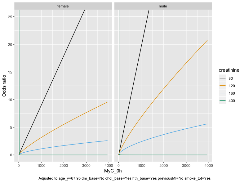
Hmm I don’t think creatinine needs a spline - because when we fit a spline to that above the line stayed straight. Also this uptick is showing up non-linear on the curve for MyC already. Hmmmm, I wonder could this be a small group of people who have really bad Cr but relatively normal MyC ? You could try plotting a curve with a higher Cr value, 300, 400 etc and see what those curves look like. Or you could actually look in the data and see are there people who experience AMI despite normal MyC - and then look at their creatinine. Maybe there are a handful of people with truly awful renal function and for some reason normal MyC ?
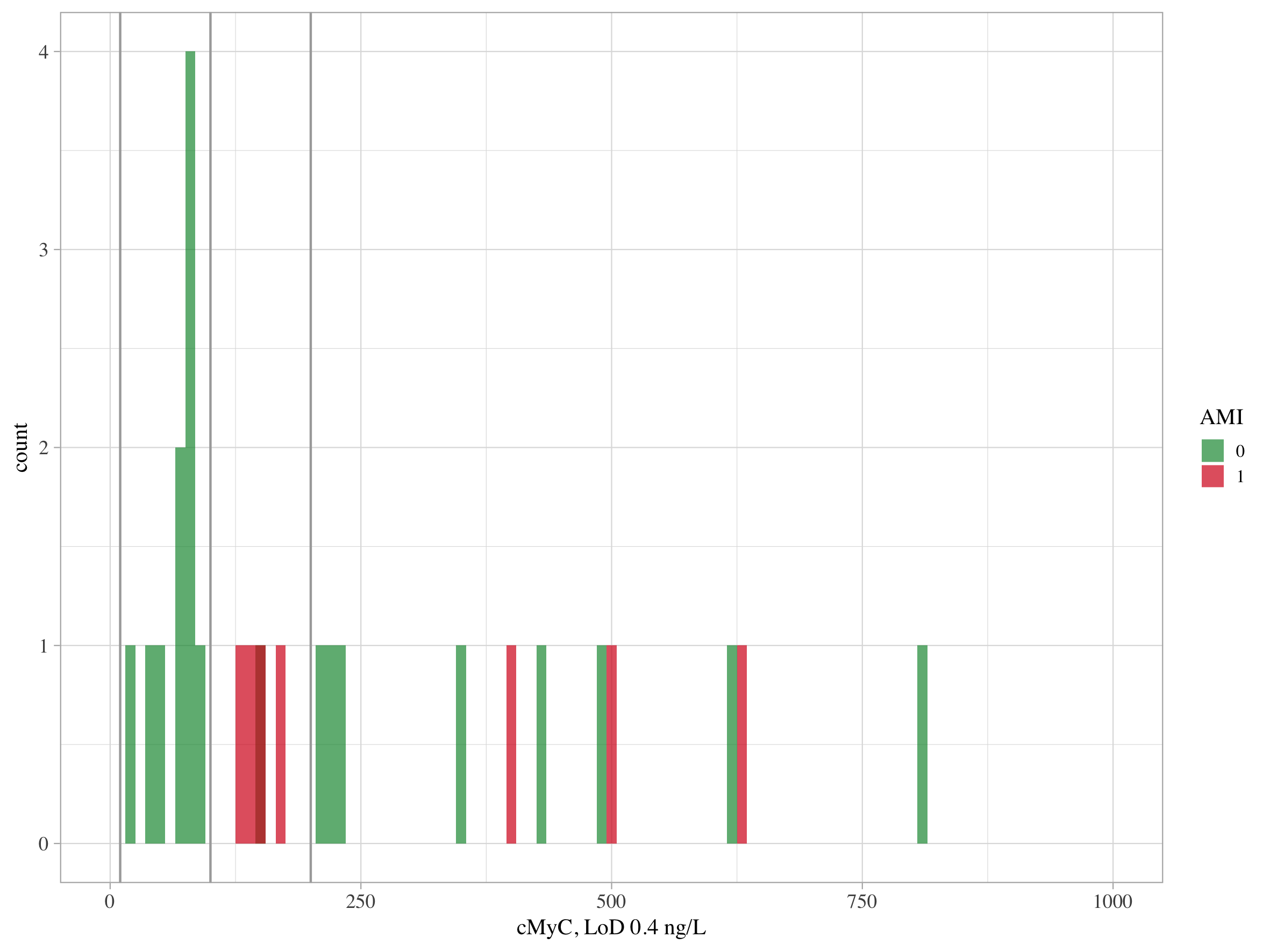
Sorry I’m confused by the histogram - how did you make it?
This again makes me think there must be at least 1 someone with crazy high creatinine, +ve AMI, and 0 or low troponin ? If there isn’t I am at a loss to explain this feature!
Sorry. The histogram contained only patients with creatinine >180 umol/L. Reviewing the raw data, all patients with AMI and creatinine >180 have a MyC >140 (almost twice 99th centile, and way above LOD (0.4 ng/L))…at least we’re confused together, but this is rather unsettling.