Thanks for circling back on this, @arthur_albuquerque. After some of our discussions I’ve continued to play around with this. Here is one approach at summarizing these data:
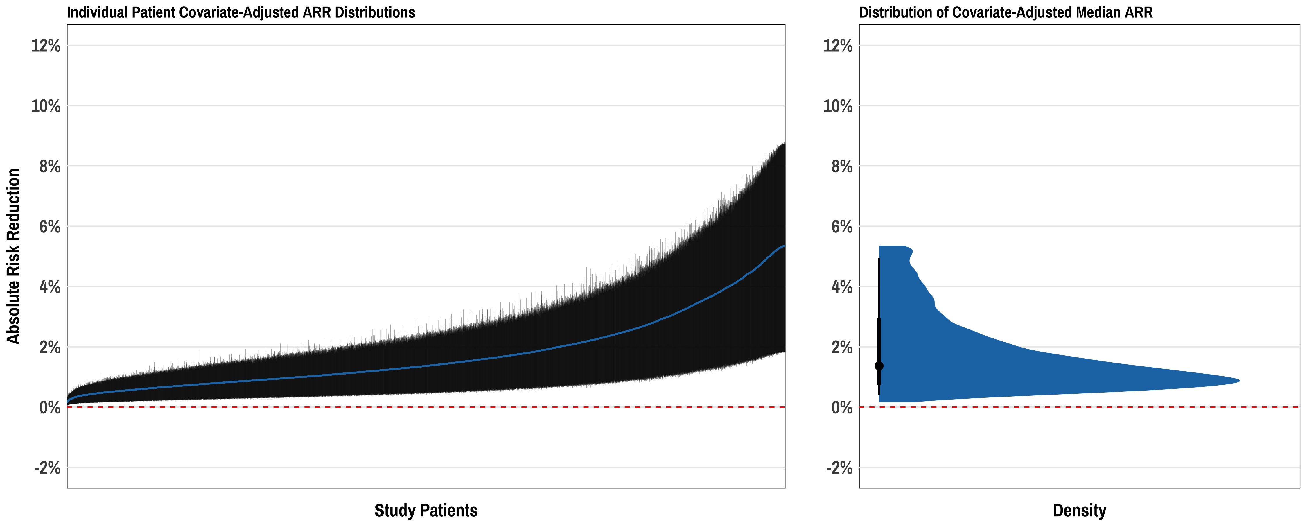
Here the left plot is a set of >10,000 patients from an example dataset with each patient represented by her/his median ARR +/- 95% credible interval. This shows the “distribution of distributions” so to speak, of ARRs across the range of patients in the cohort. The right plot shows the distribution of median ARR for the study cohort, distilling each patient’s covariate-adjusted ARR to its median value across all posterior draws. Not sure this is the “right answer” - but just a thought. The third piece to all of this could be then displaying the distributions of actual patient-level predicted ARR for various representative patients (similar to the Shiny app you reference above).