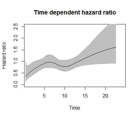
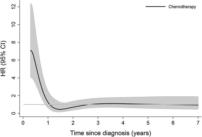
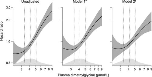
Good evening, I wanted to ask if someone could explain how to make in R a plot to represent a time-dependent hazard ratio with 95% CI, from a Cox model, as for example, the one I show below. I have tried hazard.ratio plot in rms or plot(cox.zph) but it is not exactly the same. Thank you very much.
Usually I recommend cox.zph in the R rms package. But the best way to do this takes more time and trouble: fit a time-dependent covariate for time since diagnosis, allowing for a smooth nonlinear effect through a spline function, and interact that with chemo/no chemo.
I am ashamed of my clumsiness. Is there an example or case study in any of your notes or in RMS? I’ve seen how to plot the HR against a continuous variable, but the truth is that I don’t know how to incorporate time into the equation…
It’s not for the faint of heart. See Therneau and Grambsch and Gray.
This code is as much for weak and strong hearts. I leave it there for posterity.
library(rstpm2)
mod_tvc <- stpm2(Surv(time,event==1)~arm,data=avat,df=3,
tvc=list(arm=4))
plot(mod_tvc, newdata = data.frame(arm = 0), type = “hr”,
var = “arm”, ci = TRUE, rug = FALSE,
main = “Time dependent hazard ratio”, xlim=c(1,24), ylim=c(0,2.5),
ylab = “Hazard ratio”, xlab = “Time”
)
Perhaps this function can be helpful. It was developed by Reinhard Seifert, a former biostatistician at the University of Bergen, Norway.
   plotHR <- function (model , terms = 1 , se = TRUE , col.se = "#DEEBF7",
                    rug = "density" , col.dens = grey(0.8) ,
                    ref = FALSE , col.ref = "#000000" , lty.ref = 1 , lwd.ref = 2 ,
                    xlab = "" , ylab = "Hazard Ratio" , main = NULL ,
                    xlim = NULL , ylim = NULL,
                    col.term = "#08519C", lwd.term = 3, digits = 1,
                    cex = 1 , bty = "n" , axes = TRUE , ...) {


    # set plotting parameters
    par(las = 1 , cex = cex)


    ## extract the names of all model covariates
    all.labels <- attr(model$terms , "term.labels")

    # remove 'strata()' / 'factor()' / "pspline( , df = a )"
    all.labels <- sub ( "pspline[(]([a-zA-Z._0-9]*)(|[, ]*(df|nterm)[ ]*=[ ]*[0-9a-zA-Z_]+)[)]" , "\\1" , all.labels)
    all.labels <- sub ( "factor[(]([a-zA-Z._0-9]*)[)]" , "\\1" , all.labels)
    all.labels <- sub ( "strata[(]([a-zA-Z._0-9]*)[)]" , "\\1" , all.labels)

    # The cph in the Design package uses rcs instead of pspline
    all.labels <- sub ( "rcs[(]([a-zA-Z._0-9]*)(|([, ]*([0-9]+|cut[ ]*=[ ]*c[(][0-9a-zA-Z_, ]+[)])))[)]" , "\\1" , all.labels)

    # Allow the term searched for be a string
    if (is.character(terms)){
        terms <- grep(terms, all.labels)
        if(length(terms) == 0){
            stop(paste("Could not find term:", terms))
        }
    }

    # pick the name of the main term which is goint to be plotted
    term.label <- all.labels[terms]
    if (is.na(term.label)){
        stop(paste("Term", terms, "not found"))
    }

    # Remove interaction terms since the data can't be found, ex. male_gender:prosthesis
    terms_with_interaction <- grep("[_.a-zA-Z0-9]+:[_.a-zA-Z0-9]+", all.labels)
    if(length(terms_with_interaction)>0){
        all.labels <- all.labels[!(terms_with_interaction == 1:length(all.labels))]
    }

    ## extract data from model;
    # only the covariates really used in the model
    # only complete covariate records (only used in the model anyway)
    # 'as.data.frame()' and 'names()' have to be explicitly specified in case of a univariate model
    data <- eval(model$call$data)
    data <- as.data.frame(na.exclude(data[ , all.labels]))
    names(data) <- all.labels


    ## get the quartiles of the main term
    quantiles <- quantile(data[,term.label] , probs = c(0.025,0.25,0.50,0.75,0.975))


    ### _______________ the smooth term prediction ____________
    ## calculate the HR for all the covariate values found in the dataset
    if(length(grep("cph", model)) > 0){
        # If this is a cph model then don't exclude the na values
        term <- predict (model , type="terms" , se.fit = TRUE , terms = terms, expand.na=FALSE, na.action=na.pass)
    }else{
        term <- predict (model , type="terms" , se.fit = TRUE , terms = terms)
    }

    # attach the smooth fit for the HR ('fit') and the CI's to the dataset
    data$fit <- term$fit
    data$ucl <- term$fit + 1.96 * term$se.fit
    data$lcl <- term$fit - 1.96 * term$se.fit
    ### _______________ this is the main extraction __________


    ### _______________ what now follows is the graphical manipulation of the plots ______

    # plot empty plot with coordinatesystem and labels
    plot( data$fit ~ data[ , term.label] , xlim = xlim , ylim = ylim , xlab = xlab , ylab = ylab , main = main, type = "n" , axes = FALSE )


    # sorting indices for ploting
    i.backw <- order(data[,term.label] , decreasing = TRUE)
    i.forw <- order(data[,term.label])


    # plot CI as polygon shade - if 'se = TRUE' (default)
    if (se) {
        x.poly <- c(data[,term.label][i.forw] , data[,term.label][i.backw])
        y.poly <- c(data$ucl[i.forw] , data$lcl[i.backw])
        polygon(x.poly , y.poly , col = col.se , border = NA)
    }


    ### _______________ rug = "density" ____________________________________________________
    ### density plot at bottom of panel if rug = "density" in function call

    if (rug == "density") {

      # calculate the coordinates of the density function

      density <- density( data[,term.label] )

      # the height of the densityity curve

      max.density <- max(density$y)

      # Get the boundaries of the plot to
      # put the density polygon at the x-line

      plot_coordinates <- par("usr")

      # get the "length" and range of the y-axis
      y.scale <- plot_coordinates[4] - plot_coordinates[3]

      # transform the y-coordinates of the density
      # to the lower 10% of the plotting panel

      density$y <- (0.1 * y.scale / max.density) * density$y + plot_coordinates[3]

      ## plot the polygon

      polygon( density$x , density$y , border = F , col = col.dens) }


    # plot white lines (background color) for 2.5%tile, 1Q, median, 3Q and 97.5%tile through confidence shade and density plot
  #  axis( side = 1 , at = quantiles , labels = FALSE , lwd = 0 , col.ticks = "white"  , lwd.ticks = 2 , tck = 1 )
    # plot white line ( background color for HR = 1 reference
    if (ref) {
      axis( side = 2 , at = 0 , labels = FALSE , lwd = 0 , col.ticks = col.ref  , lwd.ticks = lwd.ref , lty.ticks = lty.ref , tck = 1 )}


    ### _______________ rug = "ticks" ____________________________________________________
    ### rug plot if "ticks" is specified in function call
    if (rug == "ticks") {
        # rugs at datapoints
        axis(side = 1 , line = -1.2 , at = jitter(data[,term.label]) , labels = F , tick = T , tcl = 0.8 , lwd.ticks = 0.1 , lwd = 0)
        # rugs and labels at 1Q, median and 3Q
        axis(side = 1 , line = -1.0 , at = fivenum(data[,term.label])[2:4], lwd = 0 , tick = T, tcl = 1.2 , lwd.ticks = 1 , col.ticks = "black" , labels = c("Quartile 1","Median","Quartile 3"), cex.axis = 0.7, col.axis = "black" , padj = -2.8)
        axis(side = 1 , line = 0.0 , at = fivenum(data[,term.label])[2:4], lwd = 0 , tick = T, tcl = 0.2 , lwd.ticks = 1 , col.ticks = "black", labels = FALSE)
    }


    # last but not least the main plotting line for the smooth estimate:
    # ___________ main plot _____________
    lines(data[,term.label][i.forw] , data$fit[i.forw], col = col.term, lwd = lwd.term)
    # ___________ main plot _____________


    # plot the axes
    if (axes){
        axis(side = 1)
        axis(side = 2 , at = axTicks(2) , label = round( exp(axTicks(2)) , digits = digits))
    }


    # plot a box around plotting panel if specified - not plotted by default
    box(bty = bty)
}
Using the plotHR function you should be able to create something similar to your example, although I have not tried it with time as the predictor. See the following paper for an example.
A working code would look something like this (I have used it myself). But again I don’t know how this would work with time on the x-axis. But some tweaks will probably do.
survobj<-Surv(time, event)
model<-coxph(survobj~pspline(main_predictor)+relevant_covariates, data=df)
plotHR(model, terms=1, se = “TRUE” , rug = “density” , xlab = “” , ylab = “” , xlim=c(), ylim=c(), col.term = “#08519C”, lwd.term = “2”, col.se = “#DEEBF7”, cex = “1.5” , bty = “L” , axes = “TRUE” )
Thanks for the contribution.
There is also an example code by Chris Jackson in this tutorial (example 2.1):
Since you are not modeling hazard ratios as a function of time but are using only fixed covariates (the best I can tell) it’s far easier to use restricted cubic splines with the R rms package. This will handle arbitrarily complex interactions with the covariate being plotted. The help file for the contrast.rms function gives useful examples. This contrast function allows for general contrasts and can even compute simultaneous confidence regions. The plots take about 3 lines of code using this approach. You just need to anti-log the point estimates and upper and lower limits for hazard ratios.
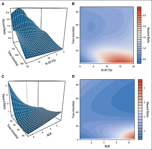
A related question arising from these last two comments, and returning to the original theme, is how the hazard ratio would be represented against time and the value of a continuous variable, all at once, assuming non-proportional and non-linear effects. All together.
Before trying to answer that excellent question, I want to list two of the best general solutions. The first involves a tensor spline (cross-products of two spline functions) in time and the covariate. This allows for a nonlinear covariate effect at any time, a separate shape of effect at every time, and a nonlinear effect modification of time on the covariate (nonlinear form of non-proportional hazards). This was developed by Robert Gray who showed that the best approach is to give a lot of parameters to this 3-dimensional surface and use penalization to pull back the effective number of parameters estimated to what the data will support.
A second general solution is hazard regression which adaptively fits interactions between linear splines in the covariate and linear splines in time. This is nicely implemented in the R package polspline.
Now to your question. Once you have estimated the function that has the needed time interactions in it (using e.g. one of the above 2 methods, or if the covariate is linear you can do this simply using plot.zph in the R rms and survival packages), the most general graph is a 3-d graph showing the relationship between the predictor, time, and relative log hazard. There are 3 main choices of 3-d graphs: color image plots (like heatmaps), wireframe plots, and contour plots. Or you can show a series of 2-d plots. For each of, say, 4 time points, plot the estimated relationship between predictor and log relative hazard. And you can switch this around: select 4 covariate settings and put continuous time on the x-axis.
As a reminder, whenever there is an interaction with time, the likelihood function needs to be explicitly for time-dependent covariates; you can’t just put time into the model as if it were a baseline covariate.
A very interesting challenge for 2019, I’ll tell you about my progress, if you allow it, have a happy New Year’s Eve, Professor Harrell.
I found a wonderful tutorial by Andreas Bender, which reproduces exactly these graphics in a very beautiful way. With this you can make both the contour map and the 3D surface that shows the interaction between the non-linear effect of the variable, and the time-varying effect. I thought it was one of the most beautiful things I have tried in statistics so far. I leave the link here:
https://adibender.github.io/pammtools/articles/tveffects.html
This is really fantastic. One question - I couldn’t see in the coxph call where a (start, stop time) time-dependent covariate dataset was used. It looks like a regular non-time-dependent Cox model (?).
I think it also incorporates the possibility of a time-dependent variable, but I haven’t tried that part.
That is correct,
the package also offers functionality to include time-dependent covariates (TDC). One has to differentiate though, whether to model the TDC as
which also affects the way the data set has to be constructed.
The arXiv preprint linked by @albertoca offers more details.
What’s always puzzling me when using psplines in coxph, why doesn’t the confidence band collapse at the reference (by default at the centre of the data, where the curve crosses a HR of 1)? How can there be any uncertainty for the reference?
For that reason, I am not using the psplines function in coxph anymore. However, the restricted cubic splines with the rms package work like a charm! Thanks for that @f2harrell .
I actually think it has to do with the nature of the function. The y-axis’ in the example I posted are erroneously labeled as “Hazard ratio”, but to be precise it should be labelled “Parital hazard” as they represent the partial hazard predicted by the independent variable and not the hazard ratio per se.
I thought that a partial hazard ratio was still a hazard ratio. And on @Peter_R_S question, the confidence interval should have zero width if one is estimating relative hazard or relative log hazard at a reference value. I’ve forgotten whether this is true if there are also adjustment variables in the model. When predicting survival probabilities, confidence intervals have nonzero width even at the reference value in rms.
I am pretty sure they have a zero width confidence interval at the reference value when using rcs in rms and applying predict() with the type=”terms” option, even when there are adjustment variables. The issue has been discussed here. Did not remember this but you actually commented there @f2harrell .
This is the final published result inspired by professor Harrell comments.
The graph effectively reveals a complexity of the biomarker that is often overlooked. For example, according to the WHO classification of neuroendocrine tumors, the biomarker Ki67 is often categorized: G1 <3%, G2: 3-20%, but there is really no threshold that suggests that these cutoff points have real meaning. If we add the time, the landscape that emerges really changes my perception of what a biomarker really is.
The manuscript here:
https://ascopubs.org/doi/abs/10.1200/JCO.19.00980
Thanks.


