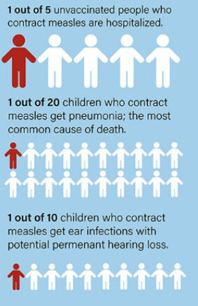
Peter Hotez has published the following graphic, with the background
I have found an effective tool for addressing parental concerns—that the risks of vaccine side effects might outweigh the illness—by working in 2020 with the New York Times to construct graphics that compare what happens when a child receives a vaccine versus an unvaccinated child acquiring the infection. A new similar graphic is illustrated in Fig 1 for measles and shows what occurs if 10,000 children become infected with measles versus 10,000 children receiving the measles-mumps-rubella (MMR) vaccine.
It seems to me this is really atrocious information-graphic design, on many counts. At the most basic level, given how person icons are arrayed here, I presume some kind of areal representation of proportions is intended. But then where is our denominator? How is this figure supposed to work, objectively?
Hotez P. It won’t end with COVID: Countering the next phase of American antivaccine activism 2025–29. Robinson J, ed. PLOS Glob Public Health. 2025;5(1):e0004020. doi:10.1371/journal.pgph.0004020
I don’t understand the whole figure, how come that 500 is larger than 1,000…?
Also, disregarding data visualization issues for a moment, my feeling is that the whole attempt is misguided: I think the major problem is not that some people can’t imagine these numbers, or sense their magnitude, but rather that they don’t beleive that they are true (and pointing out that they come from the new edition of Plotkin doesn’t help, to say the least…).
I suppose the 500 was made larger than the 1,000 because “pneumonia and death” was felt to be more important than “potential permanent hearing impairment”.
I think these graphics will probably be most useful for people “on the fence” about whether to give their child a vaccine, since they are less inherently opposed to the scientific authorities disseminating the data.
That said, the issue probably goes beyond visual coherence as @tamas.ferenci pointed out. The problem driving many of the more extreme opponents isn’t difficulty in understanding the communicated data, but rather distrusting the data and its source.
Surely one way to exacerbate this problem is to communicate in ways that are technically sloppy and therefore insulting to the intelligence. Conversely, an engaging and inviting mode of science communication may help draw more people to the correct side of the fence.
It seems that many large sporting venues such as football (bothkinds) stadiums and NASCAR racetracks have ~100,000 capacity. That might generate a sound basis in experience for people to ponder the stated risks and benefits of vaccines using a typical epidemiologic denominator. You could even ask the parent if they go regularly to any large sporting arena, and an online app could immediately produce a data graphic specifically adapted to whatever arena they’re most familiar with.
Another worthwhile part of such a consultation would contrast vaccine risks against other forms of risk (rattlesnakes, lightning, drowning) that we may think about more often — and especially those we regularly make efforts to protect children from.
OK, so it seems that the left part of the figure uses “X out of 10,000” format, but the right uses “1 out of Y”. I don’t like the second way to present proportions, but the fact that they mix the two within the same figure is borderline crazy.
Note that some (but not all!) information is presented both ways, such as “2,000 hospitalized out of 10,000” on the left side and “1 out of 5 hospitalized” on the right hand side. (However, some information is presented only in the former way…) That’s really just absurd.
Using a screen ruler, I estimate each blue rectangle is ~103 little person icons across and ~46 icons high, for ~4750 people per rectangle and thus ~9,500 altogether for both rectangles together. So perhaps the intent was to have the total area of both rectangles represent the denominator?
It feels like a case of “misguided artistry” where some good individual elements are there, but then the message gets so confused by the way these elements are distorted. For instance, the author uses the idea of icon arrays and natural frequencies. Icon arrays are good in that they avoid denominator neglect. However, this effort appears to be nullified by amputating the array and making it into a circle. There are other problems with the viz, but ultimately the main message seems lost in a poor viz.
Another thing I find misleading is that the figure seems to present strictly quantitative data, but it hides much less clear statements within these numbers. The problem is not primarily that these statements are not clear, but much more that it seems to be an intentional design to confuse the readers by associating wrong (high) number with certain much less frequent outcomes.
“1,000 child ear infections with potential permanent hearing loss”. I really don’t like the word “potential”: 1,000 pertains to ear infections with or without permanent hearing loss. That’s what the circle represents, you can’t write “with potential hearing loss” inside that circle! If you want to do that, start another circle for “ear infection with hearing loss”. I said that it seems to be intentionally misleading, because I feel that it designed so that the reader associates hearing loss with the circle of size 1,000 (while in reality only a small fraction of those ear infection cases leads to permanent hearing loss).
But it gets even worse: “500 children get pneumonia; most common cause of death”. It mentions death here – despite the fact that death has its own category on the same figure!! The only reason I can think of why “death” is written there, despite the fact that it already has an own circle, is to intentionally confuse the reader so that death is associated with the 500 circle (not the 10-30 one).
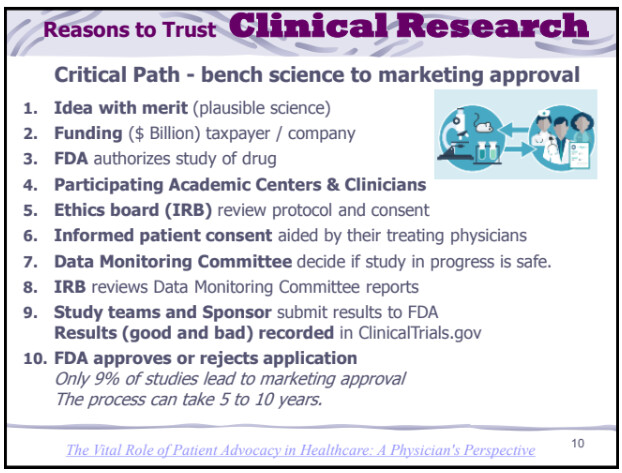
Agree that this is what ails us today. One way to potentially address this is to focus on the gatekeepers of clinical research - its collaborative nature and that it includes peer review; and that patient advocates (having no financial conflicts) take part in at least three phases. From my talk on the role of patient advocates in clinical research:
[I tip my hat to Hotez for his efforts. But the graphic reminds of consent documents written by scientists without background in best practice. Better if this portion of it was the entire focus of it … followed by plain language explaining the collaborate design, study methods and review. (Incoherent anti-vaccine-hesitancy graphic)
Postcript: I could not find a report that confirms the incidence rate of the complications of measles cited in the graphic - only that these are known to be associated with the infection. (I might be among those who have had the hearing loss complication.)
What is needed are courses given in High School to help students appreciate in a general manner what kinds of study methods have the most and least reliability. All human kind is suffering from this deficiency in public education - and if climate scientist’s (holding a 97% consensus on the urgency of the matter) are correct, the worst is yet to come.