Background:
I am analyzing data from a survival-study. I am a medical PhD, so I tried to get advanced knowledge in biostatistics, but maybe I have some „simple“ mistakes in my understanding.
I am currently using SAS but can switch over to R if needed.
Setting:
Computed a multivariable cox-proportional-hazard model, cause by analyzing Schoenfeld residuals I found out, that my „aim-predictor“ (the variable I want to analyze whether it could be an predictor lets call it „aim_var“) is time-dependent.
Got a very high Chi2 and a p-value of <0.0001 for my aim_var, and my model seems reliable, cause all other regression coefficients make sense in their direction.
Compared AICs of the model with and without the predictor as well as I computed the Chi2-difference, both yielded to the result, that my aim_var improves the model.
(As a next step I currently try to understand how NRI & IDI works and how to compute it, but that’s not important for my question.)
Problem/Question:
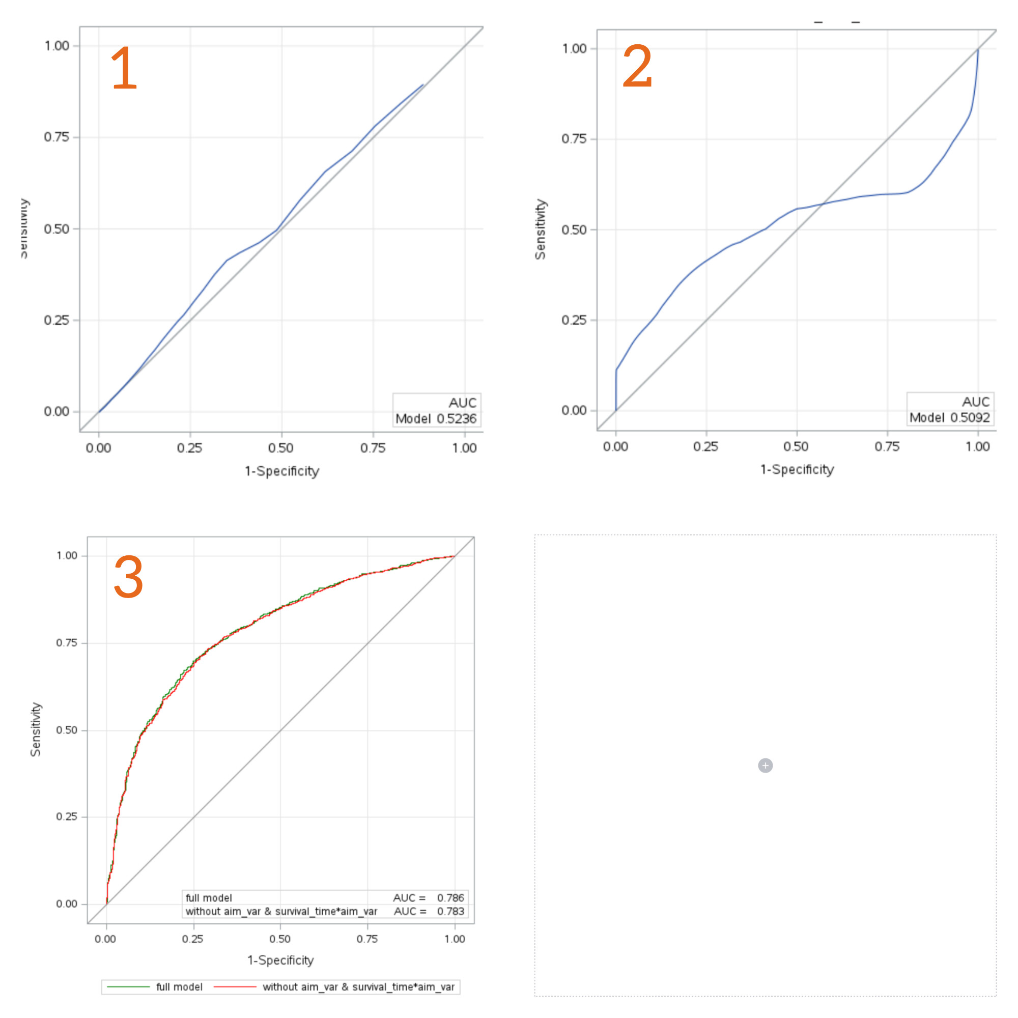
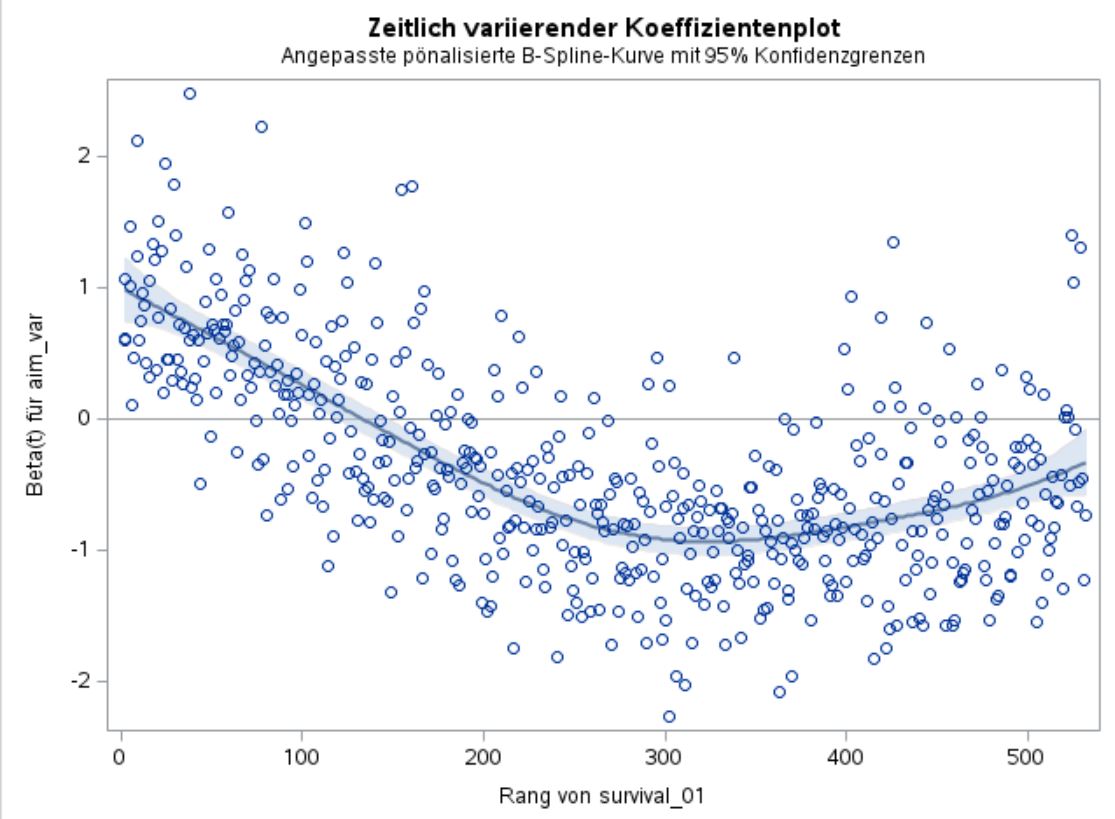
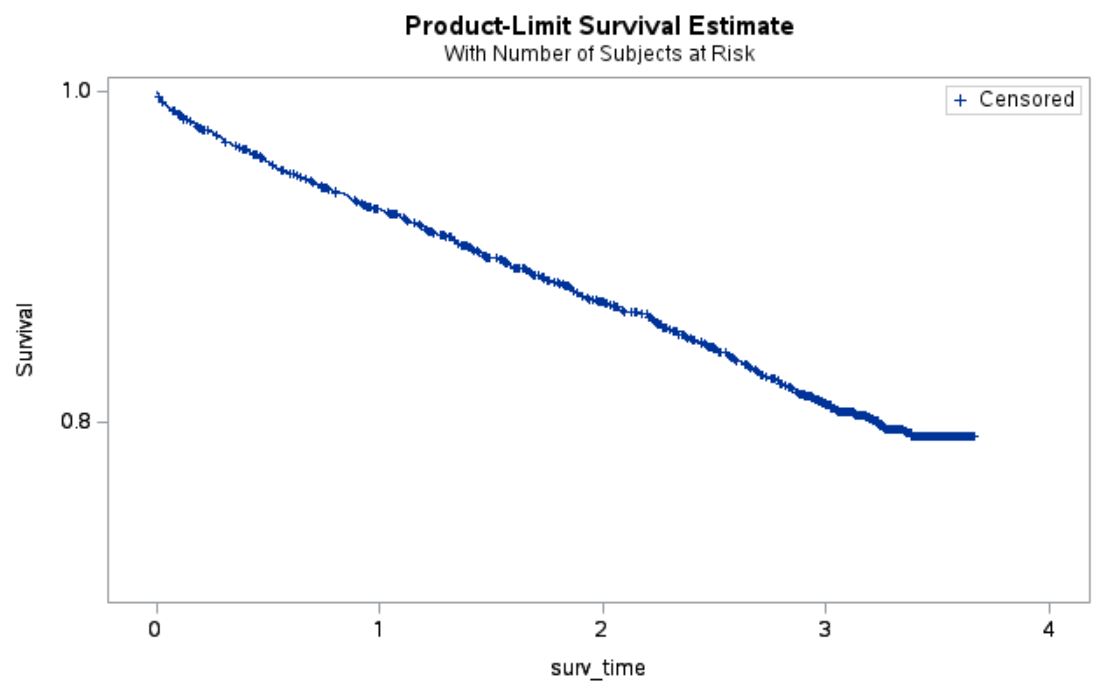
My clinical supervisors asked me, to plot ROCs for the univariable model with only our aim_var as well as for the full model and the full model without the aim_var.
As far as I know, the question if a „new parameter“ has „good predictive quality“ or „improves the currently used markers, should not be answered (only) by looking at ROC and AUC. This is the reason why for example NRI was introduced, right?
But anyways I am not argumentative strong enough yet to argue, why we should not also take look at the ROCs. So I did this and got results, which I don’t understand.
You can find the ROCs below.
Why does the ROC of the univariable model with adjustment to fit proportional hazard, so survival_01 = aim_var survival_time*aim_var , has this S shape, so the ROC crosses the bisecting line?
As a last note, cause I don’t know if it is important I want to mention it: I logarithmized the aim_var for the analysis, cause of a violation of the normality assumption regarding the residuals.
Thanks in advance for all suggestions, help and everyone who reads my post and is trying to help
Receiver operating characteristic curves, though commonly used, and not useful as they condition on the future to predict the past. See this for starters.
IDI and NRI have many problems; I don’t recommend them
You seem to have non-proportional hazards on the main variable of interest, but are fitting models that assume proportionality (time-invariant effect) of this variable
It would be helpful to include the smoothed scaled Schoenfeld residual plot for the key variable
Thanks already for your answer and suggestions. I will read your links and will export and upload the Schoenfeld residual plot later.
Good to know with IDI and NRI, then I will skip this part.
Regarding point 4, I read that the inclusion of the term surv_time*aim_var into the model will solve the problem of non proportional hazards? Isn’t that true?
Will read this document tomorrow. As you might have already noticed, my statistical supervision is not existent, but I dont want to do simple&wrong statistics, so every link or paper is helpful and I will read and work trough it, as soon as possible
Right. A bit confusing on the right upward swing. Are there other strong predictors in the analysis? Do they exhibit PH? If so then switching models may hurt more than help. But occasionally there is a different model such as an accelerated failure time model (log-normal or log-logistic in particular) that has overall better fit. That typically happens when the hazard ratio for the majority of variables converges to 1 (y=0 on your plot).
If the majority of strong variables exhibit PH and the main variable of interest doesn’t, then having time-dependent covariates representing a linear or nonlinear interaction with time may be a good approach. For your situation the time interaction might be modeled as quadratic in time
There are 8 other variables in the model, 2 with an stronger influence than aim_var and 2 with a small influence. I looked at all other Schoenfeld residual plots and they all looked fine, so no violated PH for all variables except aim_var.
Your suggestion with the quadratic term is really good, also thought about it, cause it kinda feels fitting to the situation.
Do you have any suggestion for good literature regarding your proposed accelerated time failure modelling approach?
Thank you really, really much for your help! I will try to use the time-interaction and will dive into all your suggestions especially the article to quantify added predictive value.
That is an interesting shape indeed. Just looking at your model for 2 I wonder about the shape of the survival curve &/or if there is a “J” curve relationship between aim_var and survival. How well did it meet the proportional hazards assumption?
It is often hard to tell from ROC plots just how accurate the curve is at different values. While it is tempting to say that a “high” of aim_var is diagnostic to “rule-in” (high specificity) and a low value for Rule-out (high sensitivity) it may be that some parts of the curves are not diagnostically useful. Ref 1 describes a straight line which goes through the 0.5,0.5 point to define the useful area. Calibration and net-benefit plots may also help to see what is going on.
I can’t see NRI being useful in a situation like this. IDI, perhaps. I make a plot of Sensitivity v predictive value & 1-Specificity v predictive value for the baseline model and the model + aim_var to see if the improvement in the model is mostly in reducing the predicted values for those without the event or increasing for those with the event (IDInon-event and IDIevent are the means of the change in predictions for each and like AUC are a summary measure of the plots). I’ve R code for this graph if you want (ggrap at GitHub - JohnPickering/rap: R package for Risk Assessment Plot and reclassification statistical tools). Note, the ggroc in the package can draw the “carrington line” if desired.
Carrington AM et al. The ROC Diagonal is not Layperson’s Chance: a New Baseline Shows the Useful Area. In: Machine Learning and Knowledge Extraction [Internet]. Vienna, Austria: Springer; 2022. p. 100–13. (Lecture Notes in Computer Science). Available from: 10.1007/978-3-031-14463-9_7
Thanks for your answer as well. Below I have attached the Kaplan-Meier curve, nothing ‘special’ here, I would say.
The relationship between aim_var and survival has a really really small, to be honest not really noticable, U curve shape.
Regarding the proportional hazards assumption I have attached the Schoenfeld residuals in my 2nd answer (above), the ChiSquare is 201.1 and the t-value -14.26.
Your mentioned reference 1 is interesting, I didnt thought about the ‘definition of chance’ in the context of ROCs until now.
My R skills are not that well at the moment, they might be gotten a bit rusty, but I will give your code a try, thank you already
Is this variable a “depletable biomarker”. Depletable biomarkers may exhibit atypical combined time and disease state dependent behavior. (not just the duration, but both the duration and progression of severity or lack of recovery).
In my view, the best way to obtain initial observational evidence that a biomarker may be a depletable biomarker is to plot many time series of the biomarker in relation to the time course of the disease to the death or recovery points. I am a clinician so I leave it to others here to suggest the next steps for deriving statistical confirmation of the presence of a depletable biomarker.
If anyone has any references related to depletable biomarkers please cite them as depletable biomarkers are something that I have observed in my research and clinical work but I have never found any statistical analysis of depletable biomarkers, in fact, I made up the term and there may be an extant term for this type of biomarker that I am unaware of.
Is this variable a “depletable biomarker”. Depletable biomarkers may exhibit atypical combined time and disease state dependent behavior. (not just the duration, but both the duration and progression of severity or lack of recovery).
I would say yes, cause it is a marker in human blood, which varies by time due to complex (not yet fully understood) building up and breaking down processes.
From known literature it has a time-dependent functionality. Sadly there is just one publication about this marker, which states in its statistical analysis something like: ‘we adjusted for time dependency to fulfill proportional hazard assumption’.
Biomarkers commonly have a time dependence (or perhaps a combination of severity and time dependence). A depletable biomarker is somewhat rare and unique.
As I am defining it, a depletable biomarker is:
“A biomarker which initially increases responsive to the target disease but then may, and not rarely, decline in concentration over time as the target disease increases in severity falling back to normal or even subnormal values in the presence of very severe disease”.
So I bring this up since this is the pitfall of comparing ROC for biomarkers. ROC has no mathematical component of time. You may have biomarker data in relation to time or some measure of severity. This is ideal, especially if you have biomarker in an untreated or improperly treated cases without recovery or with delayed recovery as well as treated cases with recovery. Seeing the range of the time course of the biomarker is pivotal and that will generally depend on the specific disease.
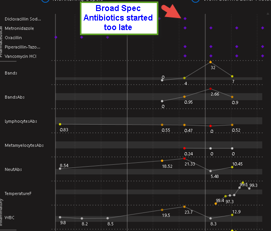
When Considering the ROC for survival, the pattern of the biomarker over time is more important. Here is a classic pattern of a “depletable biomarker” (the WBC). In some infections, depletion of the biomarker during worsening after the initial increase in the biomarker is quite common. You can see how this can effect the ROC. If we plot the ROC over time, In some cases (for example meningococcemia) Altered neutrophil counts at diagnosis of invasive meningococcal infection in children - PubMed the sensitivity of a given threshold of the absolute neutrophil count (ANC, a classic biomarker similar to the WBC) may decline as the disease worsens… It commonly surprises physicians that the ANC or WBC (legacy biomarkers for infection) can be quite normal in the ER when the patient presents with late sepsis because the rise and fall of the biomarker has already occurred and the biomarker is depleted.
The second image shows this pattern in a case of fatal E.coli sepsis where the antibiotic treatment was applied too late. Here the fall in WBC during worsening is consistent with a depletable biomarker. Note the WBC starts to recover near death likely due to antibiotic killing of E.coli (but too late)…
Now consider a depletable biomarker such as the neutrophil in cases wherein depletion is very common such as meningococcal bacteremia, Here ROC depends on the time of measurements of the patients sampled for the study in relation to the onset of infection. If the patients in the study arrived too ER early then sensitivity of a given threshold of the absolute neutrophil count would be higher. If the population arrived late to the ER then the sensitivity determined in the study would be lower. This is the opposite of what we expect with biomarkers. The average ROC is what might be published but this may be misleading as it relates to the instant case at the bedside.
In the third image you see a fatal case of meningococcemia. Note WBC is normal on admission. This biomarker has already been depleted.
So the question (as it relates to ROC) is, what is the characteristics and ranges of the time timeseries of the biomarker in relation to the time series of the disease? ROC and AUC are black boxes.
Look at the first graph again. Now think about comparing the AUC of the ANC (or WBC) to that of Band Percentage. This is exactly what they did. Not surprisingly they found AUC was better for the ANC and many less knowledgeable hospitals abandoned the measurement of bands. Of course this was foolish because the sensitivity of bands increases as severity of infection increases whereas the sensitivity for ANC may decrease as severity increases. When time is considered, the two biomarkers are synergistic. Comparing then by using AUC without an understanding of the time course led to the abandonment of bands in any hospitals due to a misunderstanding of what ROC and AUC teaches. Here the statistical tools deployed lacked the power to answer the questions the researchers asked (which is better ANC or Bands?)
So if you have timeseries of the biomarker that would be great to see. In some cases the biomarker is fairly stable or definitive and these issues so not apply but it is important in many cases to determine if they do otherwise the pitfall that those who abandoned bands fell into may be present.
@llynn Very interesting insights!
In my case I only have 1 biomarker value for each patient, which was measured at the 1st visit in the hospital. Additionally I have the survival time (if the patient died) or the end of follow-up time, if the patient survived.
To analyze the time-pattern of the marker, I would need more than 1 measurement per patient, if I understood it right?
Now I am completely confused…
What’s going on here? My feeling is that I could missing something very relevant…
Beside that, I looked at the other ways to quantify added value.
I already computed some of your @f2harrell suggested measurements:
The Fraction of new information from aim_var (d) (=1-LRpre/LRpost) is 0.12.
The Fraction of new information from variances of aim_var (j) (=1-Relative explained variation) is 0.003.
So also for the interpretation in this case I am kind of confused .
To compare this results with some other already established markers, I built the same model with those and got values for (d) of -0.07, -0.03, 0.003, and 0.3. The last one is the gold-standard marker, and the first 3 are markers also already used in clinical practice as decision rules.
The interpretation, that the first 3 are not really “adding” something is in some sense correct, cause they are special for some sub-groups of patients and not “overall” predictors. In this setting 0.12 is looking not that bad, right?
I would be happy about your thoughts, thank you already for all your time!
Does LR post refer to the all-inclusive model? And make sure all variances computed are variances of the predicted risks or linear predictor X\hat{\beta}.
LRpost is the one of the model with all parameters inclusive aim_var.
LRpre is the LRpost model without aim_var.
and for the computation for the other markers I did the same, so the same model as LRpre for aim_var and for LRpost I added the marker.
For the variance computation, I adapted your code from your article to: var(predict(g, type='survival'),na.rm=TRUE)
and your point is totally right, I falsely used the survival probabilities here instead of the linear predictor, using var(predict(g, type='lp'),na.rm=TRUE) yielded to a value of 0.032.
Concluding that some measurement does not add a lot of relevant information is also a good finding and you are doing it in a very nice way.
I was similarly a bit disappointed initially during my PhD as I was looking at the usefulness of new metabolite biomarkers for the prediction of several cardiometabolic outcomes, only to find they didn’t really add a lot of information if you really take an honest look at your data. (I had a lot of help from various people on this board and @f2harrell especially in shaping my thinking. Also created a similar plot as you did in one of my articles: https://academic.oup.com/aje/article/191/5/886/6499497).
In the end however, I’ve shifted my views and am glad/satisfied to find that a lot of prediction in medicine can be accomplished with standard measurements that are widely available in all levels of clinical practice (such as age, sex, lipid measurements, weight etc). Compared to new measurements, these standard measurements are often:
Collected in a standardised manner resulting in less measurement variation even between different countries
Available at different clinical levels (e.g. in hospital but also at GPs) which allows models to be tested and possibly used at different places in the diagnostic/treatment chain
Measured almost by default in any patient (so that your measurement is not available in only very selected individuals which can seriously affect estimates of model performance or usefulness)
Doesn’t mean we shouldn’t try to improve the prediction of some outcomes but it is somewhat reassuring to know that we can create a good basis from existing measurements. Keep up the good work!