What is the best graphical comparison of means that are shown as mean +/- SD. I used 95% Confidence interval plots, which were shot down by my reviewer. Please help.
with lab parameters maybe they want median and inter quartile range? ie more like a box plot
1 Like
Thanks so much @pmbrown . For this data set, i had normally distributed data for all variables written as means +/- SD.
and they stated the intention is merely to translate those mean/sd values into a visual summary? i don’t think you are very much at fault here, maybe you went beyond what the Q demanded - your display implies some inference ie encourages a comparison of the mean values, and i guess something more preliminary was expected
1 Like
Thanks. Much appreciated
Hi,
Picking up on what @pmbrown has indicated, did you perform a formal statistical test of the differences in the means over the three groups, presumably by a simple one-way ANOVA for an overall test, and then include a p value from that test in your text?
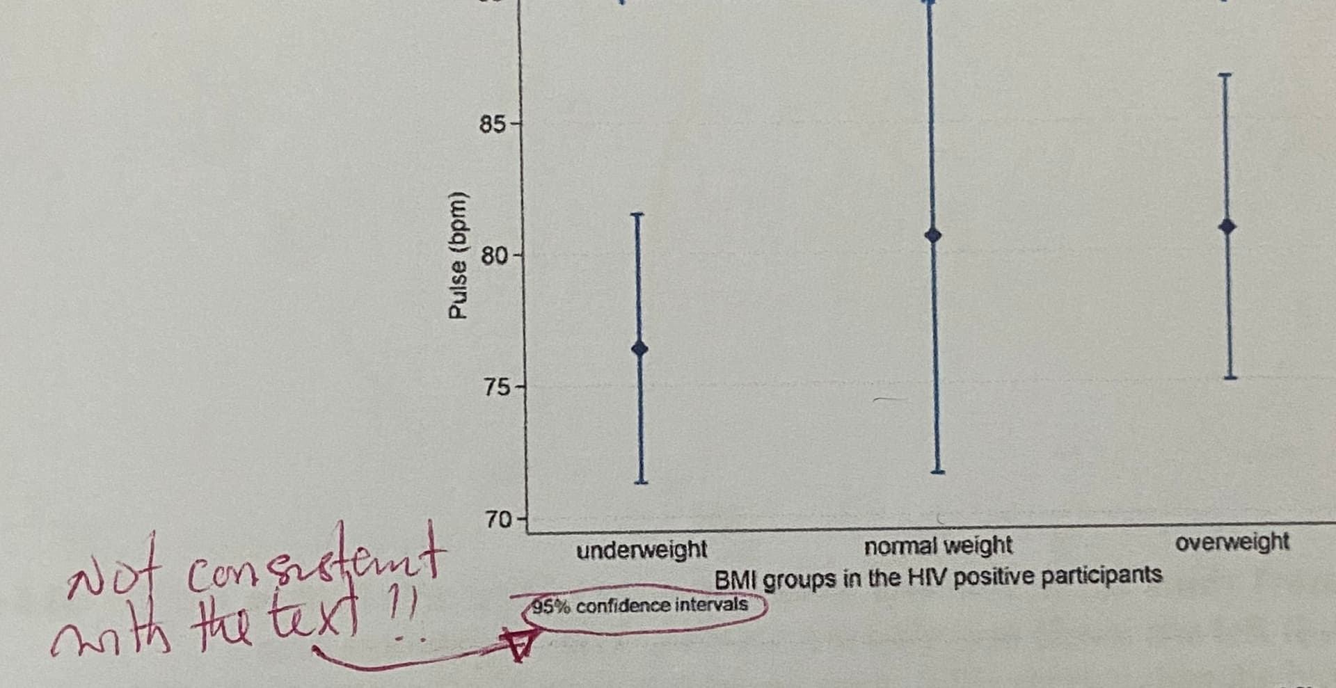
If not, then including 95% CIs in your graphic would be inconsistent with the text, as noted, since the use of CIs implies a more formal comparison of the means.
In that case, presenting the means and the SDs would be preferable in the context of a more descriptive visual presentation. I would be sure to stay with the same format that you have used already, and just adjust the width of the error bars to reflect the SDs, rather than CIs. Don’t shift to a bar chart format, which is a bad format for presenting continuous data. Look up “dynamite plots” for more information on that topic.
@MSchwartz , grateful for your response. Yes i did perform an analysis of variance and used post hoc test (bonferroni) to do a pair wise comparison. I then used those P values on the CI plots.
I actually thought i should have been doing another test aside ANOVA in order to use the CI plots when i saw the comment. I had searched in literature and came to the conclusion that using the CI plots would give me a better visual statistical difference. Since this was shot down… I have been thinking of using SD - which graphically tells the reader very little about significant differences - unless the P values are read. This was my rationale.
I’m learning a lot from all of you. Thank you
i think plotting sd would be confusing because it’s not common, people would assume they are looking at CIs even if it was clearly labelled. The alternative option would be a box plot i think
4 Likes
@Theresac, ok, the p values must be outside of the image capture that you had attached here.
That being the case, did you include the p values from the ANOVA and post-hoc tests in your text body, but not the CIs? Is there also a table with these values?
If you presented the p values, but not the CIs, in your text, it is possible that the reviewer is narrowly focused on that aspect of the textual content and the discrepancy with the figure. If that is the case, the fix is easy in my mind. Don’t change the existing figure, and add the CIs to a table, which can include the means, SDs, SEs, CIs and the min/max for each group in a single 3 row table, one row per group, as a descriptive presentation.
In the body of your text, you could also report each group using a template along the lines of:
… Underweight (M = X.X, SD = X.X, 95% CI = X.X, X.X), …
and have a footnote or table indicating each acronym used in the body.
Then report the results of your ANOVA and post-hoc tests, as apropos.
There are various writing style guides (e.g. APA) that you could review and use here, depending upon context, for the formatting of the textual and tabular presentation of your results.
As an aside, unless you were specifically directed to use a Bonferroni, or it was pre-specified in an SAP, it is a very conservative correction. The approach to dealing with multiple comparisons is one that evokes a wide range of opinions, and is also influenced by whether the post-hoc tests were pre-planned or not. You might want to review other, less conservative, adjustment methods, and if you are doing all possible pairwise comparisons, look up the Tukey HSD methodology, as one alternative.
Lastly, I see @pmbrown commented, and I agree, that the presentation of SDs, rather than CIs, can be confusing, and it may come down to context. Using a boxplot, as he suggests, with an additional overlay of the mean for each group, as a point symbol within each box, can be helpful here as an alternative, with the proviso that one understands the nuances of how the boxplot whiskers are created by default. I would go that route, if the resolution of the issue is not just adding CIs to your text as I note above.
4 Likes
This is so helpful. Definitely will use this in text and i will also try to use the post hoc test you have suggested.
I apologise but wonder if the a.m. plot has a favourable information-to-space ratio, and if not heart rate and actual BMI would best be visualised as XY dot plot (or density plot, if many data points)? (Noting as an aside that heart rate varies highly with numerous individual and external factors.)
2 Likes
I had the same thoughts. The TLDR from my reading: the simplest methods that maximize power relative to the Bonferroni (without getting into resampling) would be based on a sequential application of the Bonferrroni inequality.
The Tukey “Honestly Significant Difference” procedure is a very good, simple procedure in the context of ANOVA according to my copy of Multiple Comparisons Procedures (1987) Hochberg and Tamhane. I’m not yet sure if there have been other, analytic improvements developed for this context.
I thought the Holm “step down” or Hochberg “step up” might be better, but I have not seen any direct simulations or theory comparing them, or if there is a subtle distinction in model assumptions that makes the Holm or Hochberg methods inapplicable.
Addendum: Here is a paper that lists a number of MCPs; Holm and Hochberg’s strong FWER methods are mentioned. A caveat: I saw more references to medical journals on this statistical issue than recent statistician reviewed (ie. after 2000) papers.
There was also a recommendation of “testing for equality of variance” which strikes me as suspicious before selecting a MCP.
Interesting simulation paper that recommends Tukey’s procedure based on simulation from a normal distribution. I think the paper is consistent with parametric theory, but incomplete. I’d like to see have various families of distributions considered, (see O’gorman Applied Adaptive Statistical Methods). I am not sure if the assumptions of the paper and MC sims are correct.
Still, worth reading.
Best theoretical paper I’ve come across (so far) that describes the theory MCP for Generalized Parametric (and Semi-parametric) models. Peter Westfall is an expert in this area. All of the authors are statisticians. The mathematical maturity needed is high for this one.
The ultimate TLDR; Tukey’s HSD (and modifications) are parametric; the step method are not. If you have good reason to believe in variance homogeneity, Tukey is best. If you have reason to doubt variance homogeneity, the step methods are reasonable.
I prefer nonparametric methods as a default, so I lean towards step methods. How this interacts with the regression model chosen when assumptions are violated. is also not clear to me yet.