I have another question, this time on model validation. I have several different datasets with hundreds to tens of thousands of samples, on which I need to train and estimate the performance of three different models that use two predictors (at most) that are transformed by restricted cubic splines with 5 knots. For each dataset I want to fit and estimate a new model using all data. Is model validation needed in my case? I would appreciate any refernces on this topic, if availabe.
Assuming the two predictors are pre-specified there is little need for model validation unless the effective sample size is small, e.g., your outcome variable Y is binary and min(# events, # non-events) is small. There is just a need for having a good model fit. Depending on what distributional assumptions you need for Y the main issue may be interactions among Xs.
1 Like
Having read the excellent conversation in this thread, I have some questions myself. I’m developing a prediction model (binary outcome) in a dataset that has some missing values, and I stumbled upon the issue of multiple imputation-internal validation combination. I read the relevant material provided here, the options of MI-Val vs Val-MI and so far what I have done is this:
- Multiple imputation using mice
- Then in order to get performance measures, I fit my model in each of the imputed datasets using lrm function, and then got the average of each performance measure (average apparent, optimism, and index-corrected) using the validate function from the rms package. So I chose to impute first, then bootstrap.
- I found a nice way to get CIs of the performance measures here: Confidence intervals for bootstrap-validated bias-corrected performance estimates - #9 by Pavel_Roshanov from F.Harrell, but in my case I can do this procedure in each of the imputed datasets, and now I don’t know how to combine those confidence intervals to get my overall CIs across the imputed datasets.
- Having done that, is it now ok to use fit.mult.impute, to get the pooled model coefficients with standard errors? I would also like to do some post-estimation shrinkage using the index.corrected calibration slope and present those final shrunk coefficients.
- I used predict in each of the imputed datasets, to get my model’s predictions and then calculated the average predictions across the datasets. With these average predictions, I made a calibration curve with the val.prob.ci.2 function from the CalibrationCurves package.
To summarize, is it correct to use fit.mult.impute to get my final model, but manually fit my model with lrm across each imputed dataset to do my internal validation? How do I combine CIs across datasets? Is it correct to plot calibration curves with the average predictions across the imputed datasets? Sorry for the lengthy post. Thanks in advance!
1 Like
Hi everyone, I am using the RMS package to develope and internally validate a risk prediction model. After using the ‘validate’ function to run 500 boostrap with resampling, we used the calibraton slope (0.976) to correct our regression co-efficients, then re-estimated our intercepts (the outcome is ordinal). When using the ‘predict’ function, the linear predictors for each ordinal outcome are the exact same for the initial model and the model with the optimism-corrected coefficients and adjusted intercepts. Any insight on why this may be? We aren’t shrinking the coefficients by much, but I don’t understand why the lp is exactly the same. Thank you in advance.
Hard to know without seeing the relevant code.
This should help Multiple imputation and bootstrapping for internal validation
1 Like
Hi everyone.
I’m a new R user and I’m now in the process of learning how to deal with regression models.
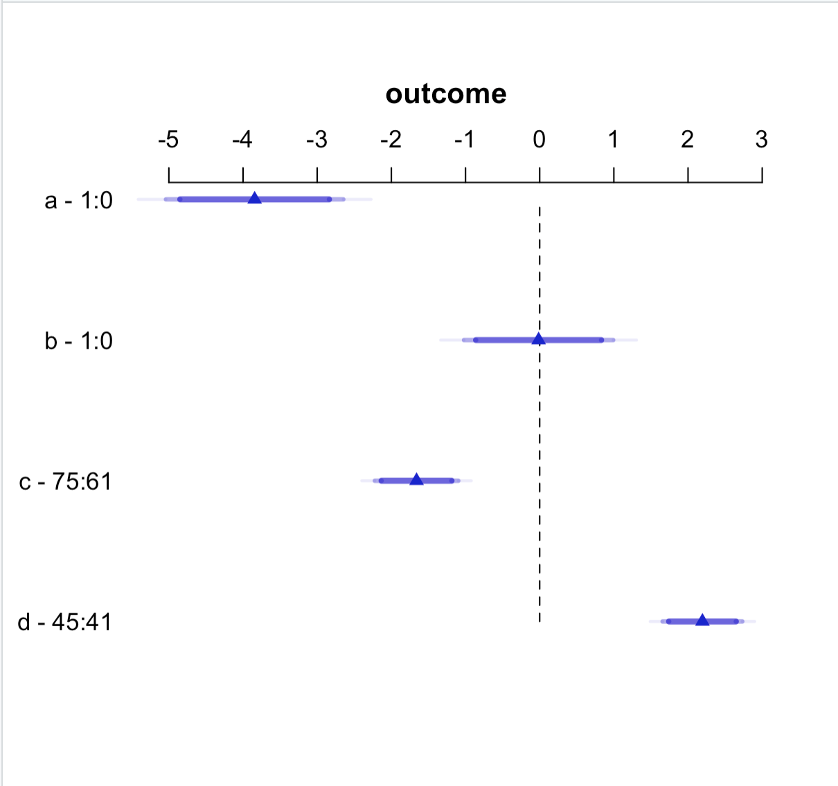
I need to plot the coefficients of a multivariate model and I learnt how to do it with the functions provided with rms package.
I’m not familiar with plot function but I was wondering whether there is a way to customise the appearance of the plot (changing the predictor labels, colours used for point estimates and confidence intervals and so on).
I thank you everyone and apologise for the silly question
model ← ols(outcome ~ a +
b +
c +
d, data = data)
plot(summary(model))
This is a multivariable model, not a multivariate one. Multivariate = more than one dependent variable.
plot.summary.rms (the full name; type ?plot.summary.rms for detailed documentation) has options for that. You can give your variables labels before fitting the model and there is an option to use those in the plot in summary.rms (the vnames options). You can specify confidence levels. I’m not sure about changing colors. But look carefully at the help file for this family of functions.
Thanks for your suggestion. I got the problem solved.
1 Like
Professor Harrell, is there a way to change the color of the ‘Apparent’, ‘Bias-corrected’, and ‘Ideal’ lines on a calibration plot using the plot function? As a clinician-researcher I am struggling with identifying a wa to do this to allow individuals to more easily differentiate between lines. Thank you so much.
I don’t think so. You are welcome to create your own version of the function that does this.
I will get help with doing that. Thank you for the quick response.
![]() I am in the process of implementing combined validation and multiple imputation in the
I am in the process of implementing combined validation and multiple imputation in the rms package. This will be in the next release, rms 6.6-0.
6 Likes
Hello @f2harrell. I am still reeling in shock from your mind-shattering course. I learnt that I’ve been doing so many things so wrongly, but crucially, you’ve given me a way of thinking about data analysis that emphasizes what is truly meaningful for real-world decisions, rather than contriving statistical workarounds to artificial problems that seem superficially easier to analyze. It is going to take me quite a while to absorb it all. Thanks so much for rocking my world!
I’ll be asking several questions in the next couple of weeks concerning many different aspects of different projects I’m working on or that I have been thinking about.
My first concerns the elegantly intuitive visualization that you strongly recommended, partial effect plots, implemented in rms with ggplot(Predict(model)). Is there a standard name for this kind of plot? I cannot find documentation anywhere on the term “partial effect plot”. It sounds very similar to the partial dependency plot (PDP) and the accumulated local effects (ALE) plot. For precise descriptions, you can refer to 8.1 Partial Dependence Plot (PDP) | Interpretable Machine Learning and 8.2 Accumulated Local Effects (ALE) Plot | Interpretable Machine Learning. Is either of these the same as your partial effect plot?
My simple, intuitive understanding is that both the PDP and ALE plot describe a predictive model by showing the relationship between a variable X1 and the Y prediction. However, they differ in at least one crucial point:
- PDP: the effects of any and all interactions between X1 and other variables in the model are included in its estimated effect on Y.
- ALE: the effects of any interactions of other variables with X1 are excluded so that only the main effect of X1 on Y is estimated.
I would think that for interpretation purposes, most analysts are primarily interested in the ALE perspective of main effects only. Interactions can be explicitly identified with other related techniques (e.g., 8.3 Feature Interaction | Interpretable Machine Learning) and then analyzed deliberately.
Since I am primarily interested in ALE plots, I would appreciate your comments on any potential shortcomings you see, especially in relation to your partial effect plots.
1 Like
Chitu I’m so glad you got something out of the course. You added a lot to the course yourself with your perceptive questions.
I had not seen any paper that developed a formal name for what we’re doing but have stuck with partial effect plot. To avoid confusion with causal inference it may be more accurate to say partial prediction plot but somehow that doesn’t have as good a ring.
I don’t think it’s meaningful to ignore interactions when fitting the model, when interactions are more than mild in their effects. So I personally would not use ALE. In partial effect plots interactions are included in the following senses:
- Interacting factors not shown in a plot panel are set to their median (mode if categorical) and such panels will be useful if it’s meaningful to set other factors to such values
- You can vary the level of interacting factors to produce a panel with multiple curves and confidence bands or to make a 3D plot
On a separate issue we need a new method for showing the effect of a predictor that is collinear with another predictor, something like a “carry along for the ride” plot, whether or not the predictors interact. For example if X1 and X2 are collinear one shows the partial effect plot for X1 but at each level of X1 we compute the estimated expected value of X2 given only X1, and let X2 vary to that value while varying X1.
@f2harrell So, do I understand that your partial effect plots are different from PDPs. If so, how so? One particular drawback of PDPs is that in setting all the other X variables at their average values, a PDP will sometimes set values to combinations of Xs that do not (and sometimes cannot) occur in the data, thus visualizing some unrealistic distortions. (ALE plots only depict realistic values because they are based on actual values in the dataset.) How do your partial effect plots handle this issue?
Concerning ALE and interactions, it is clear that interactions should not be ignored completely, so I in a full analysis, I would only use ALE plots as part of the story. I would separately test for interactions and then try to characterize them with other tools. (In fact, when interactions are identified, there are 3D ALE plots that plot two interacting variables against the Y.) So, my usage of ALE would be to clearly characterize the main effects apart from interactions while explicitly characterizing interactions separately. My point is that PDPs do not have that option.
I looked at the link you sent for PDP. I see that it is marginalizing over the non-plotted predictors so it doesn’t have the “median of all predictors may be atypical” problem that partial effects plots have. PDP seems to apply to models for estimating the mean, not in general to things like hazard rates and other estimands we use.
When drawing partial effects plots on the linear predictor scale, the settings of other predictors will not matter, at least in regards to the shape of the plot. These issues are more important when plotting on a transformed scale, e.g., probability scale or E(Y|X) from an ordinal model. Maybe we need to do something along the following lines. Suppose you wanted to show the partial effects of X_1 and X_2 (which may interact) holding X_{3}, ..., X_{10} constant when X{3} ... do not interact with X_{1}, X_{2}. Set the partial linear predictor for the adjustment variables to its median and show the effects of the first two variables.
The big problem with this approach is that although it’s easy to get point estimates, it’s not easy to get confidence bands because standard errors of predicted values depending on each particular adjustment variable setting.
Thanks. This is clearer now, though I realize it is not so simple. I appreciate your responses.
@f2harrell I have another related question, but this is somewhat more fundamental. Whether talking about partial effect plots, PDPs, or ALE plots (I will call everything in this category of plots “partial effect plots” for the purposes of this question), it seems to me that such plots can completely replace GLM regression coefficients. Let me explain my thinking.
As I understand it, the problem with a GLM regression coefficient is that it represents the average effect of a variable over its domain in the dataset. All GLM formulations assume linearity under some distributional transformation (log-linear, poisson-linear, etc.), so the coefficient represents the strength of an average effect across that linear transformation. The problem is that if the real effect is non-linear, the average of a non-linear effect might cancel itself out such that the standard errors become so unstable that the effect appears to be statistically nonsignificant. As a very simple example, if a true quadratic (U-shaped) effect is modeled as strictly linear, the coefficient would be nonsignificant because the effect is positive half the time and then negative half the time. If we suspect that the relationship is quadratic, then we can model for that. But real-life effects never perfectly match our perfect mathematical functions and they often do not match any function that we can mathematically model. This means that even for sufficiently powered tests (that is, with very large sample sizes), the statistical significance GLM regression coefficients are often false negatives–there might be a true relationship between Xi and Y, but because the particular GLM variation did not model the shape of the relationship correctly, the coefficient of Xi might be incorrectly nonsignificant.
The beauty of partial effect plots is that they visualize relationships of any shape with no need to assume the distribution of the X or the Y variable. (This enables flexible model options like cubic splines to capture such non-standard relationships, but that is beyond the scope of my question.) So, rather than using two summary numbers (coefficient for effect size and standard error/p-value for confidence of the effect) to determine if a relationship exists, a partial effect plot graphically visualizes a relationship. A flat line means that there is no meaningful relationship; any other shape of the partial effect plot indicates not only that there is an effect but the nature or form of that effect.
From this perspective, am I right to say that partial effect plots can effectively replace GLM regression coefficients for informing analysts about the existence, the strength, and nature of relationships between X and Y? (The confidence of the effect, analogous to standard errors, is a distinct question that I will ask separately. For now, I am focusing on the coefficient that is typically used to indicate the strength of a relationship.)
It would be bad practice to report a GLM regression coefficient without first checking that model assumptions are met and so there is no reason to favor a plot over the coefficients. They serve different purposes too so I dont think such a comparison should be made