If you fail to adjust for pre-specified covariates, the statistical model’s residuals get larger. Not good for power, but incorporates the uncertainties needed for any possible random baseline imbalances.
Table 1 for a randomized clinical trial traditionally contains baseline variables as rows and treatment group as columns, with an additional column for “All Treatments”. Sometimes p-values are added, as in the recent guidelines from NEJM. The latter practice is clearly misguided, because p-values are inferential quantities, and the inference is for the population from which the sample came. Suppose that one tested whether the mean age is the same in treatments A and B. The population inference would involve randomizing half of all people to A and half to B at random. But their mean age would be identical in this population, so the null hypothesis is already known to be true. Hence the p-value can have no meaning in this context.
Then the question becomes “should we stratify by treatment in Table 1”? I submit that the mere act of stratifying by treatment is at odds with how randomization works. The only reason to stratify is to compare the summary statistics by treatment. Any differences in summary statistics are by definition due to chance. So here is a list of reasons to only present the “All Treatments” column in Table 1:
- There is a significant psychological problem. A reader who does not like the treatment, endpoint, study design, or authors will seize an apparent imbalance in baseline characteristics to criticize the accuracy of the study’s treatment comparison result.
- All imbalances are by definition due to chance, and we expect imbalances to always be present to some degree.
- Related to the previous item, if you generated a “phantom Table 1” with the same number of rows as the real Table 1, and every variable created using a random number generator, you’ll see the same extent of imbalances.
- The set of baseline characteristics included in Table 1 is somewhat arbitrary, so looking for apparent imbalances is somewhat arbitrary.
- If there is an imbalance in favor of treatment A, one can always find another imbalance that is equally in favor of treatment B if sufficiently many additional baseline characteristics are examined. Thus the imbalances cancel anyway.
- Researchers who think that a particular baseline covariate imbalance might explain away a treatment benefit do not even take the time to compute whether the magnitude of the imbalance is sufficient to explain the magnitude of the treatment difference. And if one were to compute an uncertainty interval for the fraction of the treatment effect that could possibly be explained by an apparent covariate imbalance, she would be surprised at the width of this uncertainty interval.
- How often do researchers look for covariate imbalances that might explain away a non-difference between treatments?
- Most importantly, as Stephen Senn describes here and here, the unadjusted statistical test for comparing A and B is completely valid in the face of apparent treatment imbalances. The A-B comparison is just as valid when the researchers do not even measure any baseline covariates so there are no covariates even available for Table 1.
To expand on the all-important last point, there are two clear reasons that the pre-specified statistical test, whether adjusted for pre-specified covariates or not adjusted for any covariates, remains valid in the face of observed imbalances.
- Statistical inference is based on probability distributions. To know these distributions it is necessary to know the probability distribution of variables, not their observed values. So it is sufficient to know that the tendency was for baseline covariates to be balanced. It’s the tendency that goes into inference.
- The p-value is the probability of another dataset being more extreme than the current data if H0 is true. The type I error is the probability of making an assertion of efficacy when in fact there is no efficacy or harm of the treatment. The chance of falsely attributing observed treatment differences to something other than treatment is present in both p and type I error. We needlessly partition all the possible reasons for a false observed treatment effect into covariates and other unknown causes including complete randomness. The statistical test for A:B does not know anything about such partitioning of reasons for the observed effect.
Simulation
To get a sense of how easy it is to find counterbalancing covariates once a covariate with a positive imbalance (which we’ll take as an imbalance in the direction of explaining away the apparent treatment difference) is found, consider 1000 repetitions of a trial with 100 subjects and with 10 n(0,1) continuous covariates. A positive imbalance is taken as a covariate with the difference in means of the covariate between treatments that is > 0.3. This happened in about 1/2 of the 1000 trials. Consider the subset of the simulated trials with exactly one positive imbalance. Some of these trials will have an additional positive imbalance before a negative imbalance (counterbalance). Of those trials for which the first negative imbalance is not preceeded by a + imbalance in the new covariates, we find that if one measured 40 additional covariates, one always finds a counterbalancing factor. The average number of additional covariates that need to be examined for this to happen was 7.
n <- 100
k <- 10
nsim <- 1000
set.seed(1)
ne <- jc <- integer(nsim)
nc <- 0
for(i in 1 : nsim) {
  ## Simulate a difference in two means with data SD of 1.0
  x <- rnorm(k, sd=sqrt(4 / n))
  ne[i] <- sum(x > 0.3)
  if(ne[i] == 1) {
    ## Simulate 200 additional covariates (never needed > 40)
    x  <- rnorm(200, s=sqrt(4 / n))
    ## Find first counterbalance not preceeded by another imbalance
    ## in the original direction
    j <- min(which(x < -0.3))
    if(j == 1 || max(x[1 : (j - 1)]) < 0.3) {
      nc <- nc + 1
      jc[nc] <- j
    }
  }
}
jc <- jc[1 : nc]
## Distribution of number of positively imbalanced covariates in first 20
table(ne)
ne
  0   1   2   3   4   5
487 359 129  23   1   1

## Distribution of # additional covariates that had to be examined to
## find a counterbalance without being preceeded by another + imbalance
table(jc)
jc
 1  2  3  4  5  6  7  8  9 10 11 12 13 14 15 16 17 18 20 25 28 29 40
26 22 17 15 10 22 10 11  6  5  8  8  5  3  4  5  4  1  1  1  1  1  1

w <- c('Number of trials with exactly one + imbalance:', sum(ne == 1), '\n',
       'Number of such trials with a - imbalance in additional covariates not\n preceeded by another + imbalance:', nc, '\n',
       'Average number of additional variables examined to find this:',
       round(mean(jc)), '\n')
cat(w, sep='')

Number of trials with exactly one + imbalance:359
Number of such trials with a - imbalance in additional covariates not
 preceeded by another + imbalance:187
Average number of additional variables examined to find this:7
Proposed Replacement for Table 1
Any space used in a published paper needs to be justified. I submit that the overarching principles that any display in a clinical trial report must follow are
- The information be unique
- The information provides insight
Table 1 is the opportunity to describe to the reader who got into the trial. It can also provide the opportunity to provide exceptionally richer information that is usually seen by the reader: who suffered the main trial endpoint? With this and the above two criteria in mind, here is a modest proposal for a replacement for Table 1: show graphically the baseline distributions (all subjects combined) along with the relationship between that baseline variable and the outcome. In the example below, the SUPPORT study is used. For this example, only continuous or semi-continuous baseline variables are included. The outcome variable is death within hospital and each y-axis is the estimated probability of hospital death. Day 3 of hospitalization is the baseline period. R code used to create this graph appears after the graph.
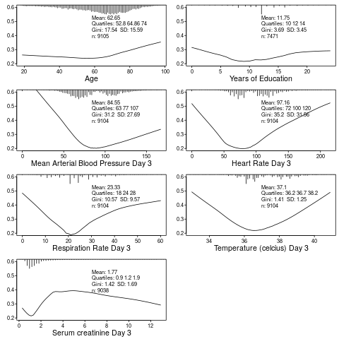
require(Hmisc)
getHdata(support2)
d <- support2[Cs(age, edu, meanbp, hrt, resp, temp, crea, hospdead)]
png('table1.png')
spar(mfrow=c(4, 2), left=-3)
g <- function(x) round(x, 2)
for(i in 1 : 7) {
  z <- d[[i]]
  x <- z[! is.na(z)]
  xl <- range(x)
  plsmo(z, d$hospdead, datadensity=FALSE, xlab=label(x),
        ylim=c(.2, .6), ylab='')
  histSpike(x, add=TRUE, frac=0.15, side=3)
  w <- paste0('Mean: ', g(mean(x)), '\nQuartiles: ',
              paste(g(quantile(x, (1:3)/4)), collapse=' '),
              '\nGini: ', g(GiniMd(x)),
              '  SD: ', g(sd(x)),
              '\nn: ', length(x))
  m <- mean(par('usr')[1:2])
  y <- 0.5
  for(j in 1:4) {
    y <- y - 0.038
    text(m, y, w[j], adj=0, cex=.8)
  }
  }
dev.off()
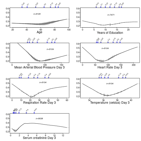
You can also use the higher-level R Hmisc package function summaryRc:
png('table1b.png')
spar(mfrow=c(4,2), top=2, left=-2)
summaryRc(hospdead ~ age + edu + meanbp + hrt + resp + temp + crea,
          data=d, ylab='', ylim=c(.18,.6), datadensity=TRUE,
          srt.quant=45, scat1d.opts=list(frac=.05))
dev.off()
Further Reading
- Out of Balance by Darren Dahly
- Does the “Table 1 fallacy” apply if it is Table S1 instead? by Dean Eckles