Examples of solid causal inferences from purely observational data

I would like to catalog here a few great teaching examples where modern principles of causal inference are used to make solid causality statements from purely observational data. Contributions with brief background, reasoning, and results are also welcomed. Methods used would include DAGs, methods of Judea Pearl, Miquel Hernán, Ellie Murray, etc., the use of instrumental variables with exceptionally well-supported instruments that are not randomization, and would need to include answers to the original causal question.

Examples that do not qualify for inclusion:

  • A smart analysis of observational data that mimics an RCT by having strict inclusion criteria, limited missing data, intention to treat, etc., but does not use causal inference methods per se.
  • An analysis where the data were taken to contain all needed confounders but for which there was no medical argument that the list of measured confounders was complete.

I seek a comprehensively worked out CI example for a two-treatment comparison from purely observational data where the outcome is univariate (not longitudinal). The example must provide a convincing argument that the list of measured potential confounders is complete.

The example needs to include the wording needed to translate data uncertainties into the final causal conclusion. For example it should include how the assertion “the true unknown treatment effect is in the right direction and the effect is caused by the treatment” was arrived at or how its probability was computed from data and from the causal argument.

10 Likes

What is considered modern causal inference? Hernan type methods. You aren’t looking for things like smoking, thalidomide, Zika virus, hypertension (CVD risk factors), etc?

2 Likes

Will clarify on original post.

1 Like

Most those papers seem to be retrospective (benefit of knowing true causal effect from other method) or too theoretical for application purposes.

Here’s an example using Instrumental Variables to examine the effects of early vs late critical care admission for deteriorating ward patients: https://link.springer.com/article/10.1007/s00134-018-5148-2

Here’s the accompanying editorial: https://link.springer.com/article/10.1007/s00134-018-5194-9

3 Likes

At the end of my Bayesian class, I teach causal inference examples with observational data from “Mixing Methods: A Bayesian Approach” by Macartan Humphreys and Alan Jacobs, which (I believe) was the first paper using Stan published in the American Political Science Review. Here is a Google scholar link but there is an ungated version along with code and a video on Humphreys’ webpage.

3 Likes

There have been interesting applications of Bayesian Belief Networks in the risk assessment and management literature that fit many of the constraints listed above. Anyone considering an observational treatment comparison study would be advised to closely study this literature.

The authors compared the standard TOSHI (Target Organ-Specific Hazard Index) to a Bayesian Belief net that incorporated epidemiological data on specific pollutants and Total Suspended Particulates (TSP) as a causal factor in the development of a large number of cardiovascular and respiratory diseases. They attempted to estimate mortality and morbidity to the workers and local population for an environmental impact of the project.

TOSHI looks like “low hanging fruit” and something relatively easy to improve upon, but the paper does go into how to apply Bayesian Belief Nets to a decision problem, and incorporates available data and expertise in an explainable format.

The Bayesian Belief Net was able to provide clear justification for the more costly mitigation measures, while TOSHI was ambiguous for reasons cited in text. The Bayesian approach was better able to incorporate prior information and uncertainty vs. the simplistic approach of TOSHI.

They had to take some short cuts in order to use the software for the project (ie. discretize continuous variables), but this was noted in text. They also note a lack of information on interactions. The result:

Blockquote
However, with not only the requirements of standards but health costs taken into account,… scenario 4 with the highest control cost but lowest total cost, was the best alternative…[see paper for probabilities of cardiovascular and respiratory diseases considered].

Related References:

Blockquote
…it is widely acknowledged that accurate BN [Bayesian Network] structure learning is a very challenging task due to the fundamental problem of inferring causation from observational data which is generally NP-hard…Specifically the search space of possible graphs that explain the data is super-exponential to the number of variables; although problems with learning statistical dependencies from finite data are relaxed, or become irrelevant, when the number of variables is small.

Some examples off the top of my head:

  1. Corroboration of the original Pfizer COVID vaccine trial from observational data (Israeli HMO data) using matching.
    Confounders where manually selected by experts and then reduced to a smaller set that showed no residual confounding. No residual confounding was (partially) verified by showing the groups to have similar incidence rate in the first ~14 days where we have evidence from an RCT that vaccines shouldn’t be effective yet and a biological mechanistic explanation for why.
    The results pretty replacated the survival curves from the RCT.

    1. Once the authors had confidence in their method, it allowed a subsequent expansion of the original BNT162b2 vaccine trial, examining rare adverse effects that the phase 3 sample might have been too small to discover.
  2. Similar design studies comparing the effectiveness of Moderna’s vs. Pfizer vaccine, and the effectiveness of 3rd COVID vaccine doses using the Veterans Affairs data.
    Confounders selected by domain experts and residual confounding was assessed using negative control outcomes: no difference in incidence the first ~10 days, and no difference in incidence of non-covid-related deaths.

  3. Staying with COVID, but reversing the temporal order: the causal effect of early treatment of Tocilizumab on reducing mortality was shown using observational data (Inverse Treatment Probability Weighted Cox regression) a few months before the RCT results were published.

  4. Moving away from COVID, but still in the OS-preceding-RCT: the effect of colonoscopy screening on risk of colorectal cancer.
    We have two observational studies [2017 (Medicare), June 2022 (German claims DB)] getting the same survival curves as a subsequent RCT [October 2022].

  5. Last one, just so we have an instrumental variable example: effect of educational attainment on dementia risk.
    Using compulsory schooling laws as an IV. Which is very nice because it is very plausible that state-level educational policies are not confounded with individuals’ risk of dementia (as opposed to regular covariate adjustment for educational attainment and dementia that would’ve required a lot of unknown individual-level confounders like childhood and socioeconomic data).

I’m not certain that examples 1-3 qualify. They adjusted for available confounders but from what you wrote did not have a DAG informed by subject matter knowledge that would strongly argue that the available confounders are equivalent to the set of needed confounders.

1 Like

There is indeed no explicit DAG in them. However, the epidemiology school of causal inference (mostly?) uses DAGs for finding proper adjustment sets. Therefore, I think “domain-experts picking (an initial set of) relevant covariates” - especially given who the authors are in these cases - is probably DAG-driven.
I agree the justification for the final adjustment set being the set of needed covariates does not come exclusively from the DAG, but rather it comes from 1) the fact they were chosen as candidates confounders in the first place (a-priori), and 2) using them showed no residual confounding (a-posteriori).

As for the latest point: the available confounders will probably always match the needed confounders due to the selection process of research and publication. If the authors think they have identified confounders they cannot control for (or they show residual confounding through negative control outcomes), then the study wouldn’t have continue in the first place.

2 Likes

Good observations. I’d like some data on the last point. I’ve seen too many convenience samples used in research (e.g., electronic health records). What I’m looking for in papers is what we did long ago in a paper on right heart catheterization where we explicitly asked experts before the study (and reported on this in the paper) what cues they use in selecting the procedure. Pooling all their responses yielded about 25 variables and we had faithfully collected all 25!

1 Like

You probably know these, but two studies from the same author using target trial emulation:

  1. Stopping Renin-Angiotensin System Inhibitors in Patients with Advanced CKD and Risk of Adverse Outcomes: A Nationwide Study. The authors refer to an ongoing trial that addresses the same question of the effects of stopping RAS-inhibitors in advanced CKD patients. This study (STOP ACE-i) has now recently been published but findings regarding occurrence or renal replacement therapy or MACE were somewhat different between the trial and the observational study.
  2. Timing of dialysis initiation to reduce mortality and cardiovascular events in advanced chronic kidney disease: nationwide cohort study. This one in particular is a nice example as they tried to emulate and somewhat expand on an earlier RCT (The Initiating Dialysis Early and Late (IDEAL) study) on this same topic with largely similar findings.

Edit: just now saw you wanted examples with univariate and not longitudinal outcomes. Apologies!

1 Like

Not sure if it fits the criteria but we used causal diagrams here to integrate experimental data in the laboratory with clinical observations and establish high-intensity exercise as a risk factor for renal medullary carcinoma in the setting of sickle cell trait.

This was a major milestone for this deadly cancer and was the challenge that motivated our group’s interest in causal diagrams.

We typically use refutationist logic and design experimental or observational studies that can refute our causal hypotheses.

Since that time, this signal has continued to emerge in independent cohorts that now allow us to go even deeper into this unique relationship.

Note that the idea of generating reliable causal inferences from purely observational data is something that few in the causal inference world believe in. Or at least I hope so. For example, we need to physically manipulate the world around us to generate the information needed to choose between DAGs that can generate the same observed data distributions.

3 Likes

Very helpful examples from both of you. Pavlos on your study does it meet the criterion that subject matter expertise (masked to what data were actually available) was emphasized to derive the list of variables to collect?

1 Like

Yup, the subject matter expertise was encoded by the DAGs which then allowed us to determine which variables to collect. Because exercise history is hard to reliably collect retrospectively in the EMR we used two separate strategies in the retrospective cohort:

  1. comparison with a control group from the same department, EMR, and time period. Collecting exercise history was thus equally noisy. A signal of no difference between the cases and the controls would thus refute our hypothesis.

  2. use of objectively measured skeletal muscle mass as a proxy for exercise history. Because renal medullary carcinoma is more aggressive than the control cases, thus leading to loss of muscle mass, the odds were stacked against our hypothesis for this comparison.

After the signal was consistently seen in the retrospective study, we prospectively asked more granular exercise history in 10 additional patients with renal medullary carcinoma. Many reported a history of high intensity exercise at the professional level.

This is now being prospectively explored even more granularly in additional patients in an approach designed to refute our current hypotheses. In general, the quicker we remove mistaken assumptions the more efficient our research is. This motivates an ecosystem of constant but structured interrogation of all putative causal networks.

2 Likes

I’m not sure whether what I am about to describe qualifies as an example of solid causal inferences from purely observational data. It is very much based on my understanding of causal reasoning linking diagnostic tests and treatment so here goes and please be sympathetic! Perhaps someone could help me to express my thoughts with DAGs.

I don’t think that a passive instrument that would avoid having to perform a RCT on a treatment (e.g. a randomly occurring birth month used by Angrist and Imbens) would be available very often during many observational studies. In addition, it is important to be disciplined and structured when gathering data. I think therefore that we should also have ‘structured instruments’ under our own control that provide a similar result to randomisation to a treatment or control. I suggest that this can be done by randomising to two different ‘predictive’ or diagnostic tests (or to two different numerical thresholds of one test). Not only can this tell us the efficacy of the treatment but also the performance of the test(s).

I will use example data from a population of patients with diabetes and suspected renal disease, the test being the albumin excretion rate (AER), the treatment being irbesartan that helps to heal the kidney and thus reducing protein leakage. The patients are then randomised to an AER to be used with a test result threshold of 40mcg/min or to be used with a threshold of 80mcg/min. Therefore, the first negative dichotomous test result used (T1 Negative in Figure 1 below) was albumin excretion rate (AER) of ≤ 80mcg/min, the first positive (T1 Positive ) an AER of >80mcg/min. The second dichotomous negative test result (T2 Negative) used was AER≤40mcg/min, the second positive result (T2 Positive) an AER >40mcg/min. Those patients positive for T1 and T2 were treated with irbesartan and those T1 and T2 negative were allocated to control as shown in Figure 1.

image

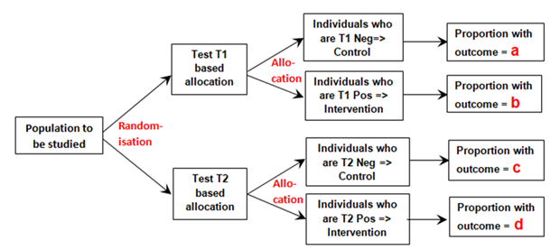
Figure 1: Diagram of randomisation to different tests and allocation to control if a test is negative or to intervention if the test is positive

The proportion ‘a’ was that developing the outcome (e.g. nephropathy) and who had also tested negative for T1 (e.g. an AER≤80mcg/min) conditional on all those tested with T1 after randomisation. Proportion ‘b’ was that with nephropathy that had also tested positive (e.g. an AER>80mcg/min) conditional on T1 being performed. Proportion ‘c’ was that with nephropathy that had also tested negative (e.g. an AER≤40mcg/min) conditional on T2 being performed. Proportion‘d’ was that with nephropathy that had also tested positive (e.g. an AER>40mcg/min) conditional on T2 being performed.

If ‘y’ is the probability of the outcome alone (e.g. nephropathy), conditional on those randomised to T1 or T2 then according to exchangeability following randomisation, ‘y’ has to be the same in both groups allocated to T1 and T2, and so:

When ‘r’ is the risk ratio of the outcome on treatment and control (assumed to be the same for those randomised to T1 and T2), the probability of having the outcome when randomised to Test 1 is y = a + a*r +b/r + b.

The probability of having the outcome when randomised to Test 2 is also y = c + c*r +d/r + d

Solving these simultaneous equations gives the risk ratio r = (d-b)/(a-c) .

Therefore when:

The proportion with nephropathy in those T1 negative (AER ≤80mcg/min) = a = 0.050

The proportion with nephropathy in those T1 positive (AER >80mcg/min) = b = 0.0475

The proportion with nephropathy in those T2 negative (AER ≤40mcg/min) = c = 0.0050

The proportion with nephropathy in those T2 positive (AER >40mcg/min) = d = 0.0700

The estimated Risk Ratio = r = (d-b)/(a-c) = (0.07-0.0475)/(0.05-0.005) = 0.5.

The overall RR based on all the data in the RCT was (29/375)/(30/196) = 0.505.

Note that proportions a, b, c and d are marginal proportions conditional on the two universal sets T1 and T2 (e.g. b = p(Nephropathy ∩ AER positive | Universal set T1)). The conditional probabilities (e.g. p(Nephropathy|AERpositive)) do not feature in the above reasoning. It was assumed also that that the likelihoods (e.g. p(AERpositive|Nephropathy) were the same for those on treatment and control in sets T1 and T2.

It should also be noted that this approach estimates the Risk Ratio in a region of subjective equipoise based on the uncertainty of whether the decision to treat patients should be based on an AER >40mcg/min or AER>80mcg/min. The data was sparse, but fortuitously for this data set, the proportions were Pr(Neph|AER=40-80mcg/min and on Placebo) = 9/199 and Pr(Neph|AER=40-80mcg/min and on Irbesartan) = 9/398. These small numbers merely illustrate the calculation. Normally a very large number of subjects would be required for meaningful estimates. However, as these patients would be under normal care (thus allowing large numbers of patients to be studied), all those who had an AER>80mcg/min would all be treated with Irbesartan and those with an AER< 40mcg/min would not be treated, which would improve the numbers consenting (few might agree to be randomised to no treatment if they has high AER levels).

This type of study with large numbers could be performed during day to day care by the laboratory randomly printing on the test results as follows: “Treat if AER > 40mcg/min” or “Treat if AER >80mcg/min”. Alternatively the laboratory or clinician could allocate to T1 if the patient was born on an odd numbered month (i.e. January, March, May, July, September or November) or T2 if born on the other even numbered months. (This would honour Angrist’s and Imbens’s choice of instrument based on which month students were born!)

The same approach could be taken with two different tests (e.g. RT-PCR and Lateral Flow Device (LFD) for Covid-19). The patients would be randomised to RT-PCR testing or LFD testing and the same design used. In this case the assumed equipoise would be that group of patients who were RT-PCR positive but LFD negative and also those who are RT-PCR negative and LFD positive. This means that all those both RT-PCR positive and LFD positive would be treated (e.g. with an antiviral agent or isolation) as this would only be acceptable to those consenting to the study, but all those RT-PCR negative and LFD negative would not be treated.

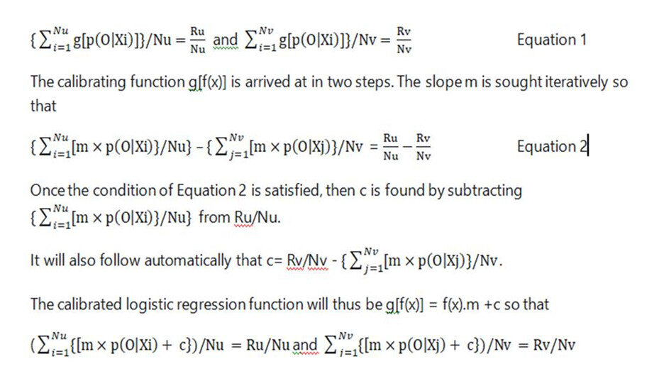
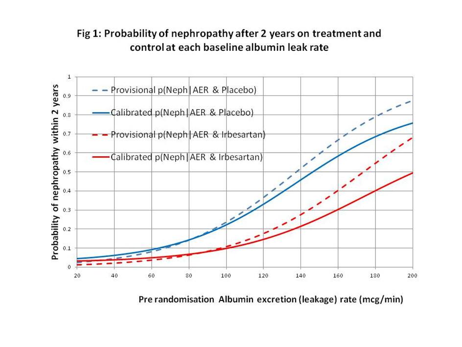
I would regard this approach as a phase 3 observational study that should only be done for a new treatment after the latter’s efficacy has been established with a suitably powered RCT, perhaps for patients with AERs in the range of 40 to 80mcg/min. By also treating or not treating patients outside this range of equipoise, the data could also be used to create curves displaying the probabilities of nephropathy for each value of AER in those treated and on control by using calibrated logistic regression. This would allow optimum thresholds for diagnosis and offering treatment to be established in an evidence-based way (see Figure 2).

image

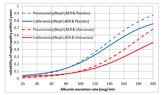
Figure 2: Estimated probabilities of biochemical nephropathy after 2 years on placebo and Irbesartan

3 Likes

I would like your opinions about the way I calibrate logistic regression. The underlying principle is as follows.
Assume that a set of Nu patients have a diagnostic test result Xi up to a threshold T of which Ru have the outcome O. The average of all the individual probabilities p(O|Xi) (i=1 to Nu) when the logistic regression function is p(O|Xi) = f(Xi) should be equal to Ru/Nu. Also assume that that a set of Nv patients have a diagnostic test result Xj above a threshold T of which Rv have the outcome O. The average of all the individual probabilities p(O|Xj) (j=1 to Nv) when the logistic regression function is p(O|Xj) = f(Xj) should also be equal to Rv/Nv. If not the logistic regression curve is adjusted with a function g(f(x)) = f(x).m+c so that the above conditions apply and so that the curve is calibrated. If it was already well calibrated then m=1 and c=0. This calibration is temporary of course because as new data arrive, the Ru/Nu and Rv/Nv change. The logistic regression function also has to be fitted again and recalibrated. The calibrating function g[f(x)] will be such that

These calculations are performed in Excel. The logistic regression function f(x) is represented by the broken lines in Figure 1 and g(fx)) is represented by the unbroken lines.
In Figure 1, f(x) is represented by the broken lines and g(f(x)) by the unbroken lines.

A few observations:

  • Calibration needs to be done inside the logistic function, on the linear predictor scale; if g is the logit function then you did this
  • Calibration need not be linear
  • If you have an independent (from the training data) dataset and only need to calibrate the intercept this is done with an offset variable in the general linear model
  • You are implicitly fitting an ill-fitting model because you are assuming that diseased patients are homogeneous, i.e., there is no such thing as severity of disease
  • By using a test threshold you are saying that it doesn’t matter how much above or how much below the threshold you are
  • When dealing with only one set of data (training data) the score equation for the logistic model maximum likelihood estimation procedure forces the calibration to be perfect if assumed to be linear
  • I’ve lost track of why we are discussing this under the “causal inference for observational studies challenge” topic

The reason that this post on ‘calibration’ is under the “causal inference for observational studies challenge” topic is because in my previous post 16 on this topic (and many others, including on Twitter), Figure 2 contained ‘calibrated’ logistic regression functions. I simply thought that I should explain what I meant by ‘calibration’ .

In my clinical work, I constantly make probability estimates in unique situations, when it is not possible to verify how well these individual probabilities are calibrated. The only thing that I can do is to check whether they are consistent (that word again!) with the overall frequency of correct predictions. I record the overall probability of being correct (e.g. 50%) and then divide the individual probabilities into two groups - those above and below this overall frequency (e.g. 0.5). I find the average of all the probabilities above 0.5 and the averages of those below 0.5 and see whether these averages correspond to the overall proportion of correct predictions above and below 0.5. They should be the same; if not then they are inconsistent with how probabilities should behave. If there is no such consistency, then I calibrate them as explained in post 18 above.

This seems to model the way that I adjust my probabilities intuitively during my day to day clinical work. I hasten to add that this does not ‘verify’ the individual probabilities but only makes them consistent with overall proportions of correct predictions. I simply did the same to the logistic regression functions. I would be grateful for a reference to the conventional way of calibrating logistic regression functions.

1 Like

Thanks Huw. This is best explained in @Ewout_Steyerberg @ESteyerberg 's book Clinical Prediction Models under the term model updating. This needs to be done in a log likelihood framework for efficiency, without dividing into groups.

1 Like